If you want new visitors to continue looking at your website, you’ll need to quickly catch their attention. Without engaging content above the fold, users may become bored before they can check out your products or read your blog posts.
Fortunately, you can use a hero image as the first visual element on your website. When you include a high-quality photo or graphic design, you can leave visitors with a positive first impression.
In this post, we’ll explain what a hero image is and how you can design one for your website. Then, we’ll show you 25 examples to provide some inspiration. Let’s get started!
What Is a Hero?
A hero is a larger banner that is displayed at the top of a website above the fold. This is the first element that visitors will see above the fold. It typically features a photo, video, graphic, or illustration along with a statement or CTA to immediately hook visitors.
What is a hero?
A hero image, or hero section, is a large banner featured at the top of a website. It can be the first element visitors see due to its prominent placement.
Read MoreHero images are a great way to grab attention. Within the first critical seconds of visiting your website, users want to be engaged by high-quality web design. Heroes can immediately leave a positive impression of your business or blog.
Since they appear at the top of the homepage, hero sections can have a great impact on your website. When used correctly, they’re able to convey everything visitors need to know about your brand. This can avoid overloading new visitors with too much information right away.
In a hero section, you can include a call to action (CTA) to motivate users to visit another page on your site. Interactive heroes can also feature carousels, sliders, and other animations. Ultimately, hero images aim to be attractive, engaging, and eye-catching.
How to Design an Attention-Grabbing Homepage Hero
Now that you know what hero images are, let’s discuss some best practices for creating them. This way, you’ll be able to design hero headers that draw users to your website.
1. Find High-Quality Images
The hero image will be the first thing visitors see on your homepage, so you’ll need to find a high-quality photo. If the image is too grainy or not compressed for fast loading, it may harm the user experience (UX) on your site.
To source images, you can use stock photos on websites like Unsplash. This platform provides free high-resolution photos without copyright protection:
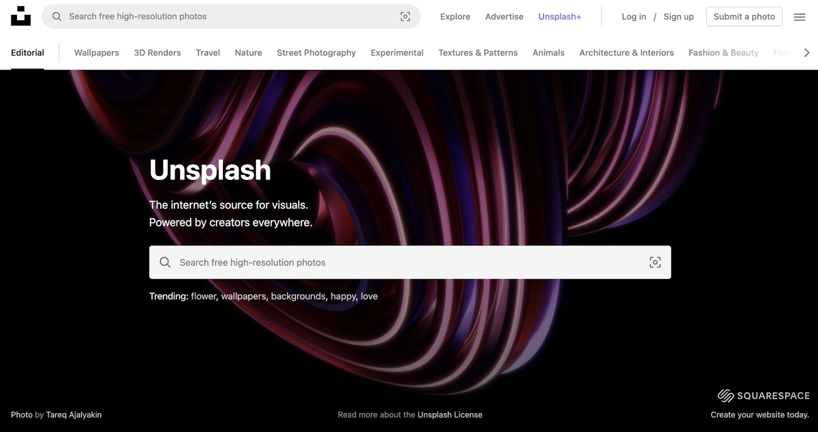
Keep in mind that you can also use graphic designs and videos instead of static photos. This can help your website stand out from your competitors.
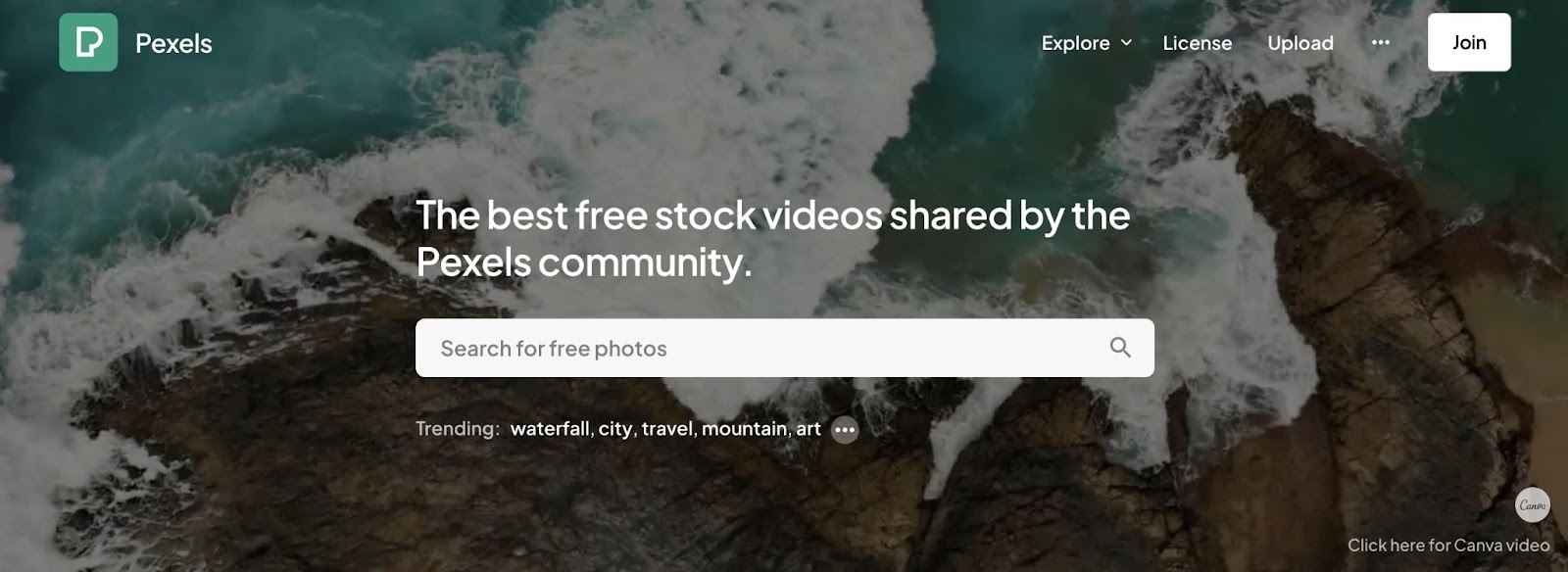
Along with stock images, Pexels has many free videos that you can browse. Like with images, you’ll be able to customize the size before downloading:
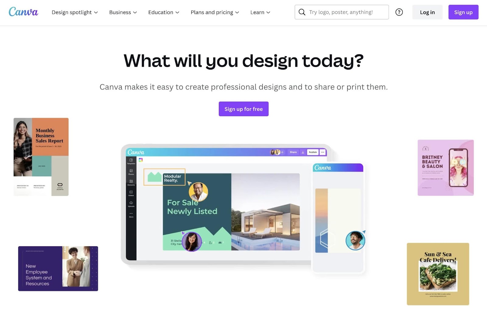
For graphic designs, we’d recommend using a flexible tool like Canva. This comes with thousands of starter templates for hero banners:
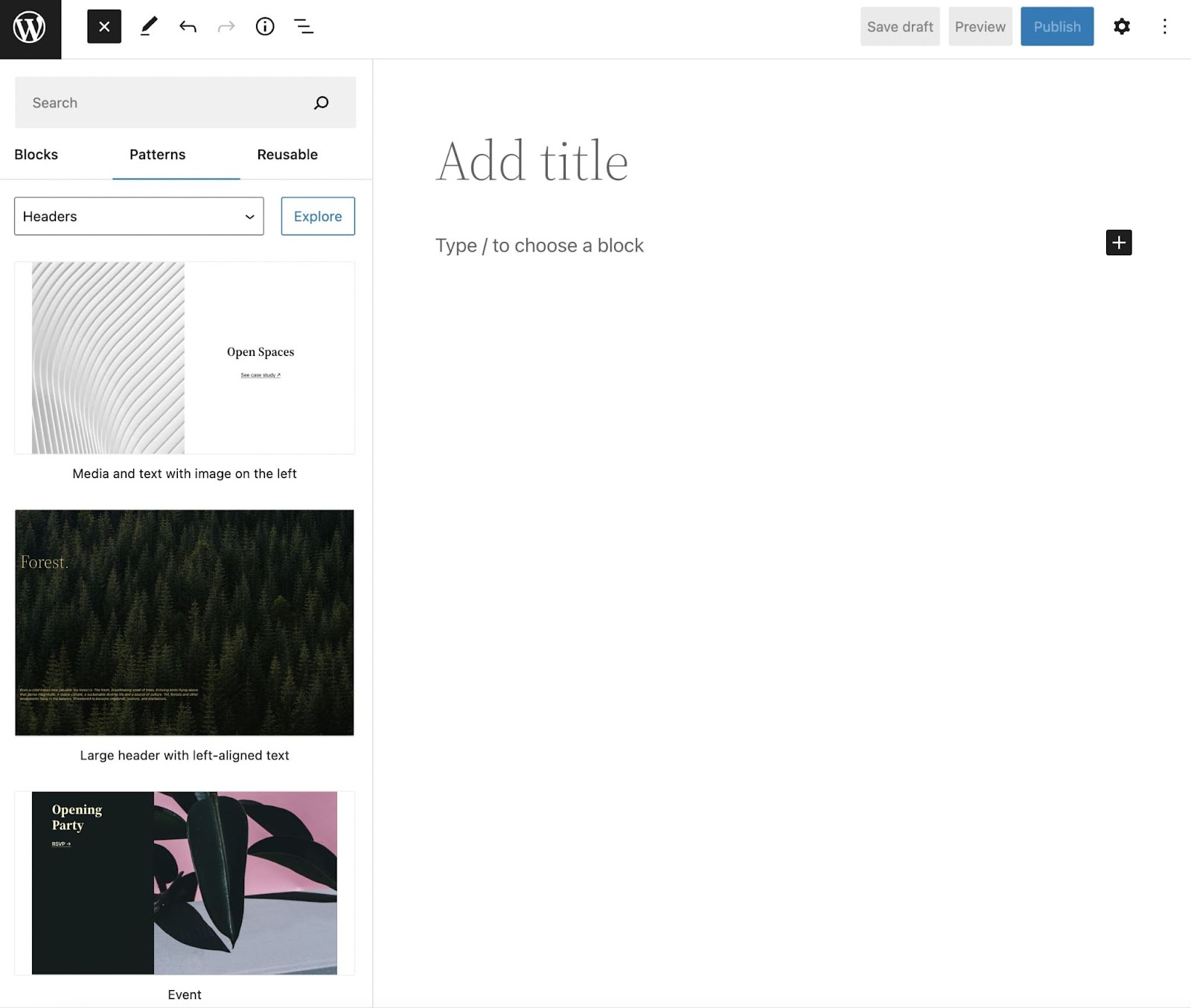
Lastly, WordPress provides pre-designed headers in its Block Pattern Library. When designing your homepage, you can easily insert these full-width hero sections. If you decide to create these manually, you’ll have to use HTML containers instead:
Keep in mind, as you’re searching for images, you’ll want to remember your website’s branding. Even if you find a high-quality photo, make sure it’s relevant to your niche.
Additionally, consider whether you want to evoke an emotion, promote a product, or achieve another specific goal. And, of course, if it’s appropriate and your budget allows, you might consider hiring a professional photographer to create images of your products or services.
2. Add Convincing and Informative Text
Many websites don’t just feature an image in the hero section. To generate new leads and conversions, they often add a text overlay. By including product promotions and calls to action, a hero can achieve the same goals as a landing page.
Although your hero text should vary depending on your objectives, here are some things to consider when writing your copy:
- Keep it short: In a hero section, you won’t want to overload readers with information.
- Use readable fonts: Although you may want to use a distinctive typeface, make sure it is easy to read.
- Consider your target audience: It’s best to evaluate what new visitors will be looking for on your website.
- Don’t use too many buzzwords: If you include advertising cliches like ‘act fast’, it may decrease your trustworthiness and make visitors leave.
It’s also a good idea to add a call to action. Paired with CTA buttons and lead generation forms, you can use your hero image to increase conversions.
Get Content Delivered Straight to Your Inbox
Subscribe to our blog and receive great content just like this delivered straight to your inbox.
3. Optimize Your Hero Image
After you download the hero image that you want, it’s a good idea to optimize it for your website. Like every image on your site, you’ll need to compress it. Otherwise, the photo could be too heavy and cause poor loading times.
Generally, your images should be less than 1MB. To make them smaller without losing image quality, you can use an image compression tool like TinyPNG. This will reduce the size of your WebP, PNG, or JPEG file with smart lossy compression:
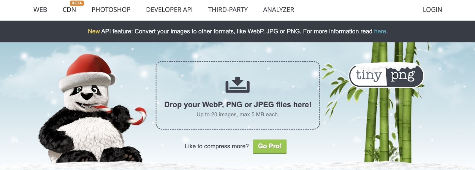
Sizing is another important factor in optimizing a hero image. Typically, it’s best for images to be at least 1,200 pixels and have an aspect ratio of 16:9. Banner hero images should be 1600 x 500 pixels, and you can go up to 1,800 pixels for larger screens.
25 Homepage Hero Examples to Inspire You
If you still need help designing your first hero image, don’t worry. We’ve compiled some of the best website hero images to give you some inspiration!
1. Tesla
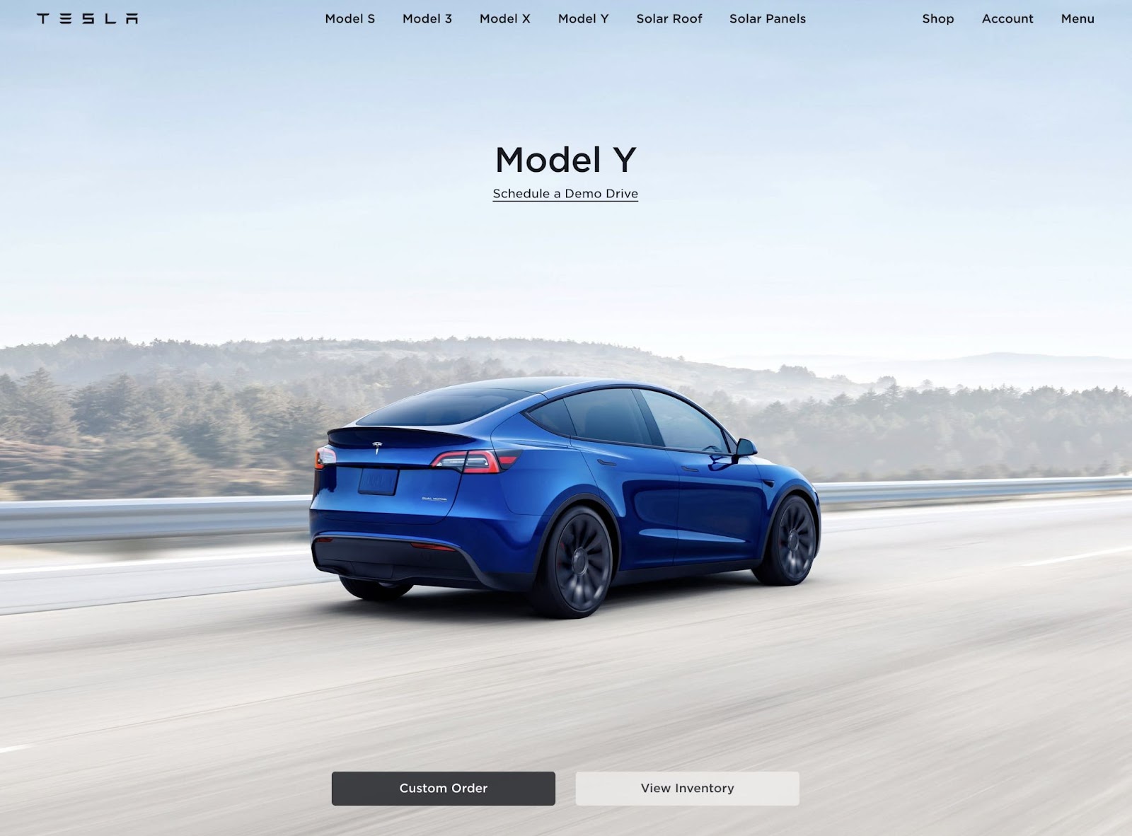
What makes this a good homepage hero?
- Tesla’s homepage features a sleek, professional hero image of its Model Y electric car.
- There are clear CTA buttons that enable visitors to create orders, view inventory, or schedule test drives.
- Since this homepage hero has a minimalist design, it doesn’t overwhelm visitors with unnecessary information.
2. The Better Fish
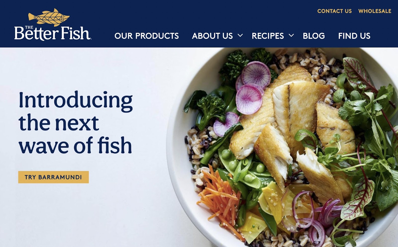
What makes this a good homepage hero?
- The Better Fish’s hero section separates the food image and the main text. This makes it very easy to read.
- The orange button draws attention to the CTA, telling visitors to ‘Try Barramundi’.
- Additionally, the main text is simple but clearly states the company’s branding and what makes it stand out.
3. Koskela
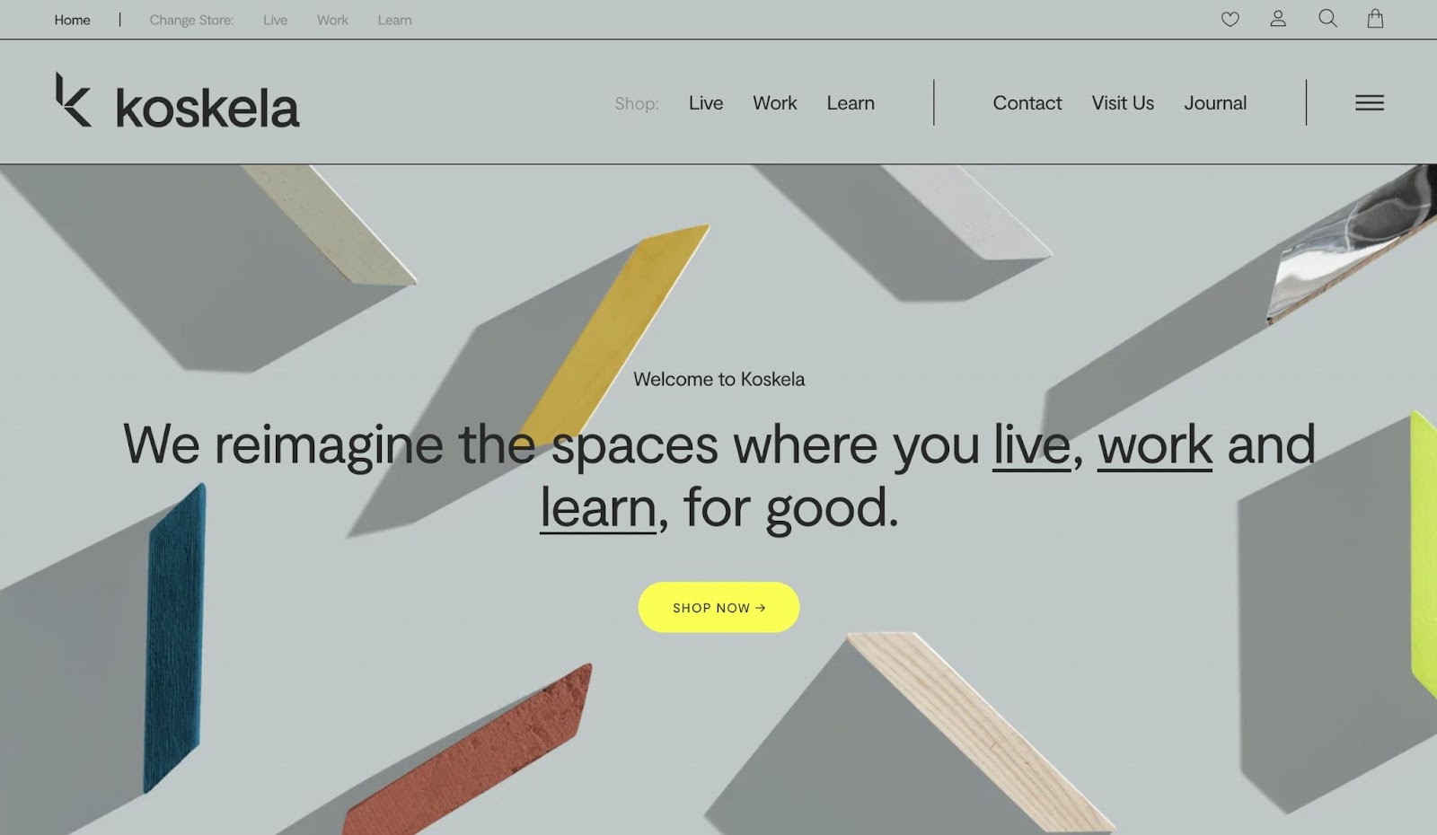
What makes this a good homepage hero?
- Koskela is an innovative furniture business, which is conveyed with a unique graphic of scattered wood pieces.
- The hero section sums up the company’s goals in one sentence.
- Although the color scheme is more muted, the ‘Shop Now’ CTA was designed in bright yellow to draw the eye.
4. The Art Institute of Chicago
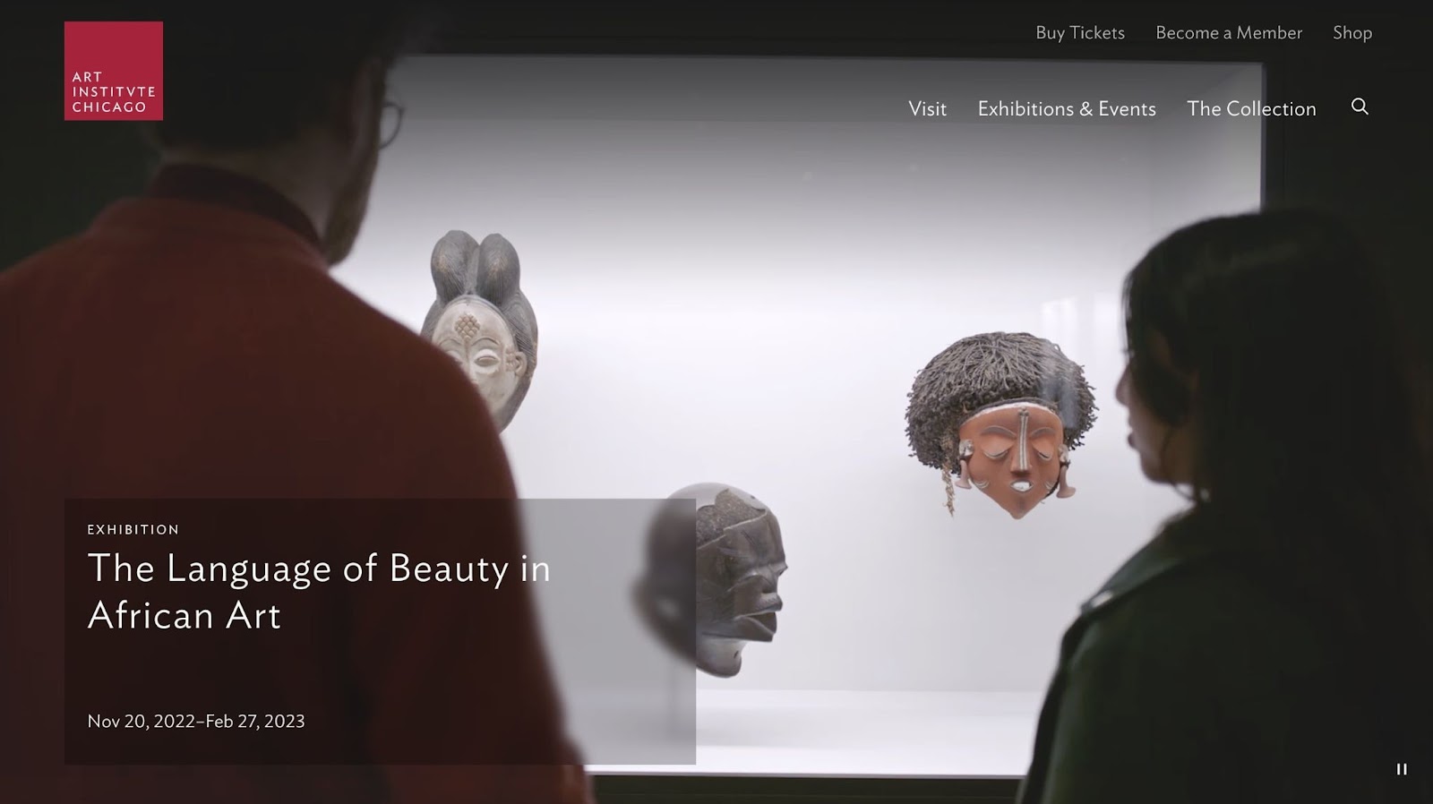
What makes this a good homepage hero?
- Rather than using a static image, this hero features a video that automatically plays when you visit the site.
- The Art Institute of Chicago chose to highlight a specific exhibition, which encourages online users to visit in person.
- When you click on the hero, it redirects to an online post about the art exhibition.
5. Surfrider Foundation
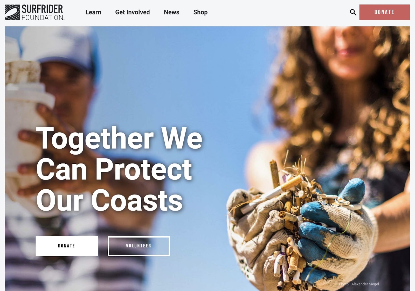
What makes this a good homepage hero?
- Surfrider Foundation appeals to visitors’ emotions, motivating them to participate in protecting the ocean.
- The image of someone cleaning up a beach conveys everything you need to know about this foundation.
- This website makes it easy to get started by donating or volunteering.
6. Daily Harvest
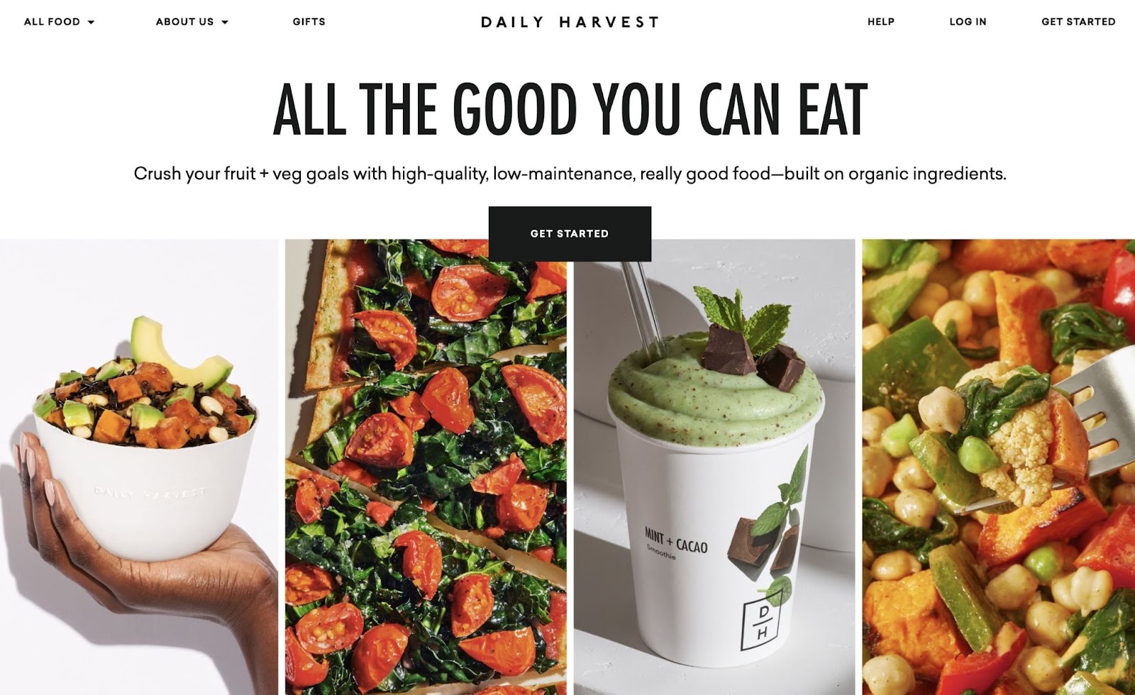
What makes this a good homepage hero?
- Daily Harvest uses multiple cropped images, showing the variety of foods the company offers.
- Readers can quickly understand that the company strives to be organic, high-quality, and low-maintenance.
- The main heading has a simple message and an easy-to-read font.
- Contrasting with the black and white background, Daily Harvest highlights its colorful foods.
7. Versed
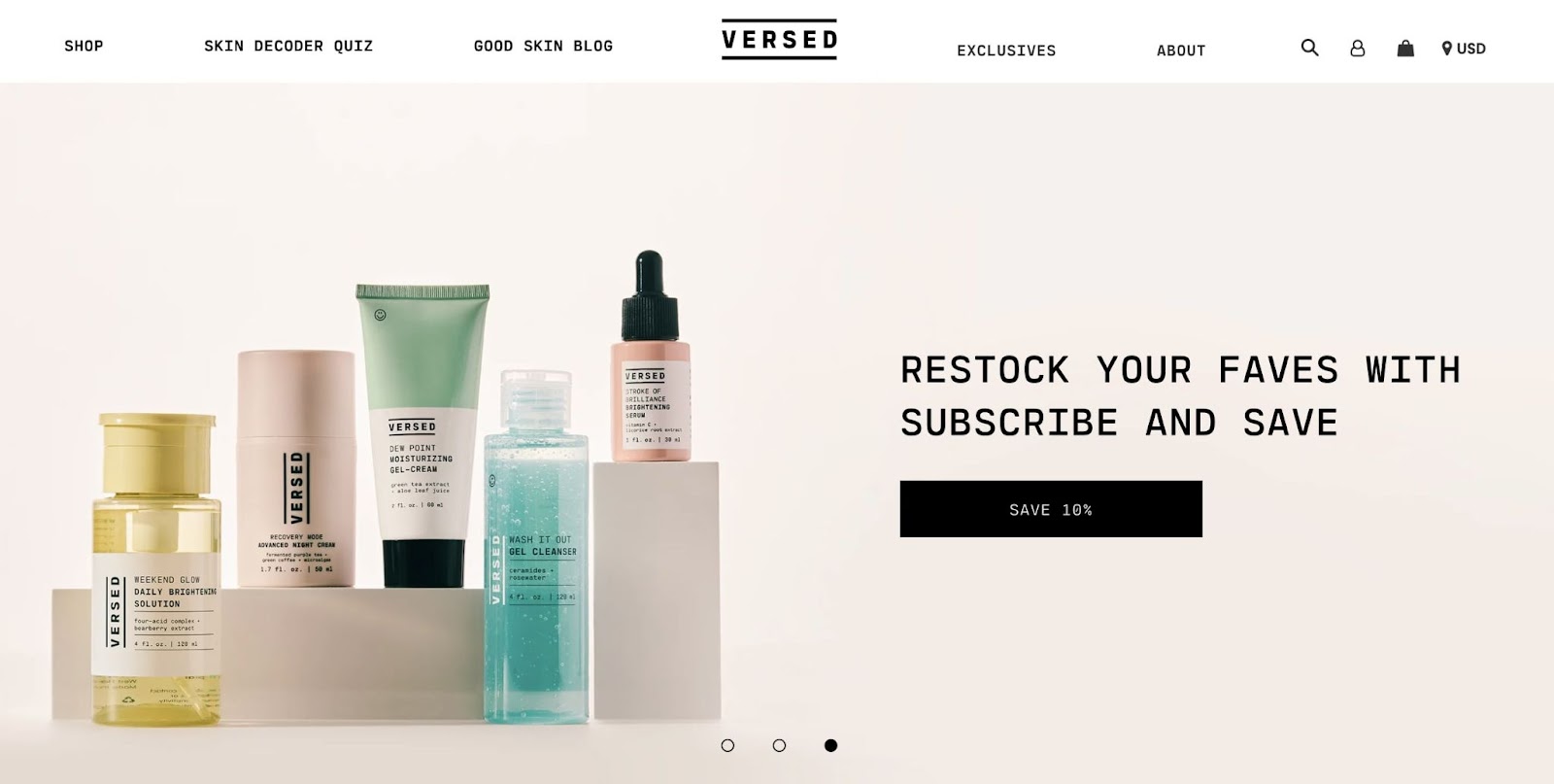
What makes this a good homepage hero?
- Versed promotes its products in an animated content slider. This showcases current discounts, best sellers, and holiday sets.
- The soft, pastel color palette matches the skin care product packaging.
- On each slider hero page, there are short calls to action for specific offers.
8. Dreaming with Jeff
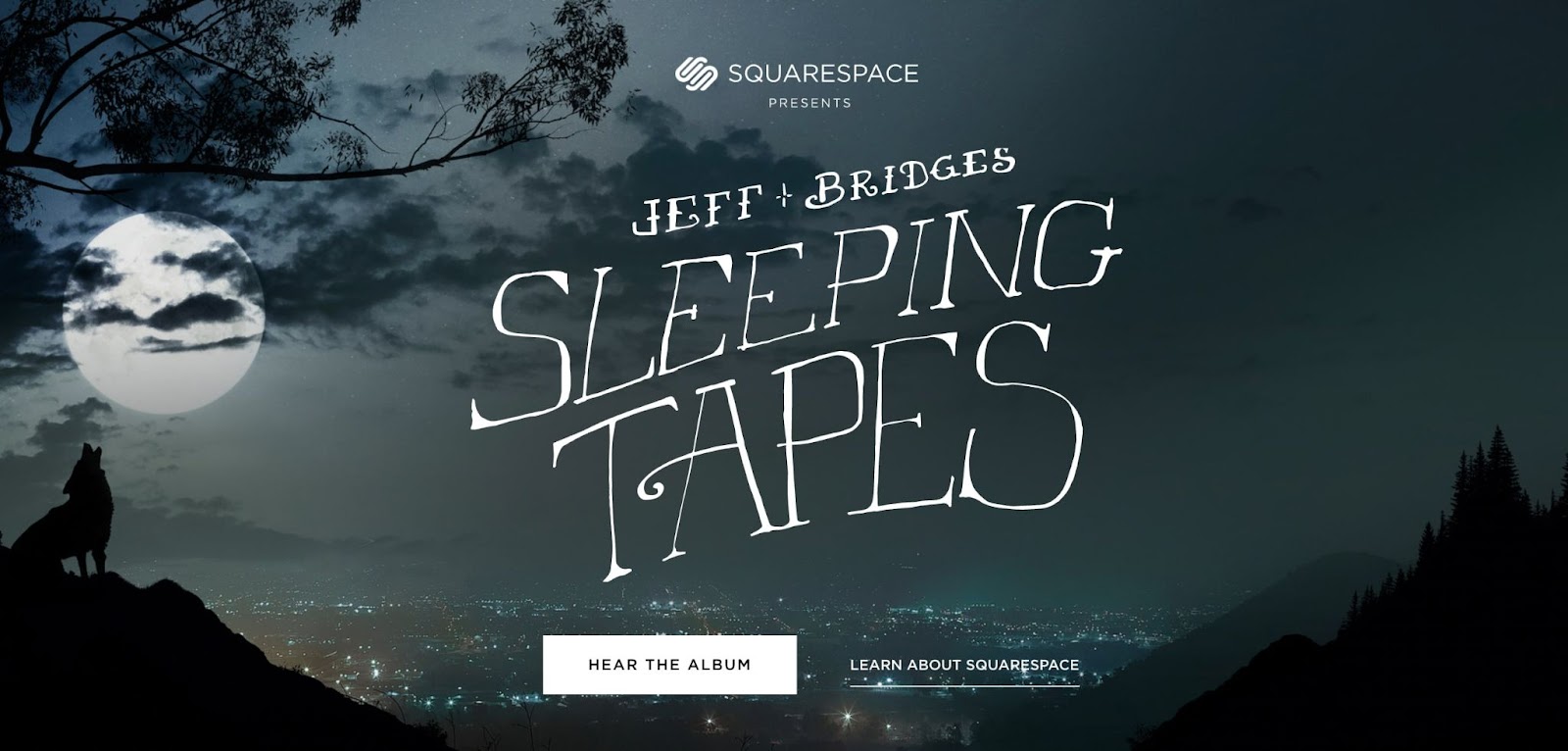
What makes this a good homepage hero?
- Since this website promotes sleeping tapes, the hero image uses a nighttime city landscape.
- You can start listening to the album directly from the hero section.
- The thin, sloping font adds to the slightly creepy and dark atmosphere of the entire website.
9. Ditto
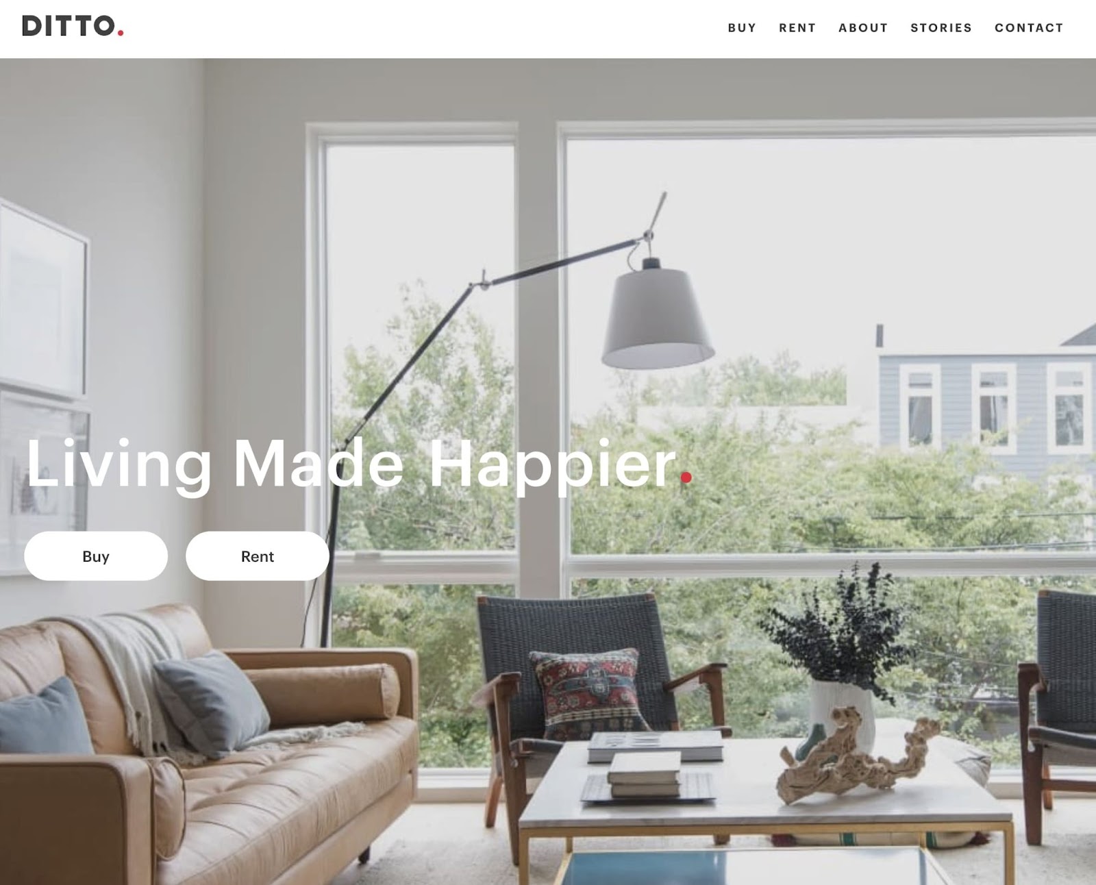
What makes this a good homepage hero?
- Ditto’s hero image features a bright and well-designed living room. This properly advertises its real estate development services.
- There is an animated slogan that automatically changes from ‘Living Made Better’ to ‘Living Made Happier’ and ‘Healthier’.
- Visitors can immediately start browsing homes for rent and for sale.
10. Kindeo
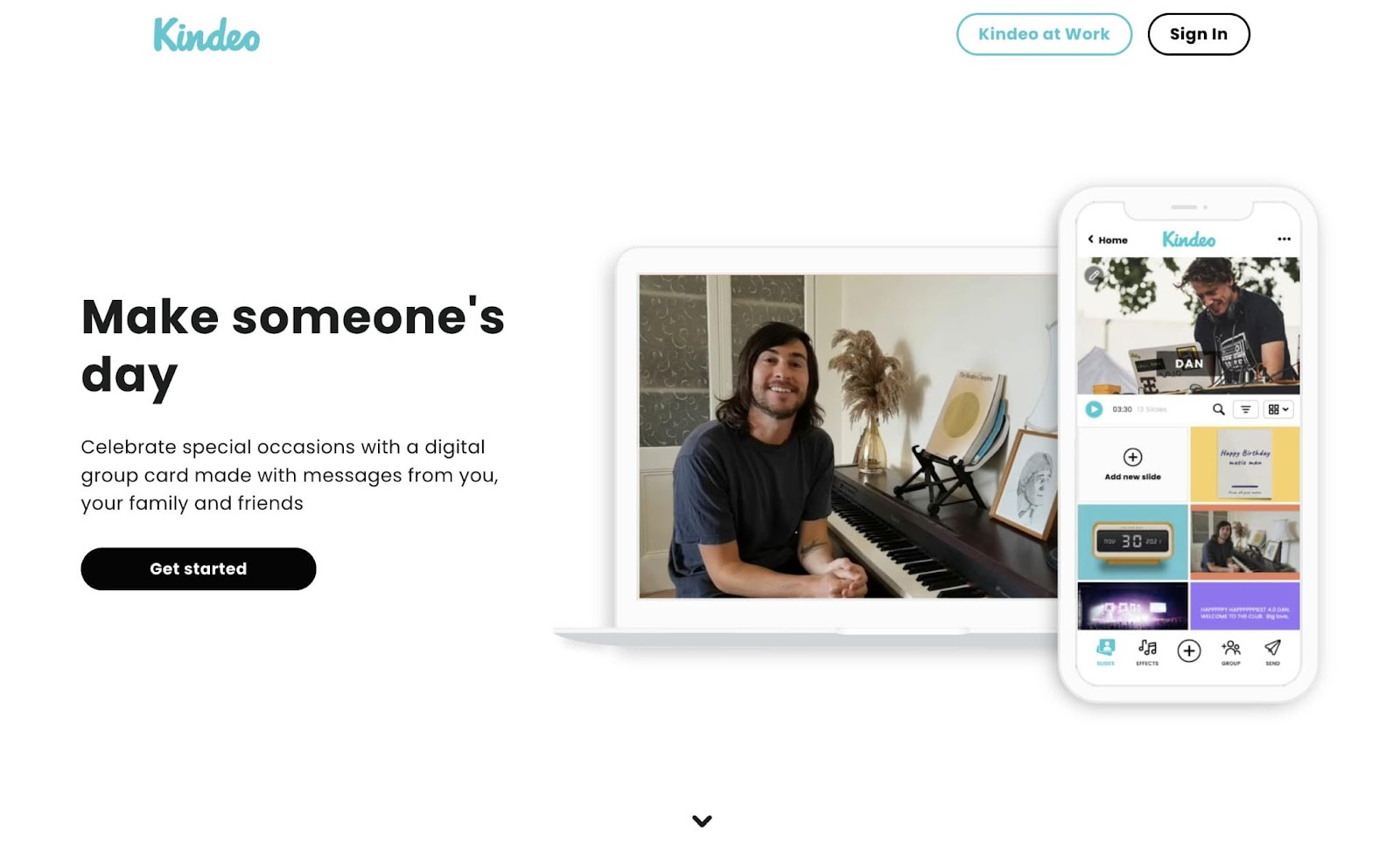
What makes this a good homepage hero?
- Kindeo uses short clips to showcase its digital group cards in action.
- On this hero page, users can also see the app’s interface and how easy it is to use.
- There is a good amount of white space separating the hero image from the below-the-fold content.
11. Pastini
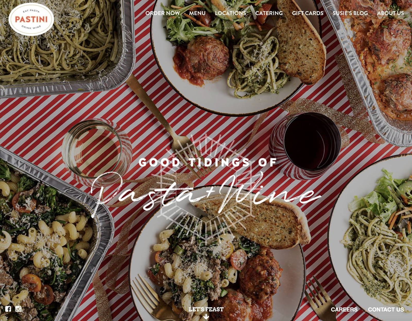
What makes this a good homepage hero?
- Pastini chose to display multiple pasta dishes to advertise its catering services.
- The heading ‘Good tidings of pasta and wine’ welcomes visitors and adds personality to the website.
- There is a CTA that encourages users to keep scrolling below the hero image.
12. Sunshine Caramel Company
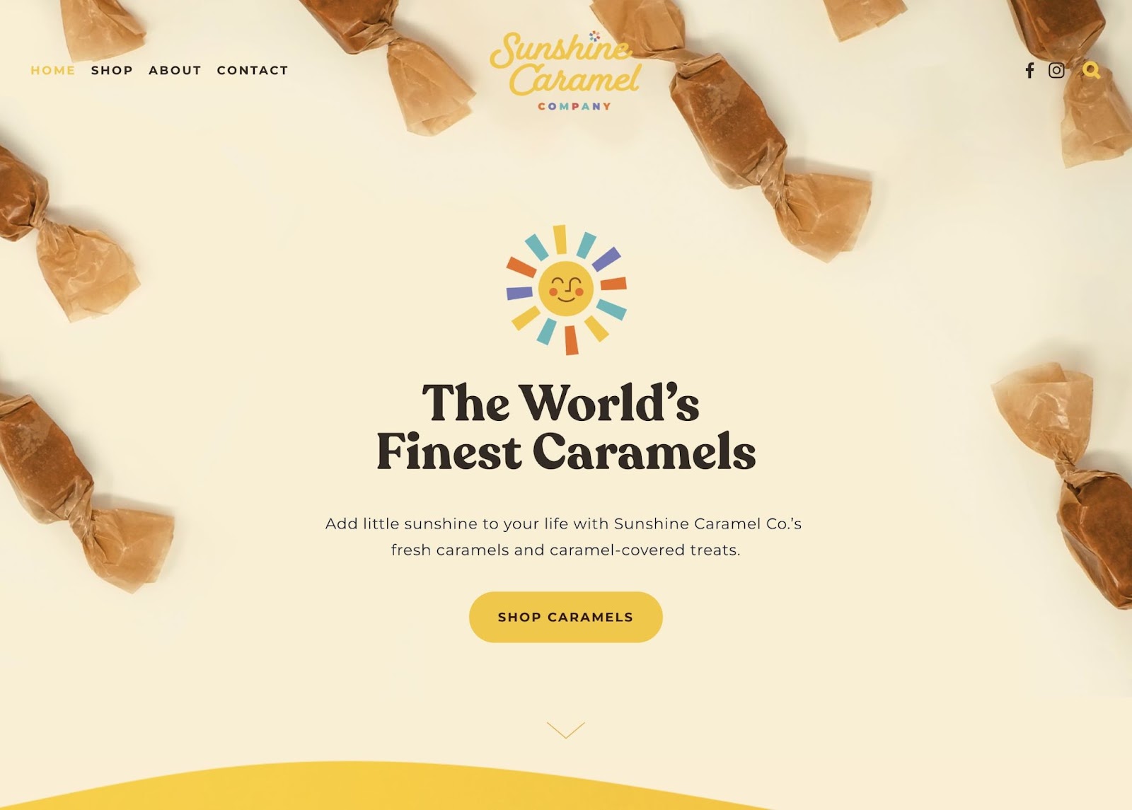
What makes this a good homepage hero?
- Sunshine Caramel Company’s hero section has an animated sun that reflects the branding and company name.
- There are close-up images of the caramels, which show visitors the product quality.
- The CTA button was designed with a bright yellow background, aligning with the business’s personality and drawing the eye.
13. The Vault
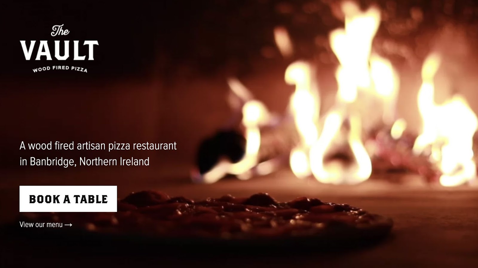
What makes this a good homepage hero?
- The copy is simple and clear, describing what the restaurant makes and where it is located.
- To differentiate the business from competitors, the hero image shows a pizza being wood-fired.
- The Vault makes it easy to immediately view the menu or book a reservation.
14. RoverPass
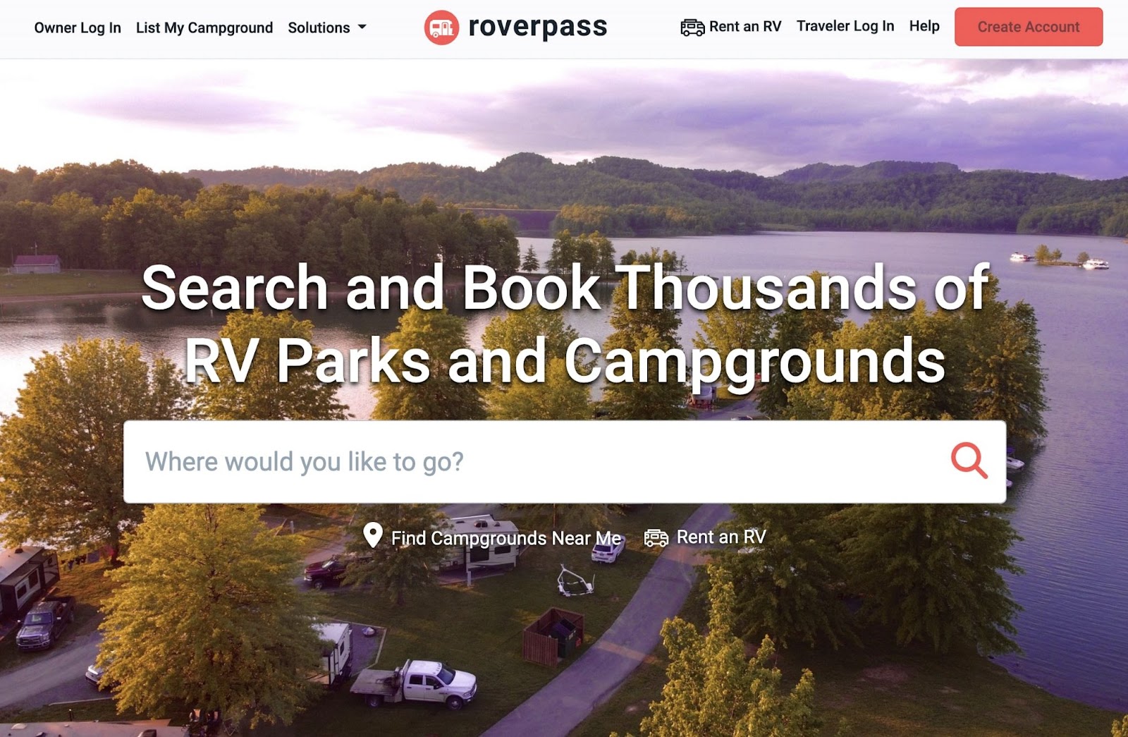
What makes this a good homepage hero?
- Unlike other heroes, RoverPass enables users to look for RV parks and campgrounds using a search bar.
- The image of a picturesque campground makes visitors want to start traveling.
- RoverPass also includes a way to find nearby campgrounds and RVs directly from the homepage.
15. Rare Device
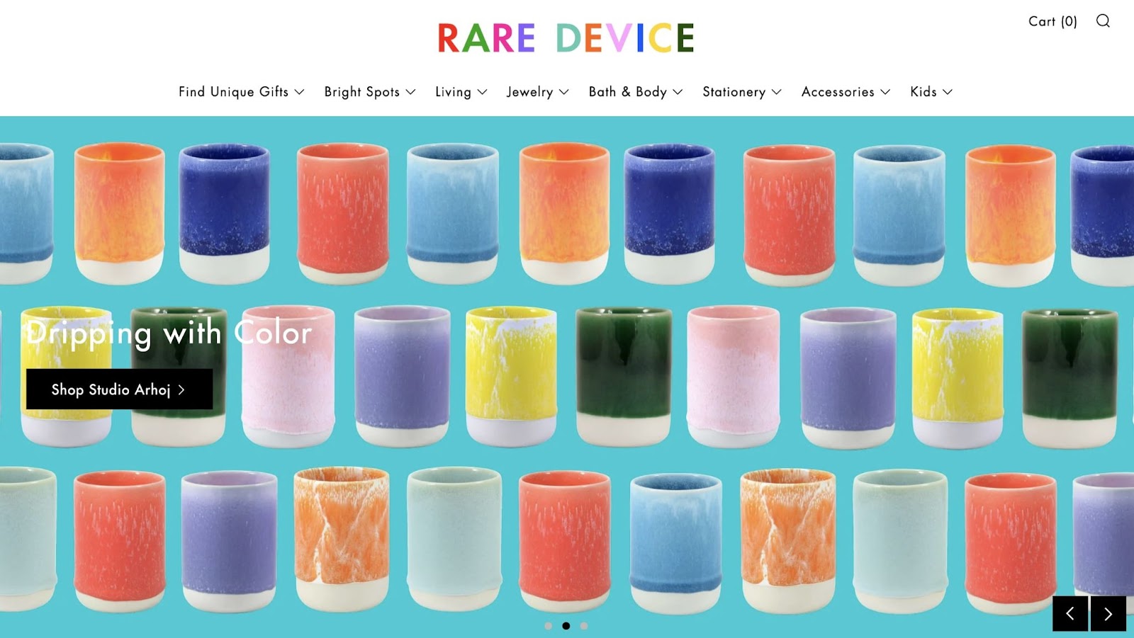
What makes this a good homepage hero?
- This homepage hero features an image slider, displaying a variety of Rare Device products.
- Like the rest of the website, the hero image is filled with bright colors.
- Each slider page has CTA buttons for unique product collections.
16. Nomz
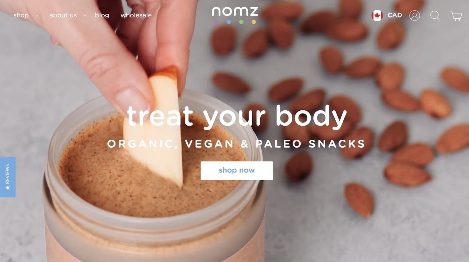
What makes this a good homepage hero?
- Nomz’s website has a hero video that shows its organic snacks being eaten. This makes them more appealing to new visitors.
- There is a tab on the side of the hero where users can find product reviews.
- The CTA clearly directs users to start shopping.
17. Detour Coffee
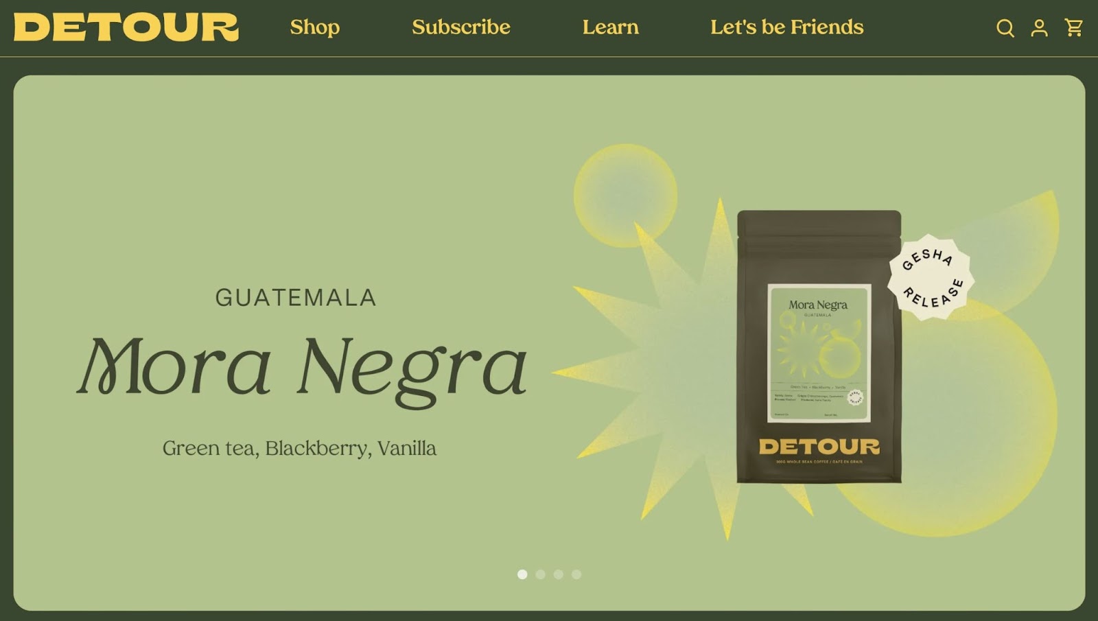
What makes this a good homepage hero?
- Like many of the options on this list, Detour Coffee includes an auto-play content slider to advertise multiple products.
- Each slide links to product pages for different coffee flavors and monthly subscription boxes.
- The background colors of the hero seamlessly integrate with the site’s color scheme.
18. Allbirds
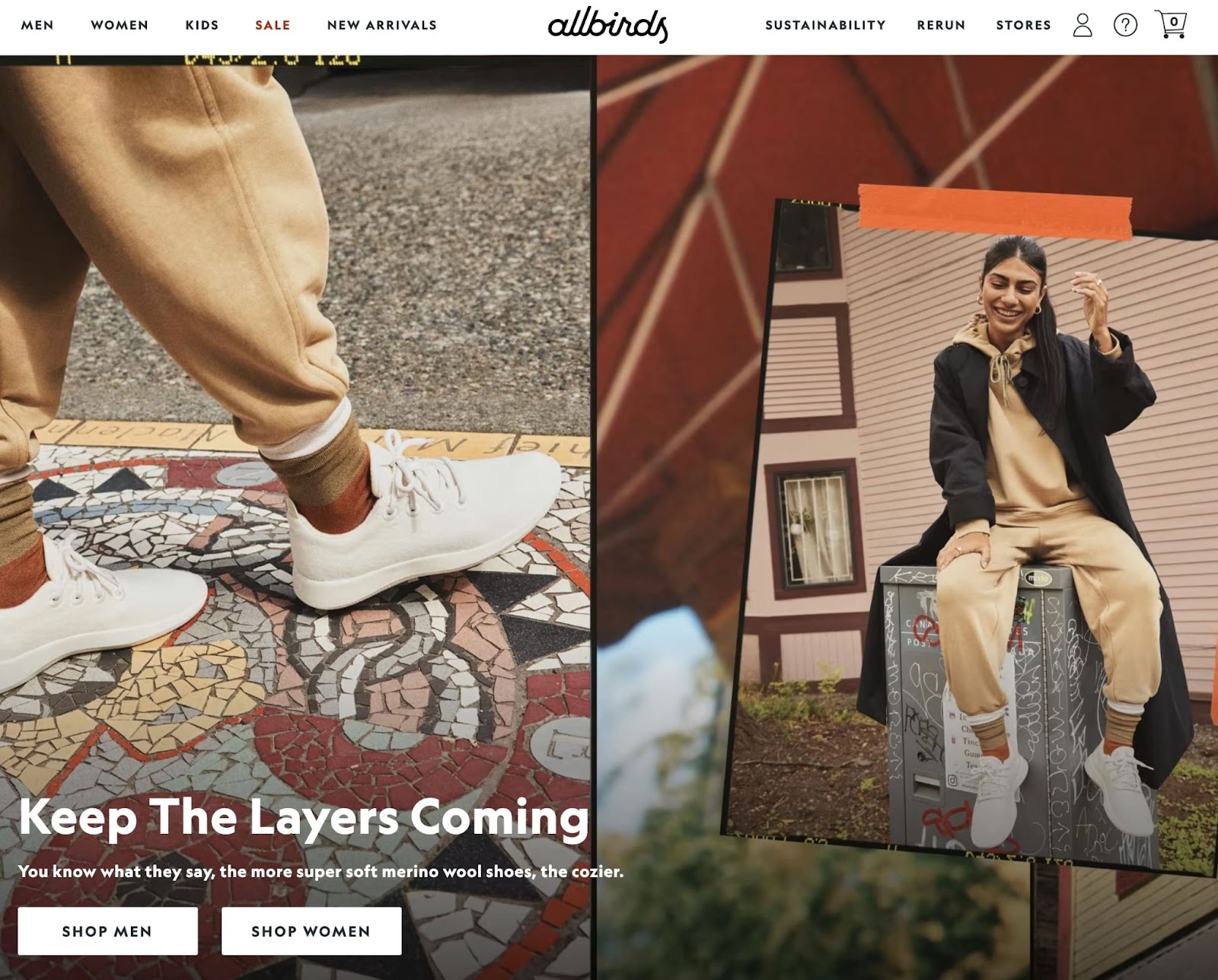
What makes this a good homepage hero?
- Allbirds uses multiple images to make the hero seem like a collage.
- There is a simple and clear call to action that reflects the current season.
- Visitors can quickly access the shop pages for both men’s and women’s shoes.
19. Lunarbot Studio
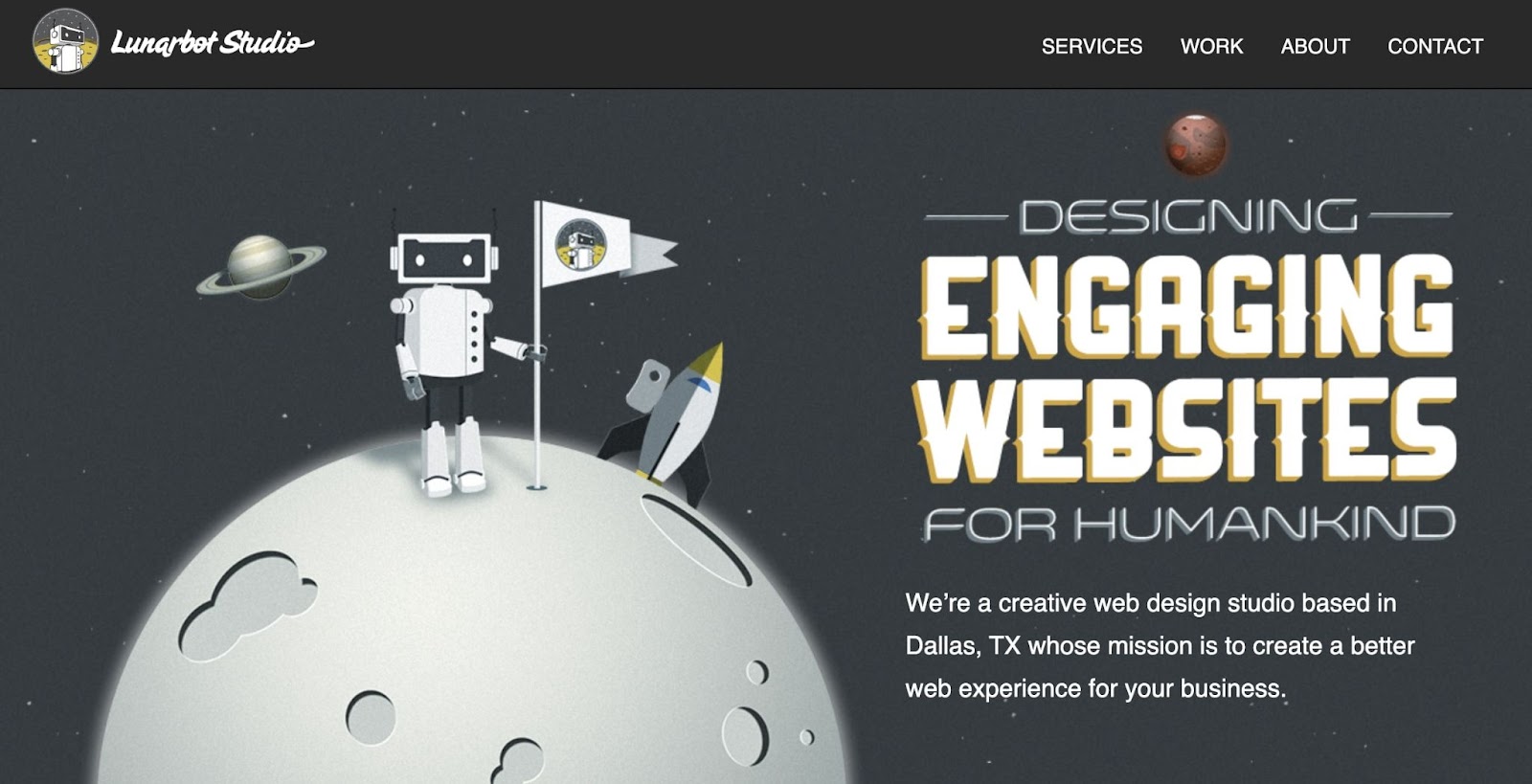
What makes this a good homepage hero?
- To highlight its web design services, Lunarbot Studio created an engaging graphic as its hero.
- The main font is futuristic, which aligns well with the company’s purpose.
- You also get a small summary of the business, what it does, and where it’s located.
20. Heco
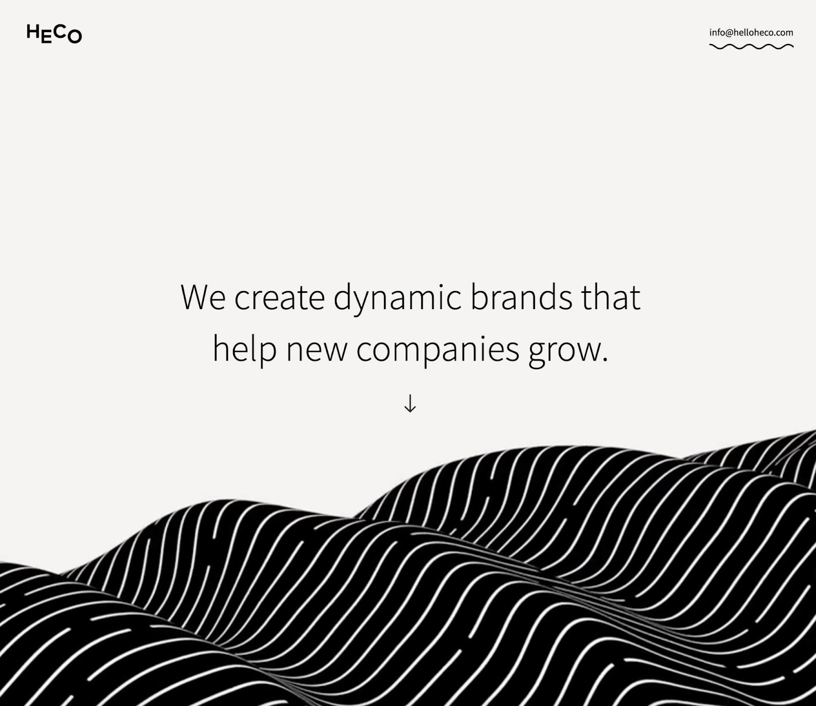
What makes this a good homepage hero?
- Heco’s hero features a rolling animation that immediately draws attention when you open the website.
- It uses plenty of white space to emphasize the hero’s main text.
- The downward arrow encourages visitors to keep scrolling through the homepage.
21. Charbonnel Towns
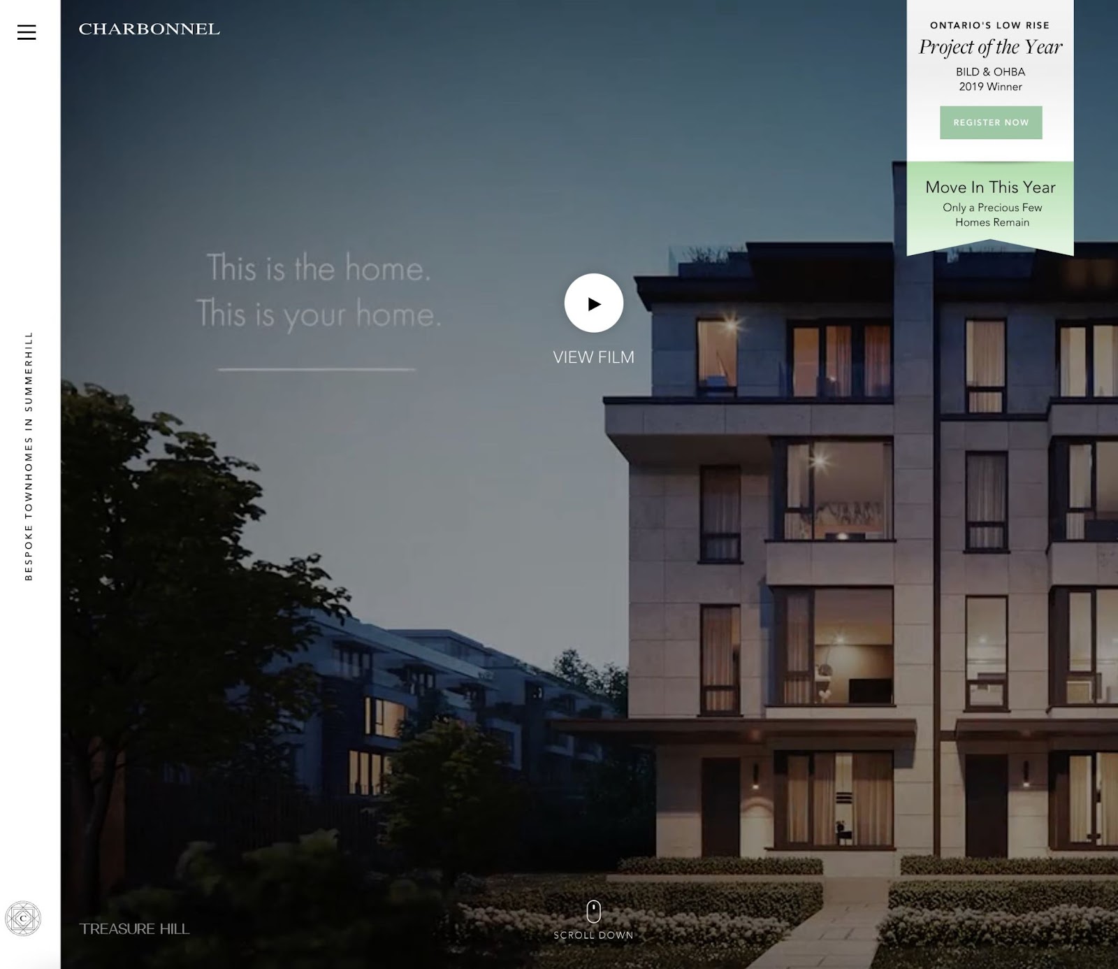
What makes this a good homepage hero?
- New visitors can watch a video that artistically displays Charbonnel’s modern townhomes.
- The company emphasizes that there are only a few homes left, so visitors should register as soon as possible.
- With a vertical white sidebar, the hero reflects the classy and modern feel of the business.
22. Campos Coffee
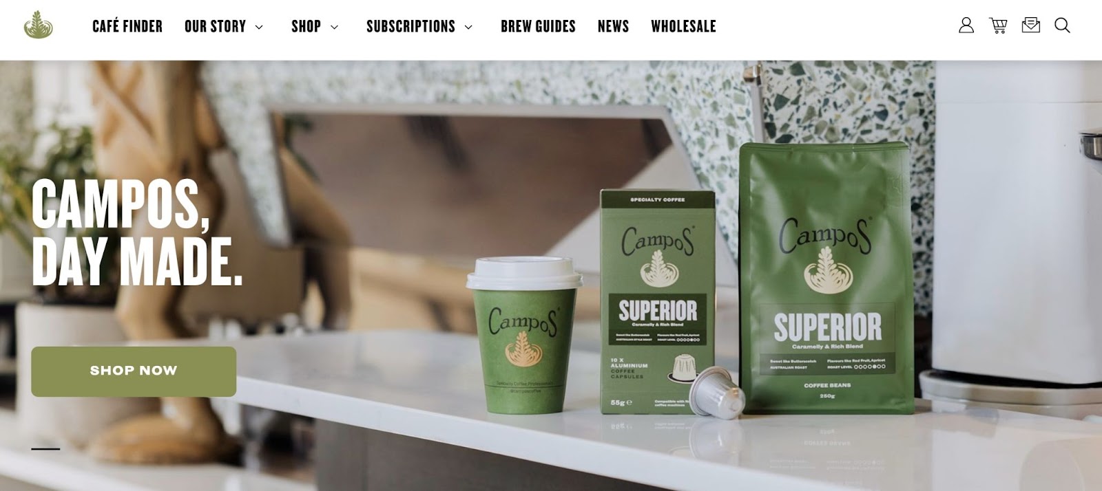
What makes this a good homepage hero?
- The slogan ‘Day made’ is a simple way to tell visitors about its high-quality coffee.
- Campos Coffee shows potential customers exactly what they can purchase from its online store.
- The same shade of green is used for the product packaging, business logo, and CTA buttons.
23. Rowing Dock

What makes this a good homepage hero?
- In a few words, the business explains where Rowing Dock is located and what it offers.
- This hero has a video showing a variety of people using the kayak rental service.
- By including couples, families, and pets in the video, Rowing Dock shows visitors that it provides experiences for everyone.
24. Moss Botanicals
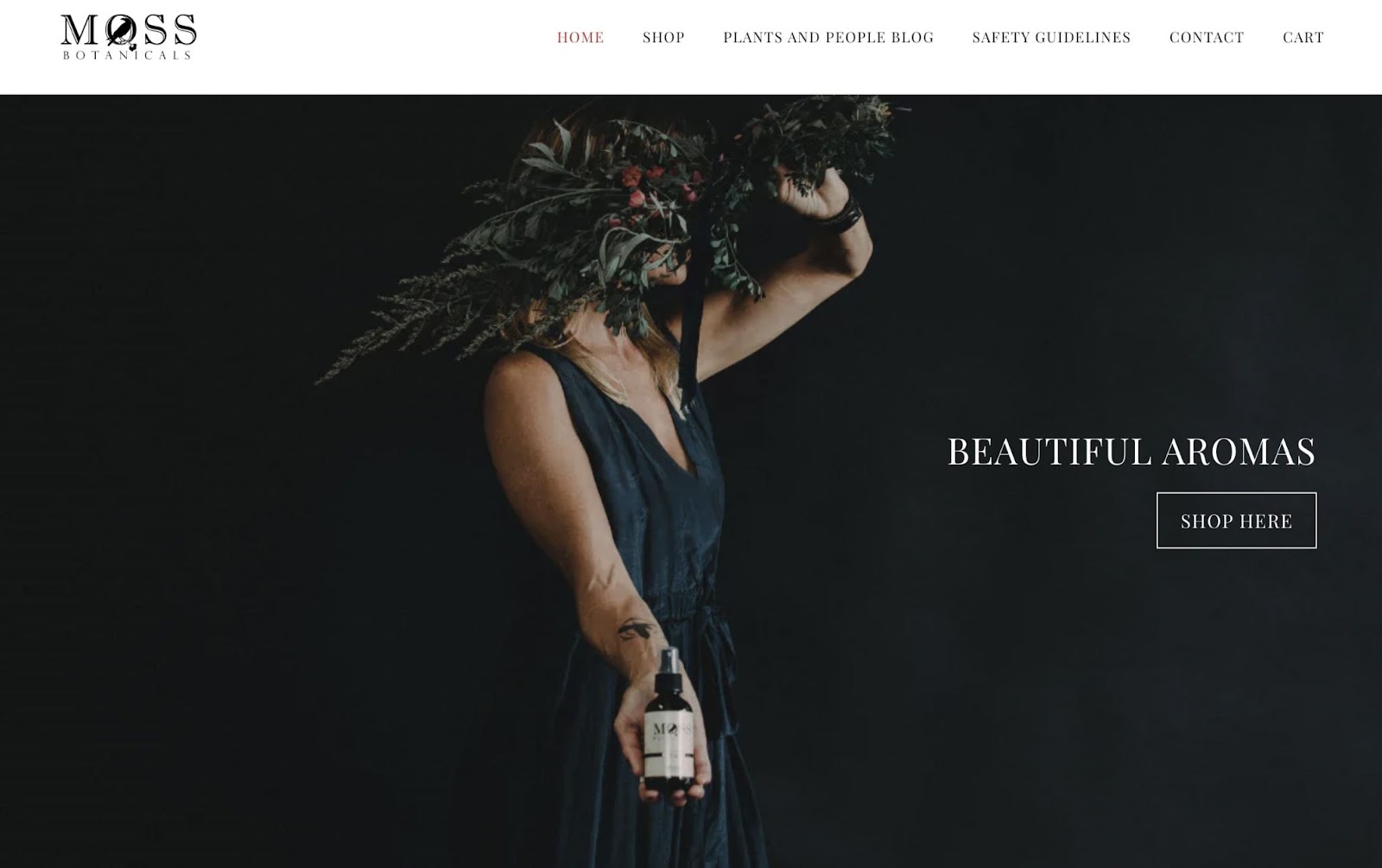
What makes this a good homepage hero?
- With floral imagery, this hero beautifully captures the essence of Moss Botanicals perfume.
- Even though there isn’t much text, visitors quickly understand what the business is selling.
- The dark hero background contrasts well with the white text and action button.
25. Seastreak
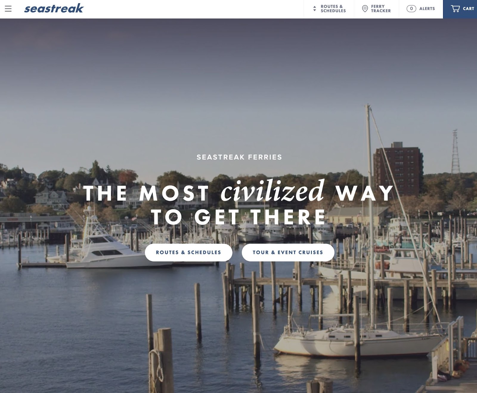
What makes this a good homepage hero?
- Seastreak’s hero perfectly appeals to its target audience, which is anyone looking for a high-end ferry ride.
- The slogan ‘The most civilized way to get there’ evokes a sense of luxury.
- Plus, the hero automatically plays videos that show some of Seastreak’s boats and visited sights.
Design Engaging Above the Fold Visuals
Your homepage’s design can make or break your website. By adding a well-designed hero image, you can immediately grab your visitors’ attention and keep them on your site. This can ultimately increase conversions and reduce your bounce rate.
To review, here are some ways to design an attention-grabbing homepage hero:
- Find high-quality images.
- Add convincing and informative text.
- Compress your hero images with TinyPNG.
Since a poor web design can lead to a bad impression, you may want to leave it to the professionals. Using DreamHost’s custom web design services, you can receive a 100% unique website with an eye-catching hero image!
DreamHost Makes Web Design Easy
Our designers can create a gorgeous website from SCRATCH to perfectly match your brand and vision — all coded with WordPress so you can manage your content going forward.
The post How to Design an Attention-Grabbing Homepage Hero (+25 Examples) appeared first on Website Guides, Tips & Knowledge.
source https://www.dreamhost.com/blog/homepage-hero-design/
No comments:
Post a Comment