Many of the changes we make to our websites come down to intuition. We use designs we think users will love and write content that we believe will resonate with them — And while experience and intuition can go a long way toward helping you create a popular website, they’re poor replacements for real-world data.
The good news is that A/B testing can help you check different versions of a web page against each other in front of your target audience. You can use this information to better understand what your users like and make changes that will wow your visitors.
In this article, we’ll discuss how A/B testing works and what the experts have to say about it. We’ll also walk you through seven landing page A/B testing best practices to help you master your experiments. Without further ado:
An Introduction to A/B Testing (And How It Works)
Conversion Rate Optimization (CRO) is a broad term that describes the practice of making iterative changes to your website to improve the frequency with which website visitors are interacting (clicking, converting) with your website. A/B testing is conducted by serving two concurrent experiences to different user groups, often with just one change to a given page or section (such as the color, size, or position of a call-to-action [CTA] button).
Conversion Rate Optimization (CRO)
Conversion Rate Optimization (CRO) refers to the practice of making iterative adjustments with a goal of improving the number of conversions earned from web pages, email campaigns, and other marketing efforts.
Read MoreIf you get enough traffic and split it equally across the two versions (variant A and variant B), one should yield better results and conversions than the other. This is why A/B testing is also commonly called split testing.
For example, if you’re testing two versions of a CTA, one should get more clicks than its counterpart. Those results tell you what your audience prefers, and you can then update your website and enjoy increased engagement:

Many modern tools enable you to handle all the technical aspects of A/B testing without too much trouble. In most cases, you can simply pick an element, use a page builder to create an alternate version, and then start the test almost immediately.
It’s important to note that, as with any type of experiment, the results will depend on whether you’re asking the right “questions” as well as your sample size. These are two aspects of A/B testing we’ll explore throughout the rest of this article.
What Elements Can You A/B Test?
First, you’ll want to come up with a game plan. “You can test almost anything on your site, from the length of your landing page to the color of your Buy Now button, but you want to prioritize those items that you think will make the biggest difference to your results,” Gallinger says. “A beginner should often start with one of the big four.”
Copy Length
The length of a website’s text can often dramatically impact a page’s conversion rate. Still, it’s hard to know in advance if you need more or less copy to explain your idea until you show it to actual potential customers using an A/B test:
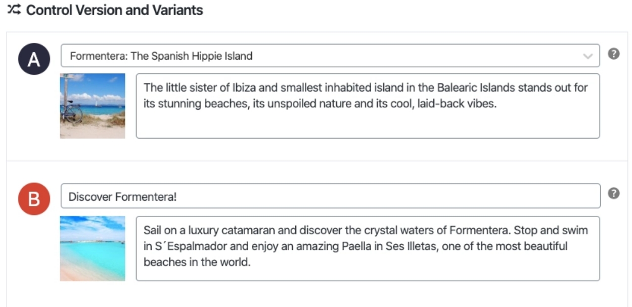
We recommend against using A/B testing for blog content and articles because too many factors can affect conversion rates.
For example, a 3,000-word article might perform better than a “condensed” 1,500-word version. However, hundreds of factors can impact user engagement if you double the content on a web page. That means test results won’t return valuable information.
Instead, we recommend focusing on testing short text elements, such as lists and introductions. They are more likely to significantly impact how users react to the content, and they’re much easier to A/B test.
Get Content Delivered Straight to Your Inbox
Subscribe to our blog and receive great content just like this delivered straight to your inbox.
Headline
The headline is usually the first thing that people see, so it is critically important to use it effectively to grab their attention. Some sites will use A/B testing on ten headlines or more before settling on a final option.
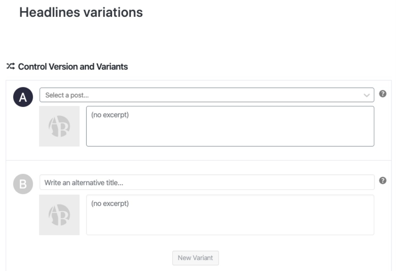
Headlines can drastically affect click-through rates on blog pages and search engine results. In our experience, merely tweaking a headline can get some pages a lot more attention.
Ideally, you won’t have to test every headline you create. Instead, we recommend focusing on pages and posts that aren’t getting enough attention (and you think their content deserves it). Try to emulate the type of title you or your competitors use in other successful pages and see if that impacts how users react to the content.
Call to Action (CTA)
This tiny bit of text can often make a big difference. For example, a button that says “Buy Now” instead of “Buy” may create a sense of urgency that encourages people to click it or generate a sense of false urgency that makes people avoid it.
CTAs are some of the simplest elements of an A/B test when analyzing results. A “better” CTA will produce more conversions. Then, you can use that information to learn what types of prompts resonate better with your audience.
Moreover, CTAs tend to be short. That means there are fewer potential variations to test, making setting up tests easier than with regular copy, headlines, or images.
Images
Images convey important emotions, but it’s not always easy to know in advance which images work and which ones will fall flat with your audience. Much like headlines, you can test a wide variety of them before choosing the best one:
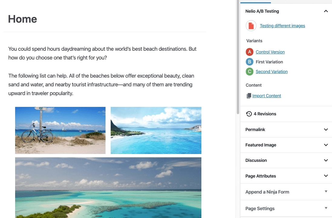
As a rule of thumb, images should always be high-quality and related to the topic at hand. Moreover, you shouldn’t look to replace pictures randomly. Instead, pay attention to drop-off metrics and see which web pages are “losing” the most users.
That metric will point you toward pages that need to be redesigned or overhauled in some way. From that point, you can analyze existing images and consider if they may affect the user experience negatively.
How to Improve Your Landing Page A/B Tests (7 Tips)
These A/B testing best practices will help you set up more accurate experiments for any page within your website. However, a landing page is typically the perfect A/B test environment since it’s self-contained.
1. Develop a Hypothesis
Practically anything can be A/B tested, and the results can be used in various ways to improve your website.
“In broad terms, you can test the design, copy, or offer,” says Sid Bharath, a SAAS marketing consultant. “Design means the colors, layout, fonts, and visuals. Copy is the content on the page, like headers or product descriptions. Finally, the offer is what exactly you’re asking people to do, like signing up for an e-course or buying a product.”
However, just because you can use A/B testing to measure almost anything doesn’t mean it should be used for everything. It’s crucial to have a strategy to employ it in ways to truly make the most of it.
“There was a popular saying when testing became popular in the early aughts to ‘always be testing,’” Shukairy says. “What people assumed was ‘test a color and call to action on your site, and you will see massive improvements in conversions.’ This is not true at all.”
There is an art and science to testing, requiring regular statistical analysis of your site to spot potential problem areas and investigate the why. That means running qualitative polling, surveys, and usability tests to understand better what customers are struggling with.
“Only after you’ve compiled issues can you start prioritizing them and deciding what solutions could be tested to improve upon the issues uncovered,” Shukairy says. “A hypothesis is necessary for the test because ultimately it is statistics that makes A/B testing viable.”
Running an A/B test takes time since you need to compile enough data to get statistically accurate results. That means it’s in your best interest to ensure you’re testing the correct elements.
For that to happen, you need to have a data-based hypothesis. For example, if your homepage has a high bounce rate, some valid hypotheses to explain it would include the following:
- The page takes too long to load
- Users are discouraged by the content they see above the fold
- The page doesn’t offer a good experience on mobile devices
All of those are valid reasons and would be worth testing. However, you can narrow down the potential cause even further by conducting internal usability tests and asking other people for their feedback on your website. That extra effort will help you zero in on the exact elements you should be A/B testing.
2. Analyze User Drop-Off Points
Instead of deciding which pages on your site to A/B test randomly, we recommend focusing on the most prominent “drop-off” points. That is to say, the pages that are losing you the most users.
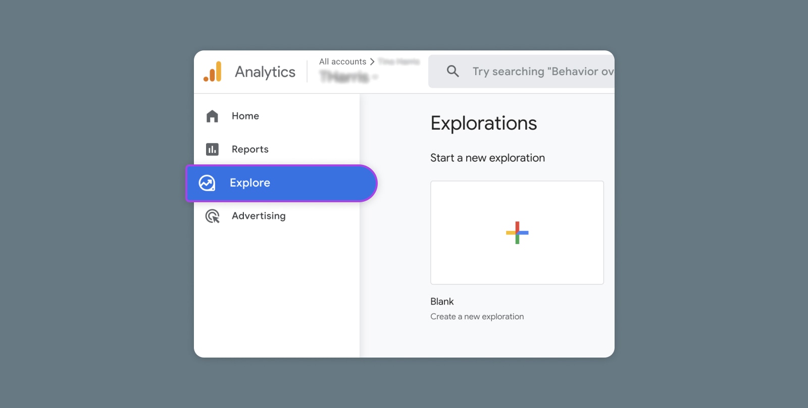
“By using Google Analytics, you should be able to highlight where the biggest drop-off points are. I would suggest starting your split testing there,” advises Andrew Wheller, digital marketing & SEO executive at Pierre Cardin Stationery. “Reviewing your top exit pages is a nice starting point for highlighting your page, which can have the potential for the biggest uplift.”
If you’re unclear about how to find your drop-off points, Bharath recommends starting with your existing data. For example, on an e-commerce website, the traffic flow might look like this: Home Page → Product Page → Cart → Checkout.
“At each step, you’ll notice people dropping out and leaving the site,” he says. “Find where the largest drop-off is and run a test on that step to reduce it. Prioritize tests based on where the largest improvement can come from.”
Focusing on drop-off pages is wise if your website has a large library of content you want to test. Finding the problems with these pages will yield the best short-term results if you develop rational hypotheses to test.
3. Give the Test Enough Time to Run
There’s no magic time frame when it comes to testing. “The time to declare what we call ‘statistical significance’ for an A/B test depends on the traffic flowing through your site,” says Blake Puryear, product lead at Engine Insights.
“If you’re getting a trickle of traffic, let that A/B test run for a while. You need about a week’s worth of traffic through both sides of your test before you can start to infer anything,” Puryear adds.
“Even if a test is killing it after an afternoon, that might be an anomaly of traffic. It’s easy to try and make gut decisions or favor a variant because you like it better. This is where it’s really important to step back and let the data speak.”
This is where the test “statistical significance” comes in. If you design an A/B test and, after 50 visits, one variant is clearly winning, that doesn’t prove anything. Fifty users is not a large enough data sample to make a decision grounded in data. If you let that test run longer, the trend might reverse completely.
The takeaway is to give your tests all the time they need until the results are unimpeachable. This process can be frustrating since it takes longer to implement changes. However, it’s the only way to ensure your tests aren’t returning inaccurate data.
For number nerds, there are tools that can help you determine your testing time. “An A/B test is complete when there is a statistically significant difference between the A and B versions of your landing page,” Gallinger says. “Most A/B testing software has a built-in calculator to determine when a statistically significant winner has been reached, so you don’t have to do the math.”
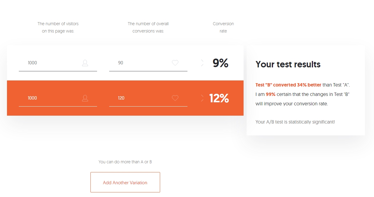
If you want to use a separate calculator, this one from Neil Patel works well and is easy to understand. The tool also lets you add more variants if you feel confident enough to try multi-variant (multivariate) testing.
4. Use the Right A/B Testing Tool
Depending on your skill level, you could set up the test yourself. “A/B testing can seem quite daunting at first, but there is no reason you shouldn’t try it yourself,” Gallinger says. “Before you do, make sure you have a good understanding of the changes you want to test and the tools you are going to use. If you need help setting up an A/B test, contact a web developer to assist with the setup process.”
The next step is to use software to show each version of your site to 50% of the site visitors. “You can use tools like Optimizely, VWO, or Omniconvert to create A/B tests on your site,” Bharath says. “With their point-and-click tools, you can create variations of a page and change elements to test without requiring any coding knowledge.”
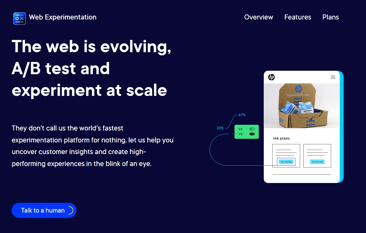
“If a client already has a WordPress plugin, I’ll adapt to their toolset and use that for the duration of the project,” Puryear says. “The tools usually work in tandem with Google Analytics, so you’ll need to lean on that heavily.” For those with more complex needs, Gallinger recommends Kissmetrics, Crazyegg, or Optimizely.
WordPress plugins for A/B testing can also be helpful to beginners. “They give you some bounds to operate in — Think of these plugins as training wheels. One that I’ve seen several clients use is Nelio A/B Testing for WordPress,” Puryear says.

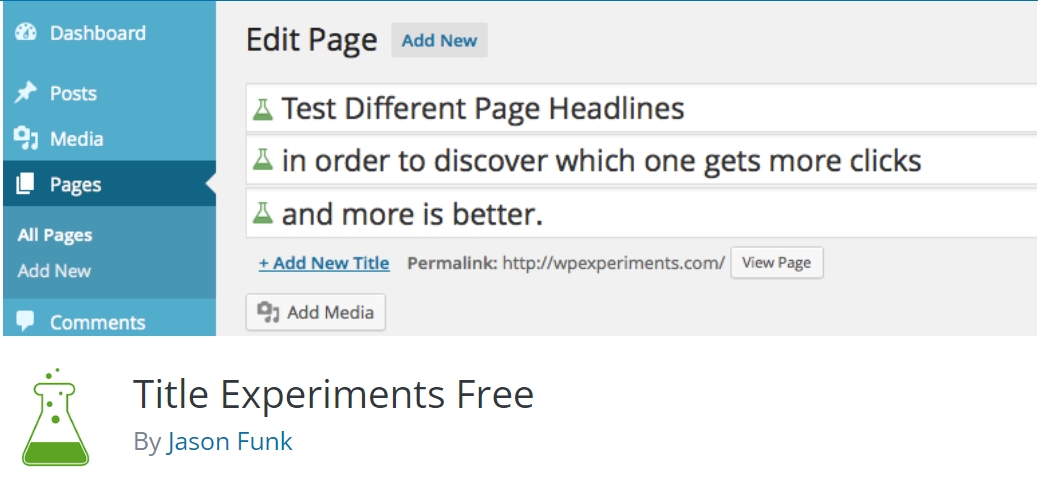
If you use WordPress, we recommend looking at popular A/B testing plugins since they can offer more straightforward implementation than third-party platforms. Puryear recommends Nelio A/B testing, but other tools can help you test more specific elements.
For example, Title Experiments Free can help you A/B test posts and page titles:
“Ultimately, you need an accurate tool that can help you split the traffic to two different designs and give you an output of information to signify the winner and other data points and metrics that may matter to you,” says Shukairy.
5. Learn How to Analyze Results
“A/B testing tools usually always have an analysis or statistics dashboard,” Puryear says. “If your tool doesn’t, you’re using the wrong tool for sure. These dashboards should show you the performance of your A variant versus your B variant. Look at the spread of performance and which variant had the most occurrences of the event you’re testing for. Good tools will provide you with a confidence value based off of the amount of traffic that has run through the test.”
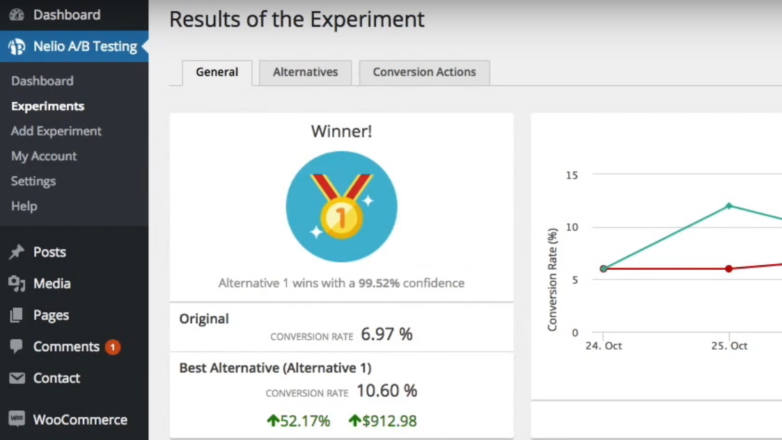
At the end of the experiment, look for a lift or possible decrease in conversion rate for the variant group. “It is important to consider that sometimes after an A/B test, the control group will remain the better option,” Edelstein says. “This is a common mistake as it can be tempting to favor changing the site due to an insignificant conversion increase.” And make sure you have enough data to give you a statistically significant result.
“Analyzing results is an important and often ignored part of testing,” Shukairy says. “First, you have to see whether your hypothesis was validated or not. Then, based on the results, verify if there are any other follow-up tests that can be considered.”
For instance, Shukairy tested removing a video and placing a static image on a client’s subscription site. Once her team validated that the static image increased conversions and confirmed the group’s hypothesis to declutter the top of the page, they reintroduced the video in another part of the page with the same static image, and conversion rates skyrocketed once more.
“The test reveals a lot about the customer behavior patterns, likes and dislikes, of course, depending on what element you are actually testing,” she says. “This data can influence future tests.”
6. Archive Past A/B Test Results
Even after you’ve moved on from a particular A/B test, you’ll want to save that data, just in case you want to refer to it in the future. “It’s a good idea to keep all test results and findings together,” Wheller suggests. “I personally use a separate folder on Google Drive; this is particularly good as you can easily share your findings with relevant team members and decision-makers.”
Most A/B testing tools will save test results for future reference. “Any A/B testing platform worth its salt is going to have an archive or reference feature that you can go back and look at old tests,” Puryear says. “One of my favorite things to do in a new year is to look at old tests that really moved the needle and then run those tests again to see how they hold up six, eight, or 12 months later. You might find the results to be really interesting as your customers or traffic profile can change over the course of a year.”
Another critical benefit of saving past test data is seeing how your hypotheses hold up over time. Running multiple tests will let you try making different changes, and some of them will resonate better with your specific audience.
For example, your audience might respond better to a specific tone within copy or types of images. By saving data from past tests and reviewing it periodically, you should be able to spot patterns that will help you refine future tests.
7. Start With Small Tests
One of the most common mistakes we see with A/B testing is that many people try to bite off more than they can chew. If you’re new to this type of testing, we recommend starting small. Identify a drop-off point on your website, develop a simple hypothesis around one element (such as a CTA), and test it.
That approach might not be groundbreaking, and even if the test goes well, it may not result in a lot of additional conversions. However, this scientific method is all about small, incremental changes applied over time to improve your website bit by bit.
Testing completely different versions of a page won’t get you accurate results, and running dozens of tests simultaneously will simply overwhelm you. Instead of thinking about A/B testing as a magical solution, we recommend viewing it as a long-term project.
“Start with small tests until you’re familiar with the statistical significance of your site and your traffic patterns,” Puryear says. “I’ve seen terrible things happen when someone jumps feet first into a huge test as their first stab at A/B testing. Optimize something small and become familiar with what you’re doing.”
Get More Conversions With A/B Testing
A/B testing isn’t a gimmick or a skill you need to be an expert marketer to pull off. At its core, A/B testing is as simple as asking, “Which of these two options works best?” and then seeing what users think in a controlled environment. With the right tools, setting up A/B tests can be remarkably simple.
The hardest part about successfully pulling off these tests is learning to ask the right questions and interpret the results. Here are some tips to help you succeed in both aspects:
- Develop a hypothesis.
- Analyze user drop-off points.
- Give the test enough time to run.
- Use the right A/B testing tool.
- Learn how to analyze results.
- Archive past A/B test results.
- Start with small tests.
A/B testing can help you determine what your audience likes, but for successful testing, your site will need a lot of visitors. At DreamHost, we provide professional SEO marketing services to help grow your audience and increase organic traffic. Find out more about our professional SEO marketing plans!
Get More Website Traffic
We take the guesswork (and actual work) out of growing your website traffic with SEO.

The post Get More Conversions with These Landing Page A/B Testing Tips appeared first on Website Guides, Tips & Knowledge.
source https://www.dreamhost.com/blog/ab-testing-landing-pages/
No comments:
Post a Comment