Everyone loves window shopping. And what’s not to love?
Walking down the street alongside a friend or loved one — pumpkin spice latte in hand — checking out all the latest and greatest fashion, books, and electronics.
You see, all these shops have something in common. They are all trying to get you to engage with their stores. “Come on in,” the open door beckons. Free samples! Maybe the occasional sign flipper or wacky waving inflatable arm flailing tube man.
And just like these storefront sales tactics urge window shoppers to enter their stores, Conversion Rate Optimization (CRO) can nudge visitors toward a desired action on your website.
In this article, we’ll take a closer look at CRO and show you how to calculate your conversion rates. Then, we’ll explore 13 ways to increase conversions and discuss some key tools to help. Let’s get started!
An Introduction to Conversion Rate Optimization (CRO)
A conversion occurs when a lead (potential customer) takes a desired action on your website. This might be downloading an eBook, subscribing to your mailing list, or completing a sale.
It’s easy to reduce conversions to just one tactic (such as gaining a lead’s email address). For instance, many websites make use of sign-up or opt-in forms:
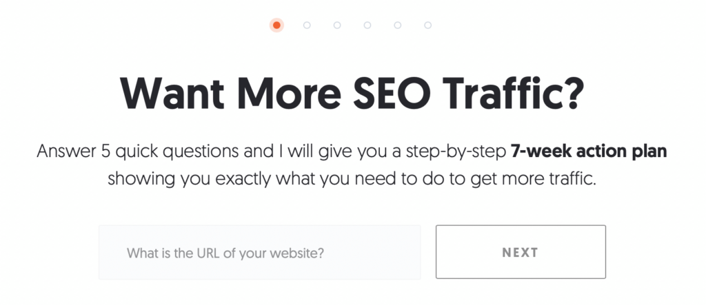
However, focusing on one conversion tactic might neglect other opportunities. For instance, you may put all your effort into email signups and miss out on customers who would purchase from your online store.
Luckily, Content Rate Optimization (CRO) enables you to manage the entire conversion process across all channels and throughout every part of your sales funnel. Implemented correctly, CRO can boost your conversion rate, track actions, and improve your overall web performance.
How to Calculate Your Conversion Rate
Before getting started with CRO, you’ll need to calculate your current conversion rate. That way, you can determine whether CRO is working on your website.
One of the most effective ways to calculate your conversion rate is to track the number of conversions (such as purchases) over a specific period. Then, you can divide this number by the number of interactions (such as a user clicking an ad) to get a percentage.
You can also calculate your visitor-to-lead conversion rate by dividing your leads (e.g., people who have signed up for a free trial) by your website visitors.
Or, you might want to calculate your lead-to-customer conversion rate. To do this, divide the total number of conversions by the number of leads in a given period.
Once you implement CRO techniques, you can see whether your targeted conversion rates go up or down. You can also utilize tools like Google Ads to help with conversion tracking.
When to Start Using Conversion Rate Optimization
While CRO can help you get more results from your web pages, there are a few factors to consider before implementing it. Here are some situations that indicate it may be a good time to start using CRO:
- When you have a sufficient amount of target market data. Marketing personas are great places to start. Or, you can use tools like Market Finder to determine the actual market for your business.
- When you’ve tracked metrics. Data is the key to understanding whether CRO is working. As such, it’s a good idea to track KPIs such as bounce rate, page load time, User Experience (UX), page views, and traffic numbers.
- When you have enough traffic. CRO practices are designed to take your existing traffic further. Therefore, it’s important to be attracting enough visitors to your site.
- When you have other marketing campaigns in place. CRO is the next logical next step following data tracking, a decent amount of web traffic, and lead funnels.
If you aren’t at these stages yet, we recommend gathering some more data first. However, if you’ve determined that it’s the right time to implement CRO, read ahead to find out how to get started.
How to Increase Conversion Rate (13 Ways)
Here are some easy ways to increase your website conversion rate!
1. Write Strong Calls to Action (CTA)
Being specific and clear with your CTAs can help your value propositions stand out since potential customers instantly know what you want them to do. Whether it’s subscribing to your newsletter or signing up for a free trial, try to communicate this message as soon as possible:
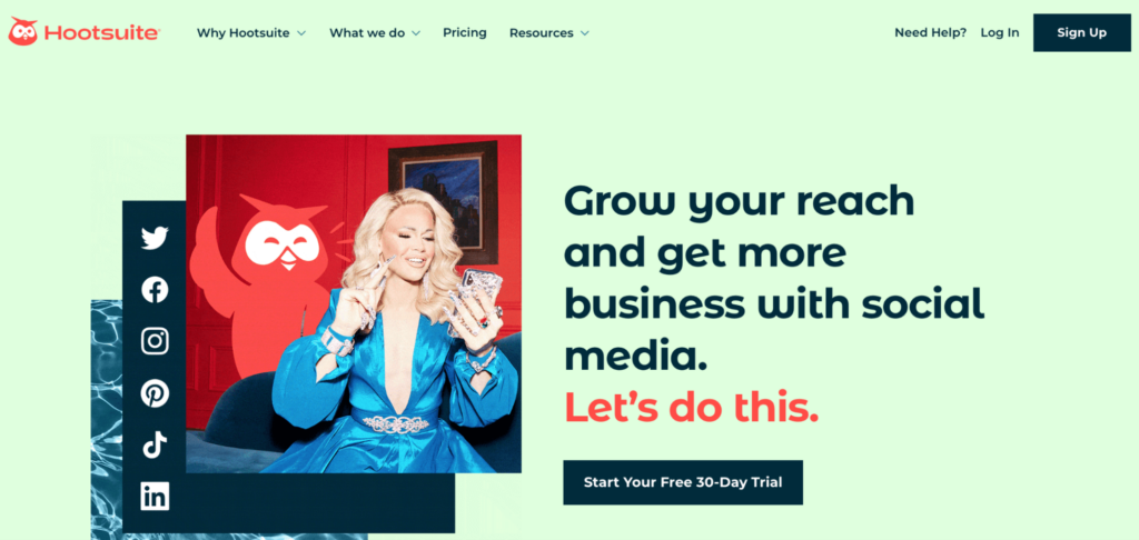
To strengthen your CTAs, you might utilize traditional best practices such as attractive CTA button design, placement, and copy. However, bear in mind that more leads come from CTA anchor text than end-of-page CTA banners. Therefore, consider using text-based or anchor CTAs instead.
One of the reasons for this is that anchor CTAs avoid “banner blindness”, which occurs when users deliberately ignore certain design elements on your page. Additionally, you can utilize larger fonts and high-contrast colors to make your CTA headings stand out.
2. Choose the Right Typography
A study at the University of Michigan found that people are more likely to view content as credible when it’s easier to understand. That being said, your font choice can make your website more accessible and your content more digestible.
Plus, you can amplify your message by opting for a font with a particular personality, tone, or mood:

Serif fonts are popular options that help publications achieve classic looks that exude tradition and authority. On the other hand, Handwriting fonts are excellent choices for brands looking to add warmth and character to their content:
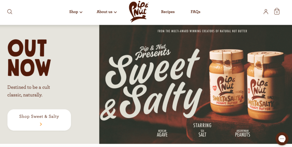
Ensuring that your body text is easy to read is equally important. Therefore, we recommend sticking with simple, clean typefaces since they are more user-friendly.
3. Build Focused Landing Pages
Landing pages are distinct pages on your website dedicated to a single conversion. You might create a page for each of your services with relevant copy, unique CTA buttons, and testimonials.
It’s important to get right to the point on a landing page. You can do this with a clear headline. However, it’s also helpful to include information about your offer before introducing your CTA. This can warm potential customers up to the idea of parting with their email address or money:
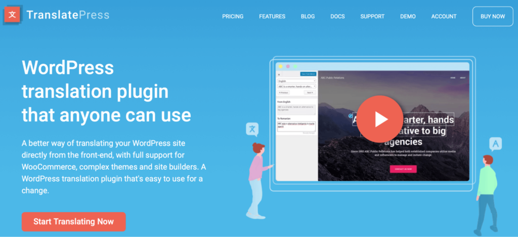
What’s more, the design elements on your page can make your CTAs appear more clickable. For instance, color psychology can play a significant role in marketing since specific colors evoke certain emotions and feelings.
Blue, for example, can suggest calmness and peace. It’s also popular in marketing campaigns since it stimulates feelings of stability. On the other hand, many CTA buttons are red because this color is associated with excitement.
4. Create Captivating Headlines
A captivating, appealing headline can persuade website visitors to stick around and act on your page. For example, 90% of visitors that read your headline also read your CTA copy.
This statistic tells us that it’s essential to hook your audience at the beginning to drive action later on:

Additionally, your headlines can impact shareability. This enables more users to engage with your content, increasing your chance of scoring conversions.
It’s also been shown that you have less than 10 seconds to hook your audience before they try a different website. As a result, your content must be straightforward, creative, and get to the point quickly.
5. Make Your Messaging Clear
One of the biggest mistakes you can make with your website is not sticking to one goal for each web page. For instance, if you discuss web hosting in your copy and then switch to a CTA to sign up for an email marketing service, you can easily confuse visitors.
Instead, make sure that your copy is relevant to your CTA so that it naturally guides readers toward it:
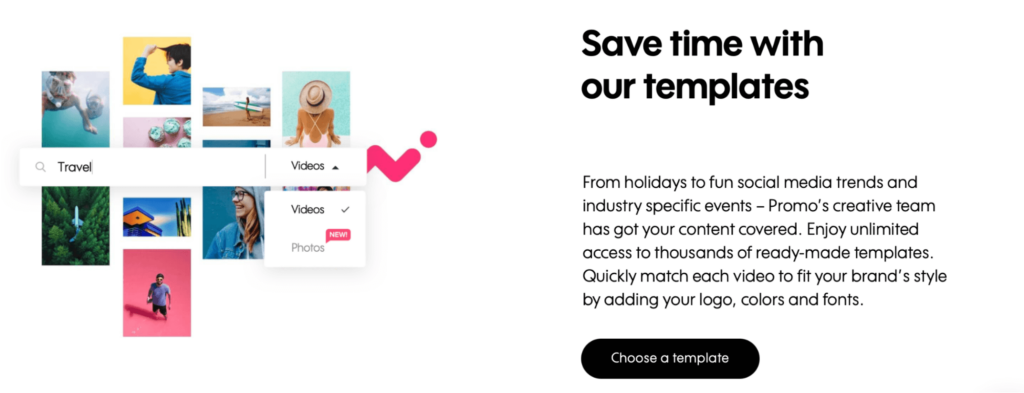
Also, be aware that some CTAs are higher risk than others, such as asking users to commit to trial subscriptions. In this case, you’ll likely need longer copy to explain the benefits of your offer thoroughly. However, getting away with bite-size content is easier when you’re simply asking for an email address.
There are various ways that you can optimize copy for readability on your site:
- Lead with active voice.
- Keep sentences and paragraphs short to assist with scanning.
- Adopt clear, direct language.
- Break up long chunks of text with visuals or bullet points.
Better yet, you can create a sense of urgency in your CTA by utilizing countdown timers that show a certain amount of time until your offer ends. Alternatively, you might display a limited number of spots left to give your CTA a feeling of exclusivity.
6. Provide Simple Navigation and Clean Site Structure
Your navigation and site structure is important for your UX. In fact, a large part of providing a better UX comes down to how useful and accessible your site is. If the path to your CTA is hard to follow or doesn’t make sense, you can easily frustrate your visitors and see a drop in conversions.
Take a look at Lingoda’s landing page. Immediately, users can find helpful snippets of information that explain the benefits of signing up. With a clear heading and an obvious CTA, visitors can navigate this website with ease:

More than that, a well-executed site structure can play a vital role in Search Engine Optimization (SEO). If users can find and interact with your content easily, this ease of use can reduce your bounce rate, increase Time on Site (TOS), and show search engines that your website is valuable to visitors.
7. Improve Your Website Speed
As page load time goes from one to three seconds, your site’s bounce rate increases by 32%. As we discussed, a high bounce rate can indicate to search engines that your content isn’t useful. Therefore, slow performances can indirectly harm your search rankings.
Fortunately, you can improve website speed by using a high-quality web host. At DreamHost, we offer a range of hosting options, including managed WordPress hosting. With one-click staging, unlimited CDN, and built-in caching, our plans are designed for optimal performance:

There are other ways to boost the speed of your website. For example, you can compress images, reduce image and text sizes, and minimize resources like JavaScript and CSS. Also, it might be a good idea to abandon outdated or unused plugins that are weighing your site down.
Fortunately, tools like Google’s PageSpeed Insights can help you identify weak points on your site. You can also conduct a quick Pingdom Speed Test to get real-time information about your web performance.
8. Design Short High-Converting Forms
When it comes to lead generation, you’ll need to consider the style, length, and placement of forms on your website. After all, these crucial factors can affect engagement. With CRO in mind, consider designing your forms to make them look and feel less form-like.
For example, HelloFresh disguises its sign-up form as a fun visual quiz. Since visitors don’t feel like they’re completing a standard lead generation form, this approach can help increase conversions:

Here are some other ways to persuade users to complete your forms:
- Make your forms short.
- If forms need to be long (to collect relevant information), use a progress bar to extend users’ patience.
- Break up questions into sections or tabs to make forms feel more manageable.
Your form completion rate can also depend on the type of information you ask visitors to submit. For instance, when you ask for a phone number, conversions can drop by 5%.
What’s more, you might consider offering incentives to readers who fill out your forms. You could provide coupons, discounts, free trials, eBooks, or samples to show appreciation.
Get Content Delivered Straight to Your Inbox
Subscribe to our blog and receive great content just like this delivered straight to your inbox.
9. Eliminate Distractions and Friction
Ideally, visitors shouldn’t feel like they have to exert effort to engage with your site. With this in mind, it’s a good idea to reduce “friction” such as error messages, data that fails to load, and unclear instructions.
To combat this, consider tracing and testing your users’ pathways on your site to check that everything works on the front end:

Remember that all elements, such as your layout, design, headings, and form fields, should guide your visitors toward a specific action. Once people land on your page, it’s best to reduce navigational elements since you don’t want to encourage them to leave.
10. Include Visual Elements
Visuals are processed by the brain faster than text. Therefore, these elements are the first things visitors will notice on your page, meaning they have a crucial role in influencing users:

Additionally, visuals can be more persuasive than text since they can show (rather than tell) visitors how to use your products.
There are many different types of visuals you can include on your website. Product images, graphics, screenshots, videos, and illustrations are all great options, depending on your niche:

More than that, users prefer video over lengthy text, so they can help you deliver an excellent UX. Since you can utilize music and storytelling in videos, it’s easy to establish an emotional connection with your audience.
11. Add Pop-Ups to Your Pages
Some visitors find pop-ups annoying since they tend to be associated with advertisements. However, pop-ups have a higher conversion rate than any other type of ad:
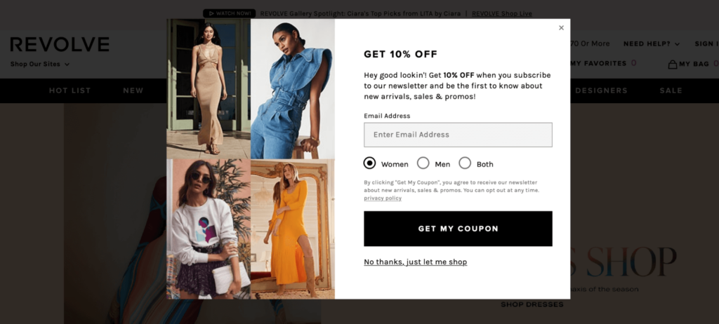
To make the most of pop-ups on your site, consider timing them effectively to make them less intrusive. For instance, you can present your pop-up after readers have spent a set amount of time on your page. This way, you know that users are already engaged with your content and are less likely to leave.
You can also design more powerful pop-ups by tailoring the experience. For example, you can show pop-ups on just one page of your site or have them appear when customers arrive from a particular link.
12. Use Social Proof and Testimonials
An easy way to increase your website conversion rate is to boost your audience’s confidence with virtual trust-building exercises. Customer reviews and testimonials from current clients can infuse your pages with the voice of actual consumers. They can authentically demonstrate to users how great your products are:
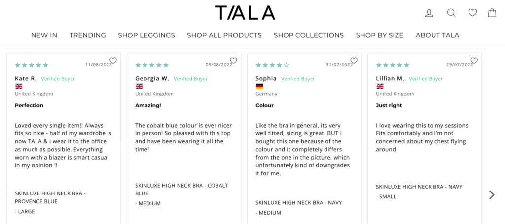
You can ask users to leave feedback by adding quick, user-friendly surveys to your website. This approach is easiest with a tool such as SurveyMonkey to help you build your feedback form quickly.
Another option is to include social proof on your site. You can integrate your website with a social media platform to display Facebook comments or posts that mention your business.
Alternatively, you might prefer to feature the logos of famous or noteworthy clients:

Another great option is to populate your site with security/trust badges to promote a safer digital environment. These elements can help customers feel more comfortable interacting with your pages.
13. Make Sure Your Site Is Responsive
Since mobile users account for almost 60% of global web traffic, it’s important to design pages that display seamlessly across various screen sizes, such as desktop, tablet, and mobile. If you’re not prioritizing a responsive design, you might be limiting your conversion opportunities.
While page builders can help you build your website efficiently, make sure to choose mobile-ready templates and utilize hamburger menus. Then you can use tools such as Google’s Program or MobileTest.me to verify that your site is responsive.
6 Best Conversion Rate Optimization Tools to Implement on Your Site
Now that you know how to optimize your website for conversions, let’s look at some helpful CRO tools. These platforms and plugins can supercharge your strategy and boost conversions in no time!
1. Google Marketing Platform
Google Marketing Platform provides an entire suite of tools that can be used within your CRO framework. It’s also a great choice for small businesses because you can access the tool for free:

Better yet, as a suite of tools, these solutions are designed to work together so that your data is accessible across all the applications. For instance, you can gather your tracking data with Google Analytics and set up your tests with Google Optimize.
2. Five Second Tests
Five Second Tests lets you access and understand a user’s first impression of your website. It’s a unique concept, relying on testers that have five seconds to view your page before being asked a series of questions.
For example, users might be asked about the main elements they remember from your page:
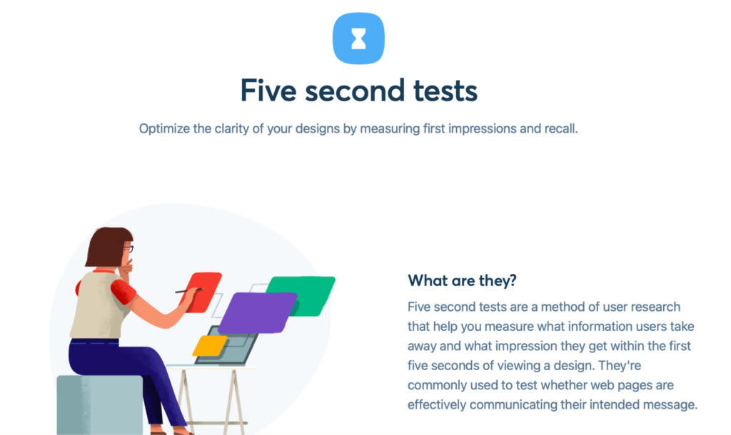
What’s more, you can get two minutes of free testing a month, which is sufficient for most businesses. Or, if you opt for a paid plan, you can increase testing time, brand your experiments, and implement A/B testing.
3. MailChimp Signup Forms
Mailchimp is one of the most popular email marketing service providers. Moreover, you can utilize Mailchimp Signup Forms to create custom sign-up forms within any widget or content area on your site:
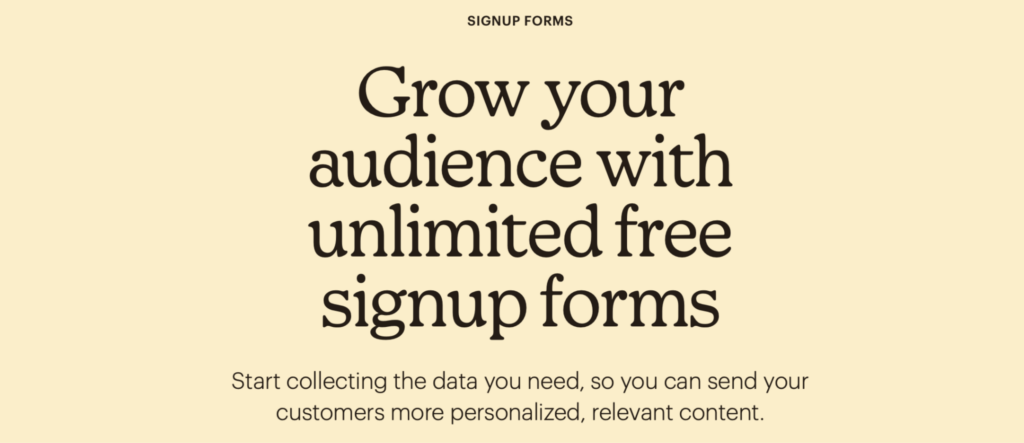
A Mailchimp widget is more prominent on your page, making it easier for people to notice and complete your forms. What’s more, with a powerful free version, Mailchimp is a great fit for beginners or small websites. Then, you can create high-converting emails and newsletters to warm your audience up to the idea of a sale.
4. Monarch Social Sharing
Since it arrived on the scene in 2015, Monarch has remained one of WordPress’s most popular social sharing services. Although this is a premium plugin, the ROI alone makes it worth the cost.
Since Monarch makes it easier for readers to share your content, you can grow your readership and boost your conversion rate:
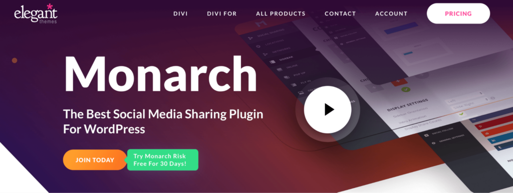
You can also use its intuitive dashboard to view your sharing statistics and discover where your content performs best. Then, you can focus your social media marketing efforts on those specific platforms.
5. Pop-up Builder by OptinMonster
OptinMonster is a pop-up builder plugin that enables you to attract more subscribers and grow your business. Several plugins provide this functionality. However, we like OptinMonster because it excels at re-engaging visitors who are about to exit your website:

With OptinMonster, you can present users with beautiful, interactive pop-ups that won’t annoy your readers. This is because, with the plugin’s smart targeting and personalization features, you can show your message to receptive readers, allowing you to maintain a superb UX.
6. Page and Website Builders
Page and website builder plugins make it easier to build beautiful landing pages that are sure to impress your visitors. They’re excellent options for people lacking design skills because you can access pre-designed templates and customize them to suit your branding.
What’s more, most page builders like Elementor enable you to create pages visually using an intuitive drag-and-drop editor:

Therefore, it’s suitable for all abilities. Plus, you can include a ton of high-converting elements on your pages, such as CTA blocks, pop-ups, and subscribe forms.
Increase Your Conversion Rate Today
It can be challenging to encourage users to convert. Fortunately, Conversion Rate Optimization (CRO) helps us minimize the risk of users leaving your site without interacting with your pages.
SEO and CRO Made Easy
We take the guesswork (and actual work) out of growing your website traffic and conversions.

The post How to Increase Your Website Conversion Rate (A Comprehensive Guide) appeared first on Website Guides, Tips & Knowledge.
source https://www.dreamhost.com/blog/increase-website-conversion-rate/
No comments:
Post a Comment