If you only focus on selling products and services on your website, potential customers might not find your business trustworthy. You likely won’t build connections with new visitors without explaining your story and core values.
Creating an About Us page allows visitors to read a compelling introduction to your brand. A well-designed About Us page helps you connect with your audience and build trust. This trust can ultimately increase your conversions and boost retention rates.
In this post, we’ll explain what an About Us page is and how to create one for your website. Then, we’ll show you 25 inspiring examples. Let’s get started!
What Is an ‘About Us’ Page?
In short, it’s a page that can inspire people to work with you or buy your products. It can contain (but isn’t limited to containing) your brand story, your achievements, and your best testimonials.
An About page is not a place to push a hard sell or boast about your business. It should offer an up-front and honest portrayal of your company, its story, and your values.
So when creating an About Us page, you should make sure to:
- Stay away from the hype. Users can see straight through it, so leave it for social media.
- Avoid a sales pitch. If a reader is on your About Us page, there’s a good chance they’re considering using your service or buying your product. They’re looking at why they should choose you. So don’t sell your product or service. Sell you.
- Be creative. Don’t fall into the trap of simply writing a brief summary of your business and calling it a day. The best About Us pages are creative, informative, and interesting.
- Don’t follow the crowd. If someone’s reading your About page, there’s a good chance they’ve been considering your competitors. So, make sure your page stands out. It should make it almost impossible for a potential customer to forget you.
- Feature faces. Consumers often like to know who they’re buying from or working with, so be sure to feature at least some of your team members on your About page. It can really help boost conversions.
The bottom line is that people want to work with other people, not brands. You can use your About page to relate to users on a personal level and help them learn about your business.
How to Create the Perfect ‘About Us’ Page (4 Tips)
You should now have a decent idea of what an About Us page should and shouldn’t contain.
We’re going to follow this with a few tips to help you create a page that makes your business stand out.
1. Tell a Story
One of the best ways to make your About page unique is to tell your company’s history. Often, stories can get visitors more invested in your brand and compel them to keep reading. And that, naturally, can lead to more conversions.
First, remember to be transparent. Your About Us page serves to sell your unique story and get buy-in from your visitors. Transparency is incredibly important to win your visitors’ trust.
You can talk about how your business got started, as well as your personal background. To help readers understand your goals, you can even write a mission statement. This text will vary depending on your brand, but it’s best to be as authentic as possible.
2. Keep It Simple
When writing your About page, don’t use industry jargon and confusing copy. The words should leap off the page and inspire your new customers to take action. A block of text that visitors have to read six times to grasp is not going to cut it.
It’s also essential to consider your audience. New visitors will likely want a simple introduction to your business without having to read your entire life story. Ultimately, consider what readers will be looking for and make a value proposition with that in mind.
After you describe yourself and your company, be sure to add your contact details. If a visitor’s got as far as looking at your About Us page, there’s a good chance they’re thinking of working with you or using your service. Don’t miss that opportunity to convert them by making them search for a separate contact page.
Lastly, don’t forget about a call-to-action (CTA). This important element can convert visitors, making it clear what you want them to do next.
3. Use Engaging Visuals
If your About Us page has an aesthetically pleasing design, it can engage visitors and encourage them to read more. Readers may struggle to understand your story when the content is poorly laid out with too much text.
Since the human brain can process images much faster than words, consider integrating them into your About page. Even if someone doesn’t read the full page, they can view the other visual elements to understand your business.
Having the right design can avoid scaring away new visitors. Here are some great ways to improve your About Us page visuals:
- Be creative and use original graphics.
- Choose the right color scheme.
- Include images and videos.
- Create animations.
- Use readable fonts for accessibility.
Ideally, all important information should be positioned above the fold. However, you can also guide users to scroll down and read more.
While it varies from industry to industry, more than half of internet browsing now takes place on mobile devices. So make sure your About Us page, and your site as a whole, is built for mobile first. Then, you can check if a page is mobile-friendly using Google’s Mobile-Friendly test.
4. Make Sure the Page Loads Quickly
Whether you run a small business or a large company, your website needs to be fast. This is one of the best practices to improve user experience. If your About page takes too long to load, users will likely leave your site without reading its content.
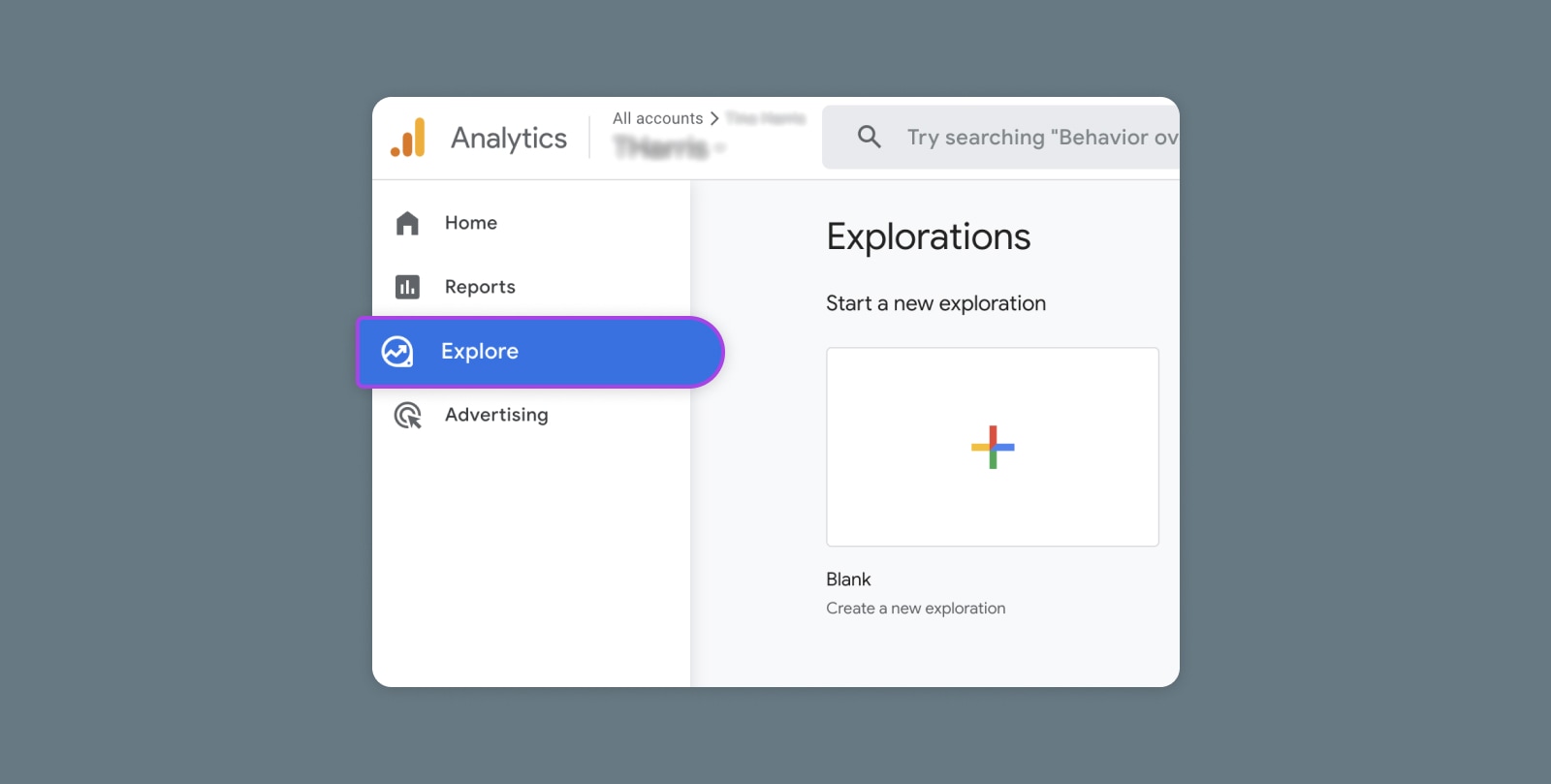
This, of course, goes for every page on your site, but key conversion pages must load as fast as possible. You can find out exactly how long a particular page of your site takes to load with Google’s PageSpeed Insights. This will evaluate your Core Web Vitals:
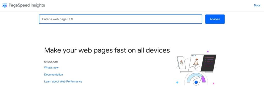
If you receive a poor score, you can take steps to improve your page speed. This speediness is necessary to keep visitors on your website and ensure they return a second time.
25 Great ‘About Us’ Pages to Inspire You
Are you in need of some inspiration to help you build your ideal About Us page? Look no further. We’ve scoured the Internet to find some of the best About Us page examples out there.
No matter your niche or what kind of business you run, you’ll be able to find some inspiration in these 25 About Us pages. Let’s take a look at each one and discover what makes these pages so unique and exciting (and worthy of inclusion on this list).
Get Content Delivered Straight to Your Inbox
Subscribe to our blog and receive great content just like this delivered straight to your inbox.
1. Nike
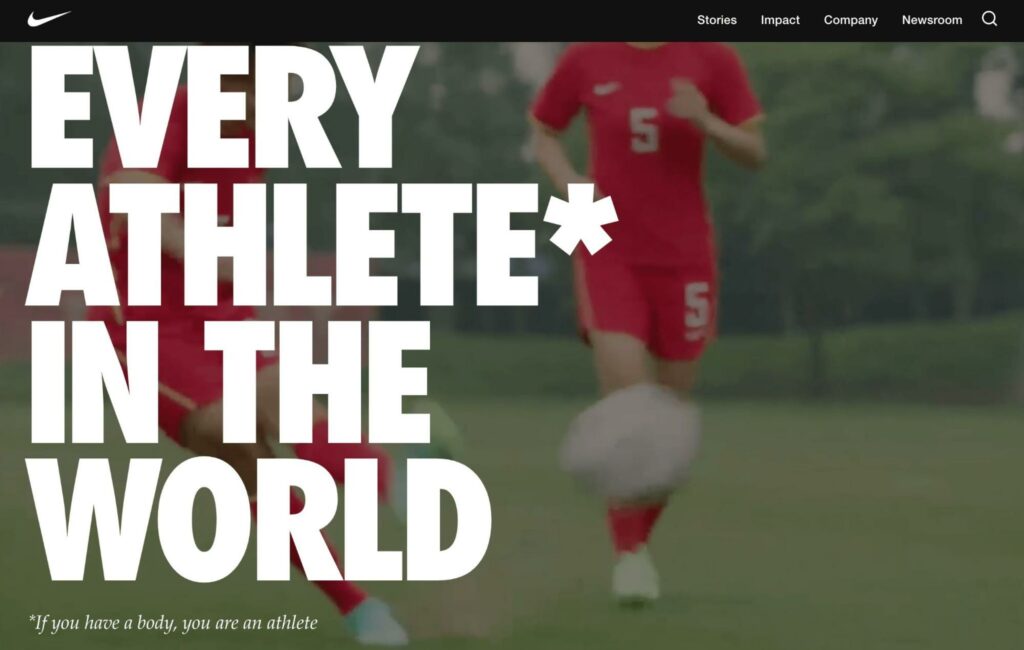
What makes this a good About Us page?
- At the top of the page, Nike establishes itself as one of the leading brands for all types of athletes. It also explains its mission to help people reach their full potential in sports.
- The page clearly identifies Nike’s audience as athletes but remains inclusive by emphasizing that anyone with a body is an athlete and could benefit from Nike products.
- To engage readers visually, this About page has full-width moving graphics of athletes competing in various ways.
- Below the fold are links to the latest stories and blog posts about Nike’s impact on sports.
2. Zendesk
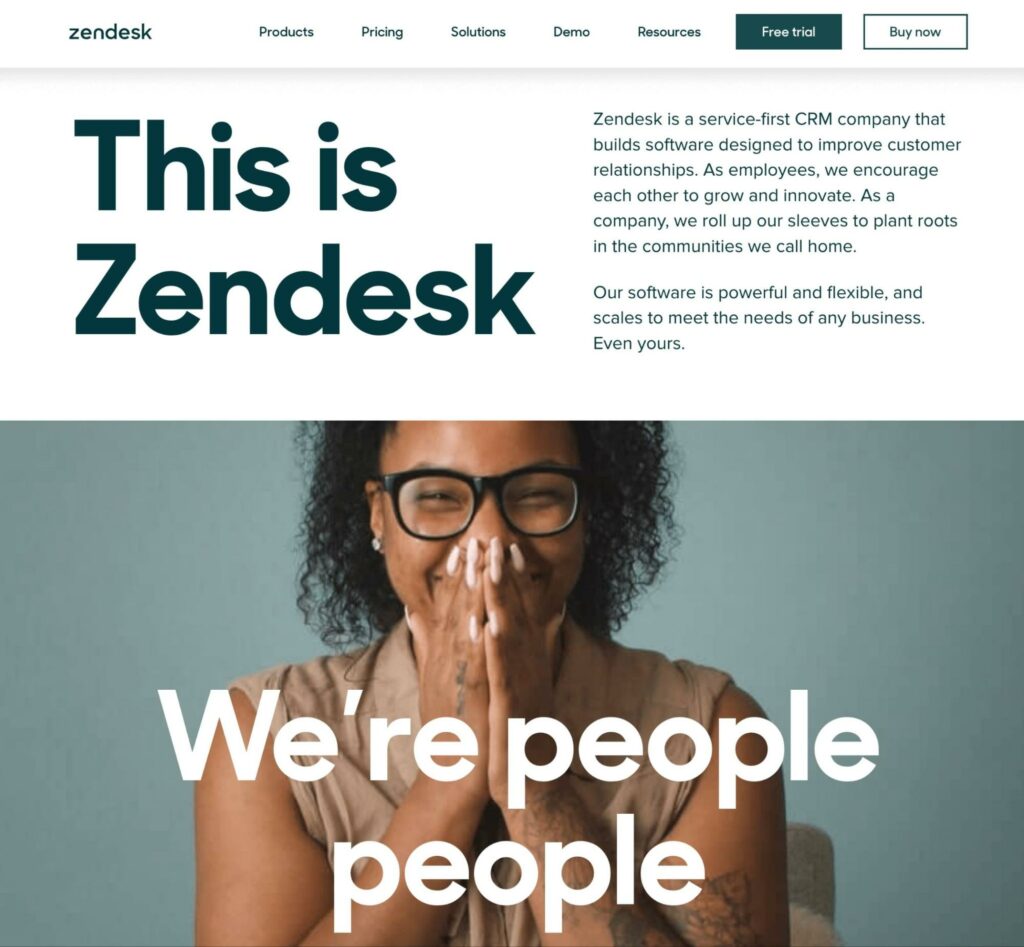
What makes this a good About Us page?
- Right away, there is a short, concise summary of Zendesk and what the company focuses on.
- The simple page design, bold contrasting color scheme, and limited word count make this About page readable and understandable.
- By explaining how Zendesk invests in communities and promotes diversity and inclusion, the reader can relate to the brand and its ethics.
- In the backstory of a “zen desk,” the writers include a little bit of humor. Plus, this makes the story more distinctive and memorable.
3. Etsy
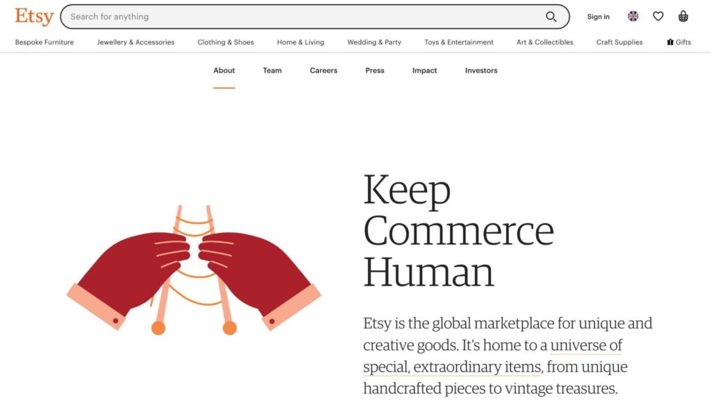
What makes this a good About Us page?
- Since Etsy is a creative marketplace, starting with the tagline “Keep Commerce Human” makes sense. This compelling call-to-action lets readers know the core message of the company.
- In the introduction, this About page features Etsy’s main guiding principles. If readers have a similar love for sustainability and creativity, they can find those values here.
- The page also outlines how Etsy works. With cute and simple animations to guide the way, visitors will learn the benefits of becoming a buyer or seller on the platform.
4. Amazon
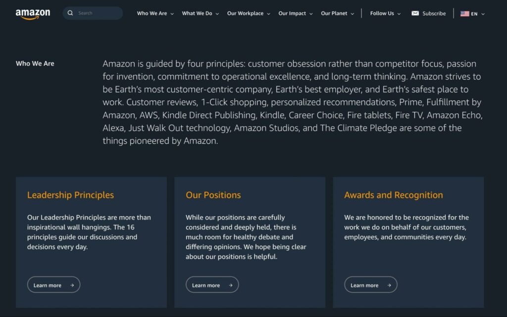
What makes this a good About Us page?
- Unlike other brands, Amazon divides its About information into a few basic pages: Who We Are, What We Do, Our Workplace, Our Impact, and Our Planet. This layout avoids having too much information on one page.
- You’ll find easy-to-navigate links to essential information about Amazon’s services, principles, community impact, and more in each tab.
- Using short paragraphs and links to other resources, this About page neatly summarizes everything about Amazon.
- As you scroll down the page, Amazon provides related articles if you want to learn about its hiring practices or company progress.
5. WordPress.com
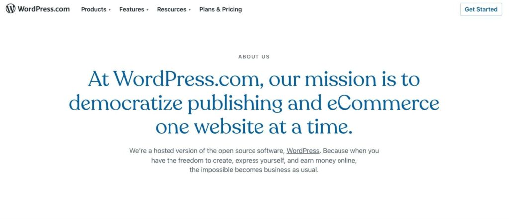
What makes this a good About Us page?
- To introduce WordPress.com to new visitors, this About page starts with the company’s mission statement.
- The designers use contrasting blue and white backgrounds throughout the page to align with the brand’s logo and increase readability.
- WordPress.com clearly considers its target audience, with frequent calls-to-action to get people’s websites online.
- The page also explains how WordPress.com supports its users with diverse, free tools. Reading this, visitors can realize they have everything they need to build a website immediately.
6. Canva
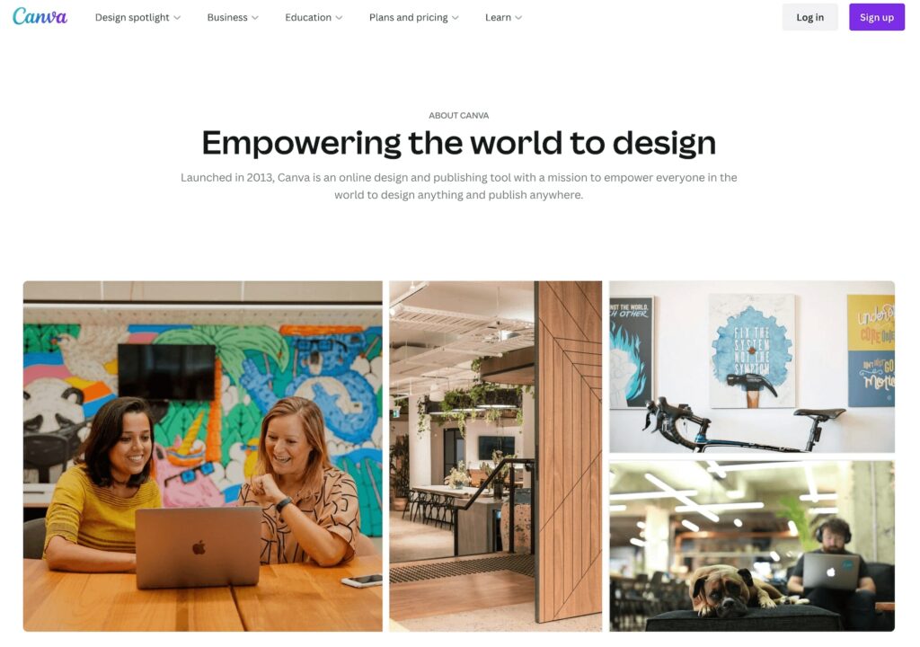
What makes this a good About Us page?
- This About page is an excellent example of a simplistic design. It focuses on visual elements rather than excessive paragraphs. Although there aren’t many words on the page, they are descriptive enough to encapsulate Canva and its goals.
- It also highlights Canva’s popularity, listing the number of designs created with this software.
- This page includes an image slider of its core values to personalize the brand. With engaging graphics, this element explains the core ideas that Canva stands for.
7. Mailchimp
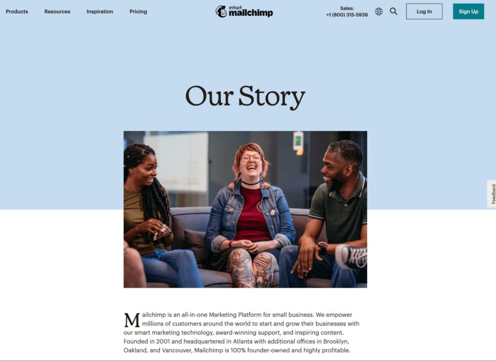
What makes this a good About Us page?
- Despite being a big company, Mailchimp successfully manages to avoid any corporate tropes. Instead, its About Us page makes you feel like you’re going to be working with a small team.
- Each section is only a couple of paragraphs long. Despite having a ton to talk about, Mailchimp understands that the reader only needs top-level ideas (though you can go off and learn more, thanks to dedicated pages for the company’s culture and history).
- At no point does the page feel like a sales pitch. It simply pulls you into what Mailchimp stands for and who it is as a company.
8. GIPHY
What makes this a good About Us page?
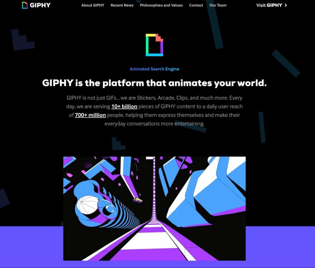
- If you’ve ever used a Graphics Interchange Format file (aka a GIF), then you’re probably aware of GIPHY. Since GIFs are fun, GIPHY made its About page quirky, engaging, and completely on point when it comes to reflecting the brand and its identity.
- Plus it’s pretty much done entirely using — you guessed it — GIFs. This promotes GIPHY’s products without including a hard sell. After seeing the fun GIFs on this page, visitors can be motivated to use them.
9. 500px
What makes this a good About Us page?
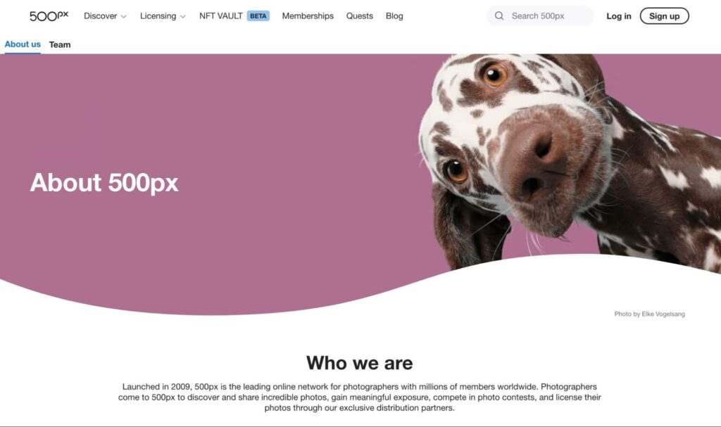
- As an online network for photographers, you would expect great visuals on the 500px About page, and it doesn’t disappoint — especially if you happen to be a dog person!
- The page goes on to explain what the company is and how it is committed to its customers. Plus, it’s completely free of fluff.
- It clearly describes how photographers can benefit from joining 500px, followed by a simple call-to-action.
10. Twitter
What makes this a good About Us page?
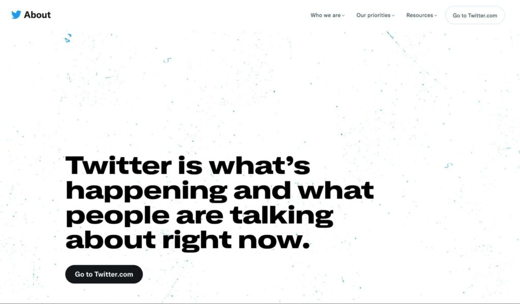
- Twitter’s About page hits the nail on the head when it comes to copy with brevity. It lays out who the company is and what it stands for without going into too much detail. You know precisely what you’re going to get from the social network just by looking at its About Us page.
- It does an excellent job of moving visitors down the funnel and getting them to sign up and start using the site. Twitter does this in part by pulling trending content into the page. This gives readers a CTA to try the platform.
11. RXBAR
What makes this a good About Us page?
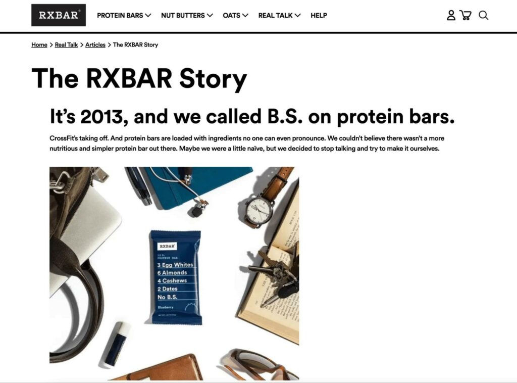
- With a bold headline, RXBAR draws readers’ attention while summarizing its company history. The page also explains what makes its protein bars different from other brands.
- Throughout the page, there are short headings that quickly outline RXBAR’s origin story and values. Visitors can understand the brand’s purpose as a simple, nutritious snack manufacturer even if they don’t read on.
- This About Us page features short, concise sentences in the main text that match the brand’s no-nonsense voice.
12. Barkbox
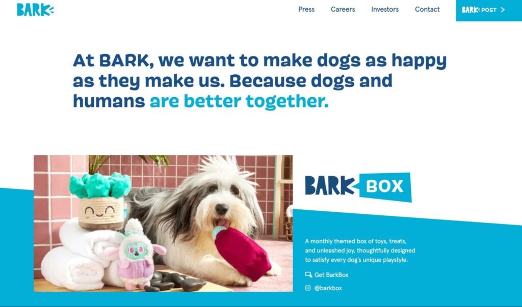
What makes this a good About Us page?
- Since Barkbox provides monthly subscription boxes to pet owners, it makes sense to use fun, adorable images of dogs on its About page.
- Even though the page doesn’t explain the company’s history, its mission statement to “Make dogs as happy as they make us” lets you know exactly what Barkbox sets out to do. Plus, it resonates with dog owners on a personal level.
- As you scroll, you’ll see different sections for each Barkbox subscription. This layout prevents visitors from navigating to a separate page.
13. Uber
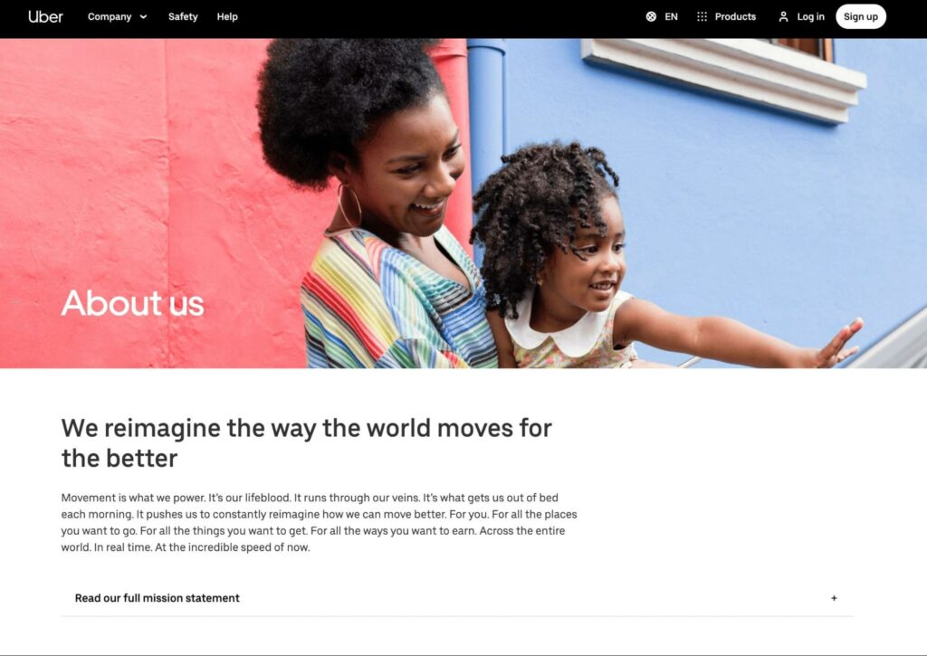
What makes this a good About Us page?
- Like other companies, Uber highlights its mission statement on its About page. This includes an emotional appeal, explaining that the main goal is to give people the freedom to go wherever they want.
- Uber also includes a picture of its CEO and a personal letter from him. By having a call-to-action button, this section motivates readers to read about the company’s history, achievements, and plans.
- As a transportation company, potential customers may have questions about Uber’s sustainability. Fortunately, Uber provides information about its goal to become fully electric.
14. Chime
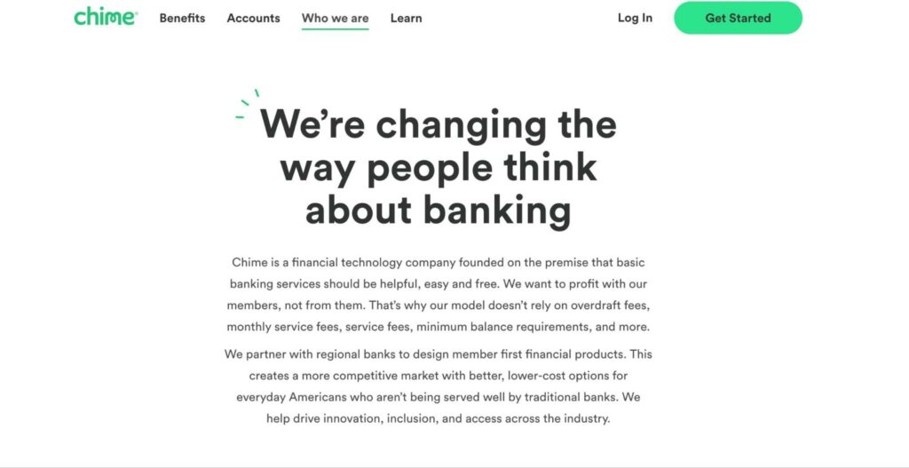
What makes this a good About Us page?
- Chime takes a more simplistic approach, explaining its history, mission, and values without fancy graphics. Since the audience will likely be people looking for a new bank, it makes sense to keep things simple.
- Right away, readers can learn how Chime differentiates itself from its competitors. Chime appears to be a good alternative to other well-known banks because it doesn’t have standard banking fees.
- This About page emphasizes the benefits of using a smaller bank by featuring the Chime leadership team and company culture. Once visitors see that employees are happy and content, they may believe they’ll also be treated well.
15. Wendy’s
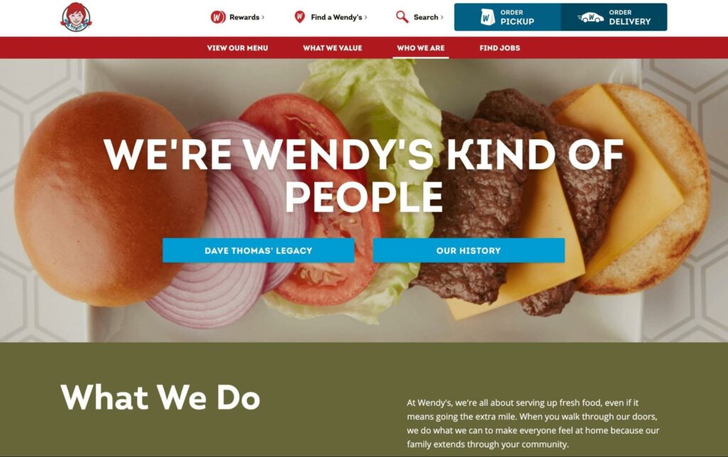
What makes this a good About Us page?
- As a fast food brand, Wendy’s is very well known. However, some people may be unaware of its history. To solve this problem, this About page links to information about the founder, Dave Thomas, and the foundation of Wendy’s.
- It also emphasizes that Wendy’s strives to serve fresh food and make every customer feel at home.
- Some visitors may want to start working with the company. Therefore, Wendy’s provides details about investing and franchising.
16. Allbirds
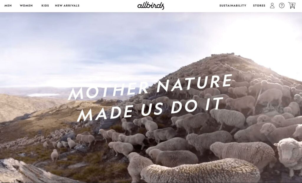
What makes this a good About Us page?
- With a looped video of sheep running across an aesthetic landscape, the Allbirds About page immediately displays its sustainable values. Adding the tagline “Mother Nature Made Us Do It” summarizes the company’s goal to work with nature rather than exploit it.
- There is a picture of the founders and a short and personal story about how they started Allbirds.
- Along with an animated graphic of Allbirds shoes, this About page states what makes this product unique. Any reader who wants simple, comfortable, sustainable shoes can benefit from ordering a pair.
17. Eventbrite
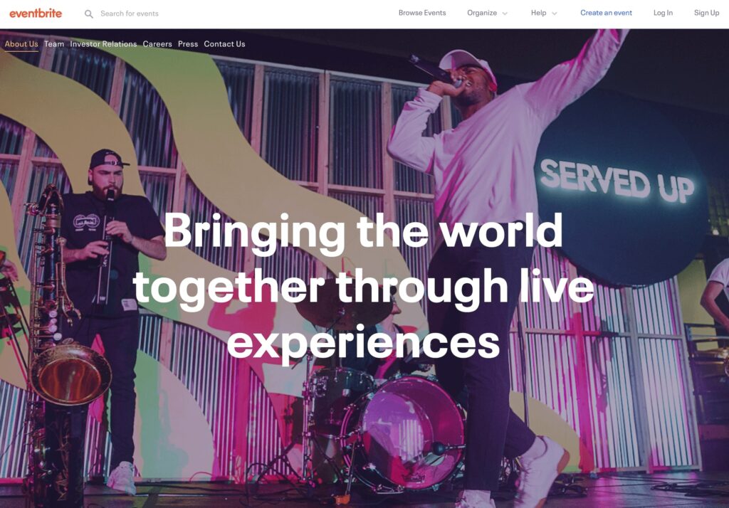
What makes this a good About Us page?
- Featuring an image of a band performing, the Eventbrite About Us page focuses on its niche audience. If someone wants to experience live performances, they can immediately know that the company specializes in that area.
- After explaining what Eventbrite is, the page further discusses what you can expect from this platform. Whether you want to go to a music festival, fundraiser, or marathon, you can find tickets with Eventbrite.
- Plus, this page tells visitors how successful the company has been in previous years. It explains Eventbrite’s achievements, as well as a high level of customer satisfaction.
18. HubSpot
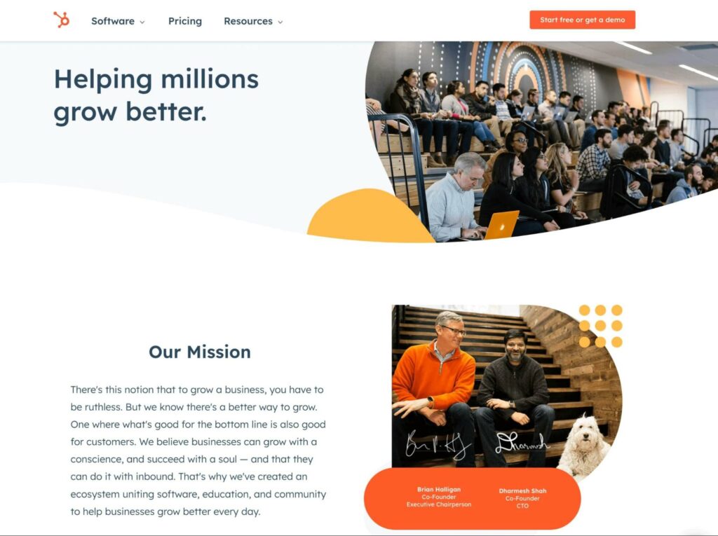
What makes this a good About Us page?
- HubSpot’s About page has a simple but effective layout, explaining the company’s mission, story, and history.
- Along with a written story of how HubSpot was founded, there is a video featuring its CEO. This makes the story more personal since you can hear it straight from the founder.
- Instead of having blocks of text, it lays out HubSpot’s history point-by-point in an image slider. Visitors can navigate through the business’s initial goals, improvements, and successes.
19. Spotify
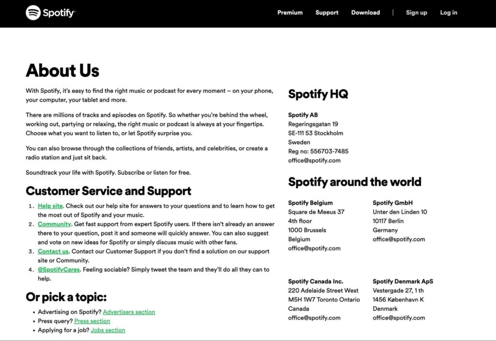
What makes this a good About Us page?
- Although this About Us page doesn’t include images, it simplifies the text and includes only necessary information. Plus, headings effectively separate each section in an easy-to-understand way.
- This page isn’t very long, avoiding the need to scroll to the bottom of the page to find specific details about the company.
- The simple black and white color scheme provides maximum readability. With the external links in bright green, visitors can easily navigate across Spotify’s website to locate customer service, advertising information, or employment applications.
20. ToyFight
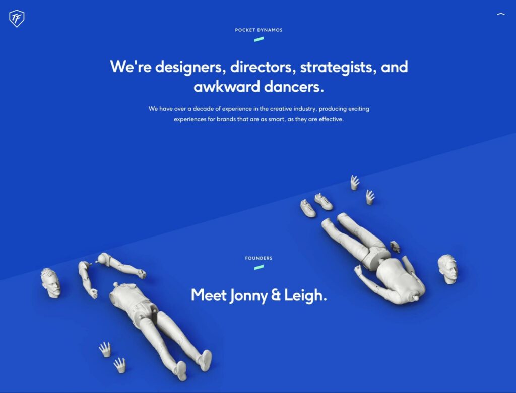
What makes this a good About Us page?
- As a creative design agency, ToyFight avoids using a standard, boring About page with blocks of text. Instead, it features engaging graphics that move as you scroll down the page. Mirroring the company’s name, you’ll see two fighting toys that enhance the reading experience.
- When describing the founders of ToyFight, they are portrayed as deconstructed action figures. This text gives the page a lighthearted and silly feel. They’re even given fun names such as “Beardless wonder” and “Napoleon complex” to make readers laugh.
21. Yellow Leaf Hammocks
What makes this a good About Us page?
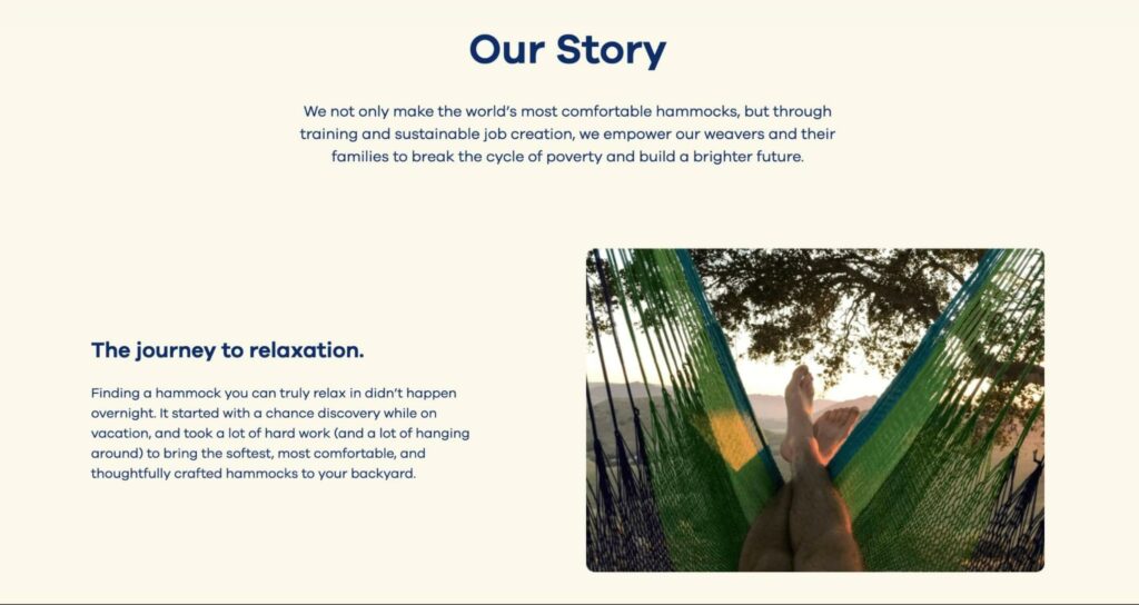
- Unlike some other companies, Yellow Leaf Hammocks tells an exciting story about its manufacturing process. Describing how each hammock is handwoven by women in the Mlabri Tribe offers a strong emotional appeal.
- Yellow Leaf Hammocks encourages readers to think about where products come from. It supports paying weavers a fair wage, empowering women with financial independence.
- As you scroll down the page, you can even see pictures of these weavers and read their stories. These elements can enable readers to believe in and support a good cause.
22. Chattanooga Renaissance Fund
What makes this a good About Us page?
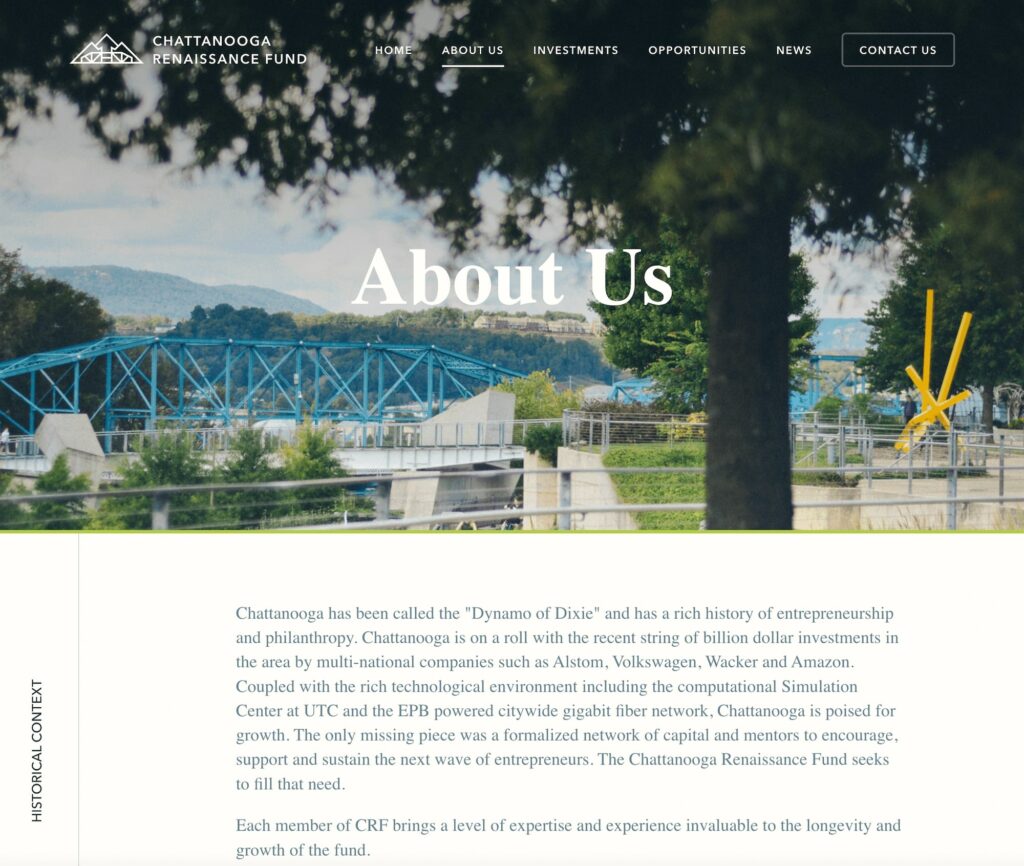
- This About Us page starts with a historical overview of Chattanooga and how it is a hub for entrepreneurs. Then, it explains how the Chattanooga Renaissance Fund fills a need in this community.
- Visitors can read about the main members and their roles in the Chattanooga Renaissance Fund.
- It also describes how this fund can help individual readers. Whether someone is looking at this site as an investor, third party, or startup, they can evaluate how the Chattanooga Renaissance Fund can support their ideas.
23. Purple, Rock, Scissors
What makes this a good About Us page?
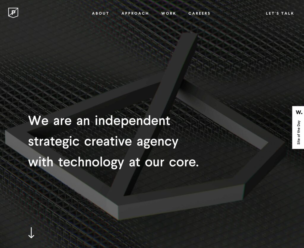
- Since Purple, Rock, Scissors is a creative agency specializing in technology, it wouldn’t make sense to have a boring About Us page. There are engaging visuals, including motion graphics, to highlight the agency’s skills.
- In a one-minute video, this company displays quickly moving animations that perfectly encapsulate a wide range of creative abilities.
- Purple, Rock, Scissors highlights its previous work experience by including a case study. This can help potential clients realize if this company is the right fit for their needs.
24. Hydrant
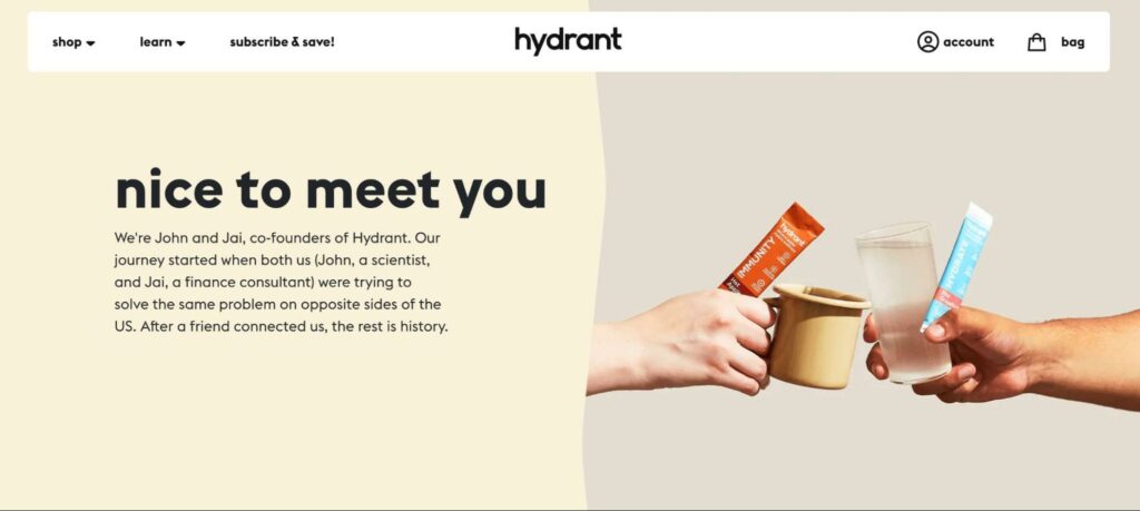
What makes this a good About Us page?
- After a brief introduction to the company, Hydrant explains the main problem that it attempts to solve.
- Visitors can see Hydrant packs and their various flavors in all the pictures. Plus, if you click on one of the images, you can immediately add the product to your cart.
- The founders recommend their favorite Hydrant packs, giving a personal touch to the company.
- At the bottom of the page, you can read positive reviews from other customers. These real-life testimonials can motivate visitors to buy a Hydrant pack.
25. Wheel
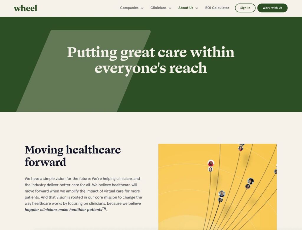
What makes this a good About Us page?
- At the top of the page, the main tagline “Putting great care within everyone’s reach” is highlighted in bold green. This color draws the eye and lets readers know how dedicated Wheel is to making healthcare accessible.
- Dividing each section by different colors, Wheel makes its About page readable and easy to follow.
- Rather than featuring huge blocks of text, this healthcare company summarizes its vision, purpose, and story in short paragraphs.
Tell Your Story with an ‘About Us’ Page
As you might have noticed, there’s no one set way to design an effective About Us page. Depending on your goals, the page can be casual and fun, information-focused, or a combination of the two. Ultimately, an About Us page is a reflection of your brand, helping users feel a little bit closer to your company — as well as the people behind it.
To review, here’s how you can build an effective About Us page:
- Tell a story
- Keep things simple
- Use engaging visuals
- Make sure the page loads quickly
If you want an About Us page that ticks all the boxes, you may consider hiring a professional designer. With DreamHost’s custom web design services, you can get one-of-a-kind pages customized for user experience and speed. Contact us today to learn more!
DreamHost Makes Web Design Easy
Our designers can create a gorgeous website from SCRATCH to perfectly match your brand and vision — all coded with WordPress so you can manage your content going forward.
The post How to Create the Perfect About Us Page (+25 Examples) appeared first on Website Guides, Tips & Knowledge.
source https://www.dreamhost.com/blog/how-to-create-about-us-page/
No comments:
Post a Comment