Whether you run an e-commerce site or a web development business, you want to attract as many visitors as possible to your web pages. However, this can be difficult if you don’t prioritize accessible web design.
Website accessibility involves making sure that your site is usable by everyone, including those with disabilities and impairments. Fortunately, there are a variety of resources, tools, and tips you can leverage to make creating an inclusive website a lot easier.
In this post, we’ll explain why website accessibility is so important. Then, we’ll show you how you can check the accessibility of your site. Finally, we’ll provide you with a complete guide for designing highly-accessible web pages. Let’s get started!
Why Website Accessibility Should Be a Priority
Website accessibility refers to the extent to which a site can be used by individuals with disabilities. This can include people who are blind or have low vision, those who are deaf or hard of hearing, have mobility impairments or cognitive disabilities, and more.
As a website owner, it’s important to ensure that you’re not excluding those who fall under this category. In fact, the Americans with Disabilities Act (ADA) is a civil rights law that prohibits businesses and organizations from discriminating based on disability. However, legal compliance isn’t the only reason website accessibility should be a top priority.
Making your website accessible is a good way to demonstrate inclusive company values. Plus, designing an accessible website can make it more successful overall. It may even improve the user experience for all of your site’s visitors.
There are a number of ways to make your website more accessible. Some of these include adding alt text to images, providing transcripts for audio or video content, and using clear and concise language.
To make achieving web accessibility easier, the World Wide Web Consortium (W3C) developed the Web Content Accessibility Guidelines (WCAG):
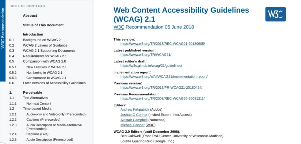
This includes a set of standards that developers, designers, and website owners can use when creating and maintaining websites and online content.
Creating an accessible website doesn’t have to be difficult or time-consuming. By taking some simple steps, you can significantly improve the accessibility of your site. This way, you can broaden your audience while also contributing to online accessibility efforts. You may even inspire others to do the same!
Get Content Delivered Straight to Your Inbox
Subscribe to our blog and receive great content just like this delivered straight to your inbox.
How to Check Your Site’s Web Accessibility
Before we get into tips and steps you can take to design an accessible website, it’s important to first understand how to check the current status of your pages. There are a few ways you can check. Let’s take a look at some of the easiest and most popular options.
Use an Online Accessibility Checker
One of the quickest ways to check your site’s accessibility is by using an online accessibility checker such as the WAVE Web Accessibility Evaluation Tool:

This software can be used to evaluate the accessibility of your web pages. One way it can do this is by checking for compliance with accessibility standards, such as the WCAG.
To use the WAVE tool, simply enter the URL of the web page you want to evaluate in the Web page address field and click on the arrow button. WAVE will then generate a report that shows you any errors or potential problems with the accessibility on that page:
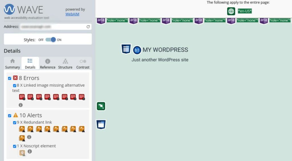
In addition to a general assessment, WAVE provides feedback on how you can improve your pages to enhance accessibility. For example, in the above screenshot, the tool points out that a handful of images are missing alternative text. It might also draw your attention to any confusing structural elements.
Install a Browser Extension for Accessibility
Another option you have for checking website accessibility is to download and install a web browser plugin that will automatically check for issues. A popular tool for Google Chrome is the Accessible Rich Internet Applications (ARIA) extension:

The ARIA DevTools extension for Chrome is a free and open source accessibility resource that allows users to customize the way they interact with web content. ARIA is designed to improve the usability of web pages for people with disabilities, and to make them more accessible to assistive technologies such as screen readers.
ARIA does this by providing a set of attributes that you can use to improve the accessibility of HTML elements. For example, the ‘aria-label’ attribute can serve as a marker for an element that is not otherwise accessible, while the ‘aria-describedby’ attribute can be used to provide an explanation.
In order to use the ARIA extension, you must first install it from the Chrome Web Store. You can visit the extension page and then select Add to Chrome followed by Add extension.
Once installed, you can enable the extension by going to the chrome://extensions page and clicking on the Enable toggle button for ARIA DevTools:

Once ARIA is enabled, you can start using the various attributes that it provides.
Manually Check for Common Accessibility Issues
Another option for checking for accessibility issues is to use a manual approach. Of course, this can be more time-consuming than using online tools and extensions.
However, if you use a checklist, it can be a thorough technique. Plus, this method is free and therefore available to all website owners. Alternatively, a manual run-through could be just one of several approaches to your accessibility assessment.
If you go with this option, you might want to use a checklist to get started. For example, the WCAG 2.0 checklist asks the following questions:
- Is all content accessible to everyone, including those with disabilities?
- Are all images properly tagged with alternative text?
- Is the website navigable using only a keyboard?
- Are there any audio or video files on the site that include transcripts or captions?
- Is the website free of any color contrasts that could make it difficult to read for some users?
Making sure your website’s User Experience (UX) is accessible to everyone is important not only for compliance purposes but also because it’s the right thing to do. When you take the time to manually check your site for common accessibility issues, you can help ensure that your site is usable by everyone, without spending a dime.
Hire a Web Accessibility Expert to Audit Your Site
If you are willing and able to use your resources for the greater good, a fourth option you have for checking website accessibility is to hire an expert to audit your website. This is an excellent choice for any website, but especially for those who want to make accessibility a core value of their online business.
At DreamHost, we offer Pro Services that can help with everything from web design to website management. This can include identifying and fixing any accessibility issues on your site:
Our team of experts will carefully evaluate your web pages and provide you with solutions for improving web accessibility. Contact us today to learn more about our professional website services.
How to Design an Accessible Website (A Complete Guide)
It’s important to design websites that are accessible to everyone, including people with disabilities. By following some simple guidelines, you can make sure that your site can be used by as many people as possible. Below is a checklist of things to keep in mind when designing an accessible website.
1. Ensure Your Site Allows Keyboard Navigation
One of the cornerstones of an accessible website is keyboard navigation. To be considered accessible, users must be able to navigate your site without a mouse. This is because many assistive technologies depend on keyboard-only navigation.
Therefore, you should ensure that users are able to navigate and browse your site using only a keyboard. This includes accessing pages, clicking on links, etc. To test this, you can visit the front end of your website and try navigating around the page using the Tab key:
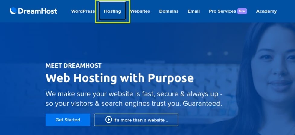
Hitting the Tab key should let you jump to different areas on the page. If it doesn’t, you’ve likely got some work to do. For help creating keyboard-friendly navigation, you can refer to the WebAIM keyboard accessibility design guide.
2. Use High-Contrast Colors
Some users may have difficulty seeing text if the color contrast is low. Therefore, we recommend using colors that have a high contrast ratio, such as black and white or black and yellow.
The color contrast throughout your site should ensure that all elements are distinguishable on the page. For instance, text should stand out rather than blending into the background.
There are a handful of online tools you can use to help you improve visual-accessibility. For example, you might find Contrast Checker useful when choosing your site’s color palette:
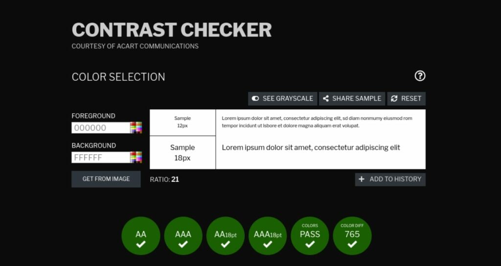
This tool lets you test out different color combinations. You can also use it to generate a score for existing color pairings on your site. For further guidance, you can also refer to WordPress’ Handbook on the appropriate use of color.
3. Provide Alt Text for Images
If you use images on your website, be sure to provide alternative text (alt text) that describes the image. This way, users who are unable to see the image will still be able to understand the content of the page when using assistive technologies such as dictation software.
You can add alt text to images in WordPress through your Media Library:
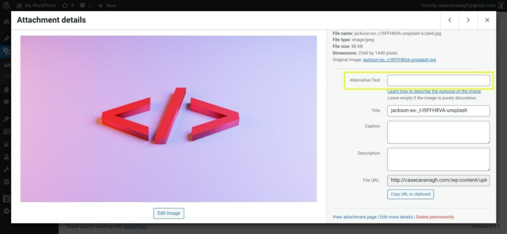
Another benefit is that alt text can help optimize your site to be more visible in search engines. You can use it to incorporate frequently-searched key terms that are relevant to your images.
4. Use Heading Hierarchies to Structure and Organize Content
Breaking up your content into smaller sections can make it easier to read. That’s why using headlines and lists to organize information on your pages can increase web accessibility.
Clear headings can help screen readers understand and interpret your pages. This also assists in-page navigation and helps those using assistive technologies browse the contents of your page.
WordPress recommends using a set heading hierarchy, which includes using one H1 per page (typically for the title) and H2s and H3s for subsections:
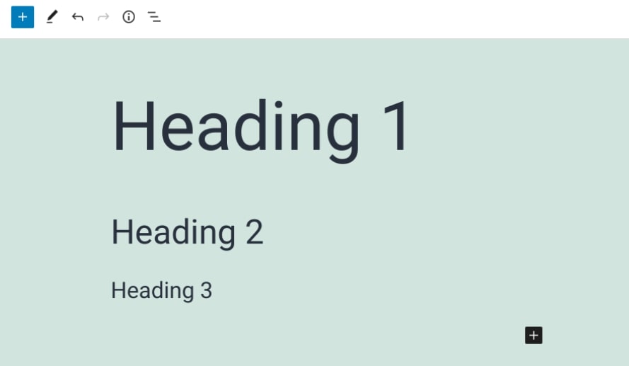
It’s best to use these headings in order, meaning H2s should come after the H1, followed by H3s, then H4s (if necessary). This level of organization and flow can also help out readers with cognitive disabilities.
5. Add Captions and Transcripts to Videos
If you include videos on your website, you’ll want to provide captions or transcripts so that users who are deaf or hard of hearing can still enjoy the content. Closed captioning and text transcripts let those using screen readers consume your content without having to rely on the visual imagery or audio alone.
As of WordPress 5.6, you can add captions and subtitles to WordPress videos by using the Web Video Text Tracks Format (WebVTT) feature. To access it, simply insert a Video block on your page, then select the Text tracks button in your horizontal navigation menu:
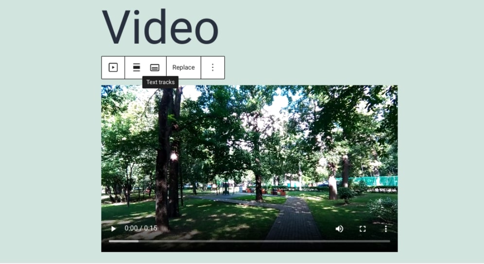
This will let you attach or upload a VTT file to your video. You can also use services such as Rev to create transcripts for your videos.
6. Design Forms Carefully
Forms can be difficult to use for some users, so it’s important to design them carefully. This includes making sure each field is clearly labeled and that the form is easy to navigate.
For example, you’ll want to place the labels directly adjacent to their corresponding fields. Additionally, it’s smart to include brief instructions that inform users exactly what they need to know in order to appropriately fill out the form.
You could also include placeholders with text that appear in the form fields as an example for users. This way, they have a better idea of how they should be filling out the form.
Plugins such as Formidable Forms come with helpful accessibility tools built-in:

This form builder includes WCAG 2.0 standard compliance. Furthermore, it’s screen-reader ready and allows you to use high-contrast text. Plus, it’s keyboard-navigation-friendly. All of this can make it easier for visitors to complete your WordPress forms.
Make It Easy for Everyone To Access Your Site
Continued improvements in web accessibility are reason to celebrate. After all, if you run a WordPress website, you likely want to reach as many people as possible, including those with disabilities or impairments. Fortunately, designing your website with accessibility in mind is becoming easier and easier.
In this post, we discussed many strategies you can use when designing an accessible website. For instance, you can make sure that your website is keyboard-navigation friendly to be compatible with assistive technologies. You can also use alt text and video transcriptions for all your visual media. Most importantly, when you follow our simple guide, you can support a more equitable web experience, ensuring that your site is available to as many people as possible.
Want to hire a developer who can maximize web accessibility for your evolving WordPress projects? If you’d rather leave this important task to the professionals, check out our DreamHost Development Pro Services!
You Dream It, We Code It
Tap into 20+ years of coding expertise when you opt for our Web Development service. Just let us know what you want for your site — we take it from there.

The post How to Design an Accessible Website (A Complete Guide) appeared first on Website Guides, Tips & Knowledge.
source https://www.dreamhost.com/blog/make-your-website-accessible/
No comments:
Post a Comment