As a website designer, you play a significant role in a website’s accessibility and inclusiveness. Many design elements, from typography to media, can create barriers for those with disabilities. With so many items that need to be addressed, it may feel like an impossible task.
Fortunately, there’s a lot of guidance available for designing a website that’s accessible to all. By giving careful attention to a few key areas, you should be able to include accessibility in your design process without breaking stride.
In this guide, we’ll introduce you to the concept of web accessibility and its importance. Then we’ll cover six key areas to keep in mind when designing an accessible website. Let’s get started!
An Introduction to Web Accessibility
Web accessibility means that all aspects of a website are usable by people with disabilities. Without it, much of the information on the internet would be inaccessible to a large percentage of the population. For online business owners, this would also equate to losing out on potential sales.
As of 2019, nearly 60% of the United States population with disabilities lived in a home with internet access. That translates to a lot of people who rely on accessible design to use the web fully. People with disabilities also tend to adopt technology at lower rates, meaning they may not have an option for which device to use when accessing a website.
The World Wide Web Consortium (W3C) developed the Web Accessibility Content Guidelines (WACG) to provide a set of standards to developers, designers, and others responsible for creating and maintaining content on the web.
The accessibility guidelines are organized into four principles, sometimes referred to by the acronym POUR:
- Perceivable: Website components must be presented in a way that users can perceive, regardless of disability.
- Operable: Navigation and operation must not require input actions that a user cannot perform.
- Understandable: Users must understand how to use and navigate a website and the content on it.
- Robust: Content needs to be compatible with current and future assistive technology.
These principles can seem overwhelming and even somewhat vague. However, there are concrete steps you can take to ensure that your website is accessible to everyone.
Get an Inclusive Design You’re Proud Of
Our designers will create a gorgeous website for your brand with usability guidelines and ADA compliance in mind. No accessibility problems here!

Web Accessibility Guide for Designers (6 Key Tips)
Having touched on how vital web accessibility is, let’s look at six areas to consider when designing an accessible website.
1. Make Visual Design Elements Readable
Typography is a fun area to showcase your creative flair, but the primary purpose of your website’s text is to convey information. There are a few guidelines to be mindful of when working with typography.
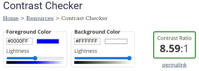
First, you’ll want to think about the contrast between the text and the background. Contrast is expressed as a ratio, and per WCAG guidelines, the minimum contrast is 4.5:1 for normal text and 3:1 for large text.
There are several tools you can use to test color combinations. WebAIM’s Contrast Checker is one of these.

Line height and letter spacing also come into play where accessibility is concerned. To keep text readable, W3C provides the following guidance:
- Line height must be at least 1.5 times the font size.
- Spacing between paragraphs should be two times the font size.
- Spacing between letters must be at least .12 times the font size.
- Word space should be at least .16 times the font size.
Graphs are another way to present a lot of information in an easily understood format. However, if you’re only differentiating the elements by color, you could be shortchanging many people. In fact, there are about 3 million colorblind people worldwide who could be struggling with your content.
To be certain visual elements are understandable, consider using patterns as well as color in your graphs. When selecting designs, we recommend choosing ones that are different enough from each other. For example, lines or dots are easily discerned, whereas lines of varying thickness may not be.
Related: Leveling the Web: 12 Questions with Accessibility Expert Gian Wild
2. Organize Content for Easy Understanding
No matter what type of website you’re designing, chances are there is a lot of text. You can improve accessibility by structuring content in a way that’s easy to skim and understand.
First, most users will appreciate you breaking your text up into short paragraphs. People often aren’t reading deeply on the web, and shorter sections are easier to scan through.
Headings are also crucial to scannability. Each heading should accurately describe the content beneath it and follow a logical hierarchy. This means using larger headings first and progressively smaller ones as you cover more specific information.
Using appropriate markup for your headings can make it easier for screen readers to read and navigate your content. In HyperText Markup Language (HTML), you’ll use tags <h1> down to <h6> to create hierarchical headings to break up your text.

When adding links to your content, be sure the anchor text is descriptive enough that readers will know where clicking on it will take them. Also, it’s smart to mention if the link will open in a new window. A window opening unexpectedly can cause issues for screen readers and confuse the user.
You should also let your users skip through the content without using a scroll wheel or repeatedly pressing an arrow key. This can be as simple as including a table of contents at the start of a blog post. You can also have a button that skips right to the main content of the page.

Next, we’ll explore some ways you can make interacting with your website easier.
3. Keep User Interface (UI) Elements Intuitive and Device-Independent
User Interface (UI) elements are anything on a website that visitors need to interact with to navigate, and they play a major role in the overall User Experience (UX). UI elements can include scrollbars, dropdown menus, and notifications.
For a website to be considered accessible, people using different devices need to be able to interact with these UI elements successfully. This means that device-independent design is crucial.
For example, some people are only able to use keyboards. To make it possible for them to navigate a webpage, you can include focus indicators to highlight buttons, links, and text fields when a user tabs through a page.
Anything on your website that can be interacted with should have a corresponding focus indicator. The appearance can vary from one browser to another, but they typically show up as a blue or white outline depending on the background color.

When adding focus indicators, you’ll need to define tab order. This order should be similar to how you read: top to bottom and left to right. You can test this by tabbing through your site.
Try to keep navigation and other menus in a consistent order throughout the website. These elements should also appear in roughly the same locations on each page because it makes them easier to memorize and quicker to use.
Touch targets are the areas a user taps when using a touchscreen device. When defining touch targets, you’ll want to be sure they’re large enough to be easily tapped by anyone. For example, people with neuromuscular disorders may lack the fine motor control needed to interact with a tiny target.
However, you also don’t want to create targets so large that they overlap with nearby elements. Tapping one button when you were aiming for another is enough to frustrate anybody.
Some users rely heavily on keyboard shortcuts. While you can define shortcuts for your website, it may not be the best course of action. Keyboard shortcuts are not standardized across the web, and any you create may conflict with the device someone is using. If you decide to add custom shortcuts, be sure to make this clear and provide guidance for using them.
There are some types of interactions that aren’t available on every device. For example, while pinch-to-zoom is convenient for mobile phones, it’s impossible on any computer without a touchscreen. Be sure content isn’t locked behind actions your users may not be able to perform. Provide multiple avenues to your information.
UX is a highly involved area of web design with a lot of moving parts. Therefore, you might consider adding a section to your style guide to help maintain consistency for all UI elements across your website.
Related: 10 Ways to Make Your Website Accessible
4. Make Input Controls User-Friendly
Input controls are a subset of UI elements intended to accept input from a user. Examples include text fields, checkboxes, and radio buttons.
Forms can be tricky to design with accessibility in mind, but there are some guidelines to follow. You can start by labeling each field of your form. You might also include some example text in the field itself.

When laying out forms, we suggest using a vertical structure and placing each field on its own line. This makes navigating the form easier for keyboard-only users. On a related note, ensure that focus indicators are placed throughout the form.
You might break long forms into multiple sections as they can be overwhelming. You could also add a progress bar for people to know where they are in the process; this is likely to be appreciated by your users.
Finally, be sure to provide error messages that are clear and easy to understand. If possible, don’t clear the entire form when an error is made. It’s a good idea to include instructions for how to fix the mistake as well.
5. Include Multiple Ways to Enjoy Media
Media can add a lot to a website, but there are accessibility issues to be mindful of. Fortunately, you can ensure that any media you use is enjoyed by everyone.
First, some types of media are best avoided altogether. Flashing animation or pop-ups can potentially trigger seizures in some people. You may also want to skip scrolling text or animated content that can’t be paused. It can be difficult or even impossible for some users to absorb.
If you feel the need to include scrolling or animation, there are ways to make these elements more accessible. Be sure text moves slowly enough that visitors can read it easily. In addition, make it possible for users to pause the content and be clear about how to do so.
When you create video content for your website, you can include closed captioning for the deaf and hard of hearing. You should also add a text transcript of the video’s content for those using a screen reader.
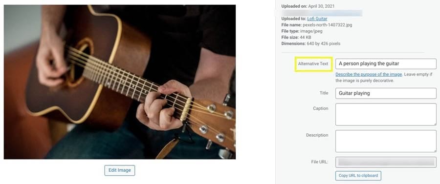
Visitors who use screen readers can sometimes have a difficult time with images on a site as well. To make it possible for these people to see what is happening in a picture, you can include alt text.

Alt text is a description intended to show up when an image fails to load. However, screen readers also speak this text, so those with visual impairments don’t miss out.
When you’re writing alt text, you’ll want to be as descriptive as possible. You can base your description on what is featured in the image and the context of the surrounding content. Also, there’s no need to include the words “Picture of…” at the start of your alt text, as the screen reader will add that automatically.
Related: What Is UX Design (And How Can You Use It to Build a Site for Your Audience)?
6. Perform User Research and Testing
User research and testing probably aren’t as exciting to you as the design process, but they’re crucial for nailing accessibility. User research is best done early in the process to get a handle on who your users are and what they expect from you. You can do testing throughout the design process to help keep you heading in the right direction.
Thorough research ensures that none of your users will fall through the cracks and will help you develop a plan for designing your website. You might use focus groups or surveys to determine what users need from your website and how they intend to use it.
You’ll likely want to do some testing throughout the site-building process. You might try A/B testing at the wireframing stage when there’s still time to pivot. Once your site goes live, you could observe people using your website and ask for their thoughts as they accomplish specific tasks.
During research and testing, it’s best to gather a diverse group of participants. Including those of all abilities gives you a better chance of designing a site that works for everyone.
You can also perform testing yourself, such as trying to navigate your website using only your keyboard. For other elements of accessibility, you might want to try a plugin such as WP Accessibility.

This plugin is free to use. It can help you correct a variety of accessibility issues.
DreamHost Takes Inclusivity Seriously
We regularly report on diversity, accessibility, and representation in the tech industry. Subscribe to our monthly newsletter so you never miss an article.

Let’s Make Accessibility Standard
Focusing on accessibility during the design process can result in a website that’s accessible to everyone. While it may seem like a lot to keep track of, the payoff is well worth the extra effort.
Keep the following in mind when you’re designing your website:
- Make visual design elements readable.
- Organize web content for easy understanding.
- Keep User Interface (UI) elements intuitive and device-independent.
- Make input controls user-friendly.
- Include multiple ways to enjoy media.
- Perform user research and accessibility testing.
Building an accessible website is a lot easier with the right web host in your corner. DreamHost’s Shared Unlimited hosting can ensure that you get off to a great start with a fast and reliable website!
The post Web Accessibility Guide for Designers (6 Key Tips) appeared first on Website Guides, Tips & Knowledge.
source https://www.dreamhost.com/blog/web-accessibility-guide-for-designers/

No comments:
Post a Comment