Here at DreamHost, we believe everyone should be able to use any website on the internet, regardless of any disability they may have. However, while we care about web accessibility, we also understand that designing a website that’s both accessible and visually attractive can be challenging.
The good news is that accessible websites don’t have to be ugly. On the contrary, some stunning websites out there are designed with accessibility in mind — which we could all learn a thing or two from.
In this post, we’ll start by showing you what strong web accessibility looks like. Then we’ll show you seven of the best web accessibility examples on the internet and see what we can learn from them. Let’s get started!
Create a Website for All
We make sure your website is fast and secure so you can focus on the important stuff.
What Great Web Accessibility Looks Like
According to The World Bank, over 15% of the global population has some form of disability. These can include:
- Visual impairments: Some users have visual impairments that inhibit their ability to see clearly or perceive color contrasts
- Hearing impairments: This includes deafness and partial hearing loss.
- Physical disabilities: Some people have mobility impairments that can impact their dexterity and ability to make precise movements, possibly making using a mouse difficult.
- Cognitive disabilities: Conditions like dyslexia and dementia can affect a person’s cognitive abilities.
It’s important to keep all of these different challenges at the forefront of your mind when creating your website to ensure there are no barriers to disabled users. To help web designers with this, W3C has developed a set of Web Content Accessibility Guidelines (WCAG).
Solid web accessibility means adhering to these guidelines and carefully following the four guiding principles of web content accessibility. These guiding principles state that all websites should be:
- Perceivable
- Operable
- Understandable
- Robust
Ensuring that your website is “operable” might mean implementing keyboard-friendly navigation for people who cannot use a mouse. “Perceivable” might mean making sure to use high-contrast colors for people with visual impairments.
We’ve already outlined 10 practical ways to implement the web accessibility guidelines and make your website more accessible (including advice on accessibility testing and UI components). Now we’re going to look at some examples of websites that are already doing it right.
Related: Leveling the Web: 12 Questions with Accessibility Expert Gian Wild
7 Great Web Accessibility Examples to Inspire You
Below, we’ve listed some of our favorite web accessibility examples. These seven websites set the bar when it comes to accessibility.
1. Scope

Scope is a disability equality charity based in England and Wales dedicated to creating a fairer, more equal society. As a champion of disability equality, you’d expect that this organization’s website would be as accessible as possible — and it is.
Not only does it fully adhere to WCAG 2.0 and WCAG 2.1 guidelines, but the site is even customizable for individual users. For example, users can change the site’s colors, increase the text size, or even turn on text narration to have the content read aloud.
If you look at the top-left section of the home page, you’ll see an Accessibility tab. Click on this, and the site will bring you to its accessibility page, which includes instructions on how to adapt the experience to your needs, links to assistive technologies, and a list of known accessibility issues that are being worked on.
Scope uses short sentences and large, clean fonts throughout the site for maximum readability. Plus, the site is fully compatible with screen reader software.
Despite already being a fantastic example of website accessibility, the team at Scope continues to make improvements. Every three months, they test the website for accessibility and make updates where necessary.
2. Paralympic.org

Paralympic.org is the official website of the International Paralympic Committee (IPC). The IPC is a powerful advocate of social inclusion, and its website is a testament to that.
It features keyboard-friendly tab navigation and an instant “scroll-to-top” button to make it easy to move around the page. Images and videos are large and highly visible, and there’s plenty of white space to make visual elements stand out.
If you go to the home page, you’ll notice a text size adjuster in the top-right corner of the screen. This is easily visible and allows users with visual impairments to quickly customize the size of the text to meet their needs.
Related: What Is User Experience (And How Can You Use It to Build a Site That Suits Your Audience)?
3. KidzWish

KidzWish is an organization that provides therapy, support services, and an annual Christmas party for children who are disadvantaged or have a disability. It caters to many people with different disabilities, so naturally, it needed to build a website that was as accessible as possible.
It definitely achieved that goal. The KidzWish website is wonderfully designed, with a logical structure, keyboard-friendly navigation, high-contrast colors, and large text. Plus, it’s easy to navigate with prominent, clickable elements.
The design is also very child-friendly. It boasts a bright, bold color scheme and tons of fun graphics.
4. SSE Energy
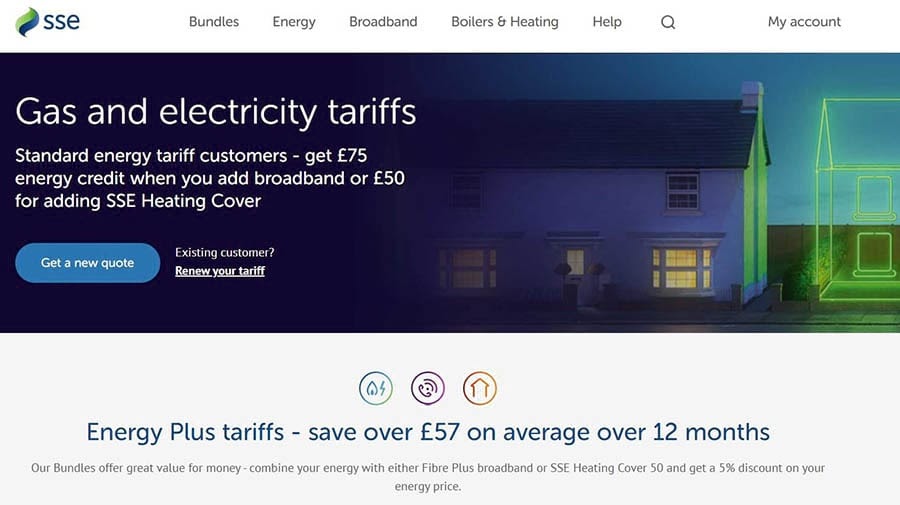
SSE Energy is a UK-based energy company. Its website features information about tariffs and bundles and includes a main login portal for its customers to service their accounts.
The company has done a wonderful job of making the site accessible to all by using large readable text and a clear interface. It also incorporates keyboard navigation to make it easy to get around the site.
The designers went above and beyond to ensure that the site is accessible to visually- and hearing-impaired users. There are SignVideo services for British Sign Language users, and the color contrast meets WCAG guidelines.
Customers can also request bills in Braille and larger formats. In addition to all of this, the site is compatible with assistive technology.
5. BBC iPlayer

BBC iPlayer is the BBC’s online streaming service. Its website is where users go to watch programs online. It’s also another fantastic web accessibility example that we can all learn from.
First, the website is both very easy to navigate and compatible with assistive technology. You can move around the page by clicking on the Tab button. Navigating over the iPlayer logo brings up an option for Accessibility help, which links to a resource page with a lot of useful information for users with disabilities.
The content is logically laid out, and all buttons use a clear visual design with high contrast colors. There are also keyboard and mouse-accessible tooltips that provide extra information for users and descriptive alt text for all images.
The video content is also accessible. All shows on BBC iPlayer feature subtitles. There are also audio-described and signed content categories.
Related: 10 Ways to Make Your Website Accessible
6. NSW Government
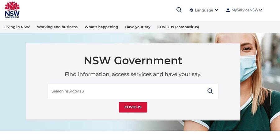
The NSW Government website is the government hub for the New South Wales area of Australia. It’s perfectly designed to make it easy for residents of all backgrounds and abilities to use.
This site features tab navigation, making it simple to navigate pages using a keyboard or screen reader. Thanks to large fonts and contrasting colors, it’s also extremely readable and is compatible with assistive technology.
7. GOV.UK
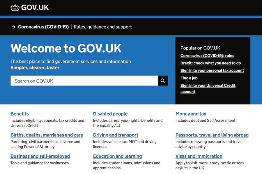
GOV.UK is the central hub for all U.K. government web pages. It can be used to access everything from information about benefits and disability aid to visa and immigration support.
The U.K. Government has done an amazing job of making its site accessible for everyone who needs it. The site features keyboard navigation and ARIA attributes, making it easy to find pages and navigate the site. It also is adapted to support 300% zoom for visually impaired users.
DreamHost Takes Inclusivity Seriously
We regularly report on diversity, accessibility, and representation in the tech industry. Subscribe to our monthly newsletter so you never miss an article.

Make an Accessibility Statement
Making sure your website is as accessible as possible is both a moral and a professional obligation. It might seem like a challenge, but it’s worth it. You can simply follow in the footsteps of the web accessibility examples above to create an inclusive website that all users can enjoy.
Ready to build your accessible website? Let us take care of the technical side for you, so you can devote more of your time and energy to what matters: the design. Sign up for our Shared Unlimited Hosting Plan and get unlimited, secure hosting for all of your websites!
The post 7 Great Web Accessibility Examples to Inspire You appeared first on Website Guides, Tips & Knowledge.
source https://www.dreamhost.com/blog/great-web-accessibility-examples/
No comments:
Post a Comment