Tuesday, 24 November 2020

Black Friday and Cyber Monday 2020: What to Expect and How to Score the Best Deals

To say everything has been different in 2020 is an understatement. Ever since COVID-19 hit, life has been turned around, from work to school to play. That goes for the upcoming holiday season, too. You might have to carve the turkey over Zoom this Thanksgiving.

And the typical shopping sprees that follow on Black Friday and Cyber Monday will be different too.

The Centers for Disease Control and Prevention (CDC) even posted a guide on how to safely celebrate Thanksgiving during the pandemic, including the holiday shopping season. They advise staying close to home and skipping the in-store doorbuster deals in favor of bargain hunting online.

But just because things have changed doesn’t mean you still can’t get into the holiday shopping spirit to nab the best deals of the year. The good news is you can still score major bargains while staying safe. We consulted the experts to help you do just that!

Create a Budget

“Given the economic impact of COVID-19, some Americans’ budgets will be tighter this holiday season,” says Sara Skirboll, Shopping & Trends Expert at RetailMeNot. “Nearly a third of Americans impacted by COVID-19 (30%) say they will have less money to spend on holiday gifts this year.”

There’s a good chance COVID-19 may have impacted your budget, so the first step should be assessing exactly how much you have to spend, which may be a very different number than last year. Even if wallets are a little slimmer this season, many families are forging ahead, as usual, to create a bright spot for the holidays after a tough 2020.

“Consumers are searching for normalcy this year,” Skirboll says. “In fact, 66% of Americans will spend the same amount or more on holiday shopping this year to create normalcy for their family.” Decide what’s reasonable and responsible for your own family.

The Crowds Will Be Online

Unsurprisingly, data shows that most people will be shopping online instead of in-store this Black Friday.

“While we expect the same amount of people to be shopping during Black Friday, online traffic will be significantly higher than in-store traffic,” says Jon Vincent, founder of EarlyBlackFriday.com. “This is due to the fact that retailers will be pushing their customers to shop online and avoid a potential COVID-19 liability in their stores. The last thing retailers want to hear is that a super spreader event happened during their in-store Black Friday sale!”

EarlyBlackFriday.com predicts a 25% increase in online shopping during Black Friday compared to Black Friday 2019. Traditionally, retailers offer their best Black Friday deals exclusively in stores, but now retailers will be putting their best doorbuster deals online.

“This will limit the reasons for people to shop in stores,” Vincent says. “In fact, we highly recommend you do not go to the stores at all this Black Friday because every deal can be grabbed online safely from your home.”

Know There Are Still Deals

It’s no secret that many retailers are hurting after a tough year. While you might assume that means they’re less likely to slash prices, surprisingly, the opposite is true.

“Retailers will be very aggressive this year,” says Jeff Rosenblum, co-founder of digital agency Questus. “They are facing pressure to generate revenue to offset the decrease in traditional retail sales and maximize the performance of their digital storefronts. Shoppers can capitalize on this pressure by taking advantage of attractive discounts and promotions.”

This could be one of the best years ever for Black Friday bargains.

Make a List

Man sitting at a desk writing in a notebook.

Retailers have always offered doorbuster deals that were too good to turn down to get people in stores with the plan that people make impulse buys while there.

“By shopping online, it helps cut down on those last-minute impulse purchases,” Vincent says. “We suggest you do your research ahead of time by viewing the Black Friday ads in advance and creating a shopping list. By having a well-researched shopping list, you’ll feel better about sticking to it instead of being tempted by a different deal that you might see online.”

Determine if the Price Is Right

Just because something says “Black Friday deal” or “Cyber Monday sale” doesn’t mean its price has been significantly slashed. It’s up to you to do some detective work to determine if you’re actually getting a good deal.

“There is a two-step process that consumers should follow to ensure they are getting the best deals,” Vincent says. “First, on EarlyBlackFriday.com, each retailer’s Black Friday ad is leaked weeks in advance. Take your shopping list and visit the retailer’s website that day to see what the current price of the item is. This will give you an indication of how hot a Black Friday deal is. For example, if the current price is only $10 more than the Black Friday price, the deal might not be that great. Finally, compare prices with other retailers, starting with Amazon.com. If Amazon’s price is significantly higher than the price being offered during Black Friday, you know it’s a great deal.”

Learn Where to Shop — and When

“Take advantage of key retail holidays like Cash Back Day, Black Friday, Cyber Monday, Prime Day, and Free Shipping Day,” Skirboll says. “You can score deep discounts on everything from apparel and electronics to beauty, toys, home goods, and more. Shopping on these occasions will help stretch your dollars further. Scour the internet for what’s on your shopping list as some retailers might offer it at a better price or have better offers. Don’t assume you’re getting the best deals until you have searched for coupons and cash-back offers. Do your research and price compare.”

Take a two-step approach by searching for a sale or coupon code and combine that with a cash-back offer to stack your savings.

Often, the bigger the retailer, the better the deal. “Traditionally Target, Walmart, and Best Buy have been the best places to find deals during Black Friday, and we expect that trend to continue this year,” Vincent says.

Even DreamHost will have a Black Friday sale.[a]

Go Big This Black Friday Weekend

Our automatic updates and strong security defenses take server management off your hands so you can focus on generating sales.

Search Online to Your Advantage

Hands holding a smartphone while shopping online.

Getting a pop-up ad online for something you just searched for can be annoying, not to mention a little creepy. But that can actually be connected to you landing the best price.

“There is great value to be garnered by letting brands know you are in the market for a specific product,” Rosenblum says. “When shoppers go on search and social media for specific products, their data is shared with retailers who will then target shoppers with advertisements and promotions. While most of the press and conversation we hear is about data privacy, it’s important to note that data can be a valuable tool. When shoppers search for products, the data signals are analogous to walking into a retail store and asking a salesperson for assistance finding specific products.”

Practice Online Safety

Technology can work for and against you. “Beware of email phishing,” cautions Skirboll. “It’s best not to click on links from senders you don’t recognize. Be sure to hover your mouse over links without clicking to see if the address is really taking you to where it says it will. Before sending any personal information over the internet, make sure the website has ‘https://’ at the beginning of its web address. The ‘S’ at the end of HTTPS indicates that the website is secure and your information is encrypted, which makes it safe to enter a credit card number or other personal information.”

While it’s fine to look up reviews or compare prices using public Wi-Fi, avoid logging on to any sites with sensitive personal information, warns Skirboll. Public Wi-Fi is often vulnerable to people who are looking to steal your info. To ensure your computer and personal information are safe, use anti-virus software on your computer or mobile device, and keep it up to date.

One last tip: Always buy with a credit card when you can.

“A credit card provides additional protections over a debit card in case of fraudulent transactions,” Skirboll says. “If your card number is compromised, it’s easier to dispute any charges that you didn’t approve. Using a card also decreases the transference of germs compared to shopping with cash.”

Be Social Media Savvy

If you don’t already follow your favorite brands on social media, now is the time to do so, and sign up for their email newsletters as well. They sometimes will post special sales and offers exclusively for their followers on Black Friday and Cyber Monday.

“Shoppers should monitor Twitter and Facebook feeds from major retailers to look for announcements on when the Black Friday deals are live,” Vincent says. “However, their announcements are sometimes hours after the sales have gone live and the most popular items have sold out. We suggest that you also follow earlyblackfriday.com on Twitter (@EarlyBF) and Facebook. We monitor each retailer’s website in real-time to look for when the deals are live and we will be announcing these sales on our social media feeds.”

And don’t forget to use apps to your advantage. “Be resourceful—check apps like RetailMeNot to find the latest sales, deals, and cash back offers from thousands of retailers,” Skirboll says.

Put Your Health First

Black Friday was built on doorbusters and fleeting in-person deals. But to make adjustments during the COVID-19 era, you can get the same bargains without having to leave your house.

“There is no reason to visit the physical stores on Black Friday this year,” Vincent says. “While the in-store shopping experience will be made as safe as possible, all of the same deals will be available online, so we do not feel that it’s worth the potential health risk to visit the stores. If customers do end up going to the stores on Black Friday, they can be comforted by the fact that retailers will be making social distancing and mask-wearing mandatory in all stores. Extra staff will be wiping down high-touch surfaces to help prevent the spread of COVID-19. Wearing a mask, practicing social distancing while shopping, and using hand sanitizer once you are done shopping are the best practices you will want to follow.”

If you’re nervous about shopping in-store this year, you’re not alone.

“Most Americans have concerns when it comes to holiday shopping this year during COVID-19,” Skirboll says. “Nearly nine in 10 (87%) are concerned about COVID-19 when thinking about holiday season shopping. Among those concerned, top concerns include other shoppers not following CDC guidelines (57%), being around other shoppers (57%), being around crowds during Black Friday shopping (54%), waiting in long lines due to reduced store capacity (50%), or shopping in stores with others (47%).”

For those reasons, Skirboll says 75% of shoppers will prefer online shopping for holidays, and 18% plan to complete holiday shopping online only. A whopping 88% of consumers say they will not shop the traditional in-store doorbuster deals this year, and Black Friday and Cyber Monday shopping will occur mostly online as more retailers choose to close on Thanksgiving.

“In-store will continue to have an important role,” Rosenblum says. “A lot of people have quarantine fatigue and are excited to get back to stores, and there are some categories where it’s really important to touch and feel products.”

Those who still feel the need to shop in person: Ensure retailers take health and safety precautions seriously. Before going to the store, Vincent advises visiting the retailer’s website, going to the store locator page, and selecting their local store location. There should be information on that page that lists the steps the retailer is taking to make their stores safe to shop in.

Next, when you visit the store, look for signage at the entrance that indicates that social distancing and mask-wearing are mandatory. If you don’t see those signs and there are customers without masks, avoid the store. Any time you see unsafe practices, the best thing to do is simply leave and stick to stores that respect their customers’ health.

Support Small Businesses 

Mom-and-pop shops have been hit especially hard this year, with many of them forced to permanently shutter their doors. That’s why it’s crucial to support small businesses as much as you can during the holiday season.

“Small businesses have to follow the same restrictions as larger retailers, which limit the amount of shoppers they can have in the store at once,” Vincent says. “To safely support your local small business, see if they have a website where you can place an order online or by phone. This will help them limit their in-store traffic so that other shoppers can shop in their stores. Finally, do not expect small businesses to match the extremely low prices you will find at a major online retailer. However, even if you have to pay a little more, it’s good to know that a local small business is benefiting from your sale.”

You’re Cordially Invited

Join DreamHost’s Facebook group to connect with like-minded website owners and get advice from peers and experts alike!

Are You Ready for the Black Friday and Cyber Monday Deals?

While 2020 may have been a dumpster fire wrapped in a trainwreck, Cyber Week should deliver some solid discounts (along with much needed holiday cheer).

Whether you decide to shop sales in-person or stick to online-only deals, taking the time to budget, create a wish list, and price check before you shop can help you get the most bang for your buck this holiday season. And no matter the time of year, it’s always important to practice online safety.

So tell us: Do you have any holiday sales hacks? Follow DreamHost on Twitter or Facebook and share your best tips for saving big on Thanksgiving weekend.

Above all, have fun, stay safe, and happy shopping!

The post Black Friday and Cyber Monday 2020: What to Expect and How to Score the Best Deals appeared first on Website Guides, Tips & Knowledge.


source https://www.dreamhost.com/blog/black-friday-cyber-monday-shopping-guide/

Tuesday, 17 November 2020

How to Set SMART Goals for Your Website (In 4 Steps)

When you run a website, it can sometimes feel like you’re pulled in many directions at once. There are sales to make, content to publish, and customers to respond to. With so many obligations, it can be easy to lose sight of why you started your business in the first place.

However, setting Specific, Measurable, Attainable, Relevant, and Timely (SMART) goals for your website can help you focus your energy on what is most important. This concentrated effort can result in measurable progress toward a better site.

In this article, we’ll explain what SMART goals are, discuss why they matter for your site, and provide you with a few examples. Then we’ll walk you through how to set SMART goals in four simple steps. Let’s get started!

We’ll Support Your Dream

Whatever your goals, we’ll be right there with you, making sure your site is fast, secure, and always up. Plans start at $2.59/mo.

An Introduction to SMART Goals

As we mentioned above, SMART is an acronym for Specific, Measurable, Attainable, Relevant, and Timely. Goals that meet these five criteria tend to be more effective than overly broad, ambitious, or ambiguous ones.

Making more money” is a fairly common goal, for example, but it doesn’t fit the definition of a SMART goal. However, with a little tweaking, it could.

Here’s a quick breakdown of what each element entails and how it could be applied to turn the above goal into a SMART one:

  • Specific. A specific goal is narrow in scope and focuses on a single target. Getting as precise as possible with a goal comes in handy when building the necessary steps to achieve it. This gives you a clear bullseye to aim for. For example, how do you plan on making more money, and what resources will you use in the process?
  • Measurable. If a goal isn’t measurable, there’s no way of knowing if or when you reach it. Typically, creating a measurable goal involves choosing a number or quantitative metric to pay attention to, such as a percentage or dollar amount. For example, how much more money do you want to make? Whatever metric(s) you decide on, you’ll also need a way to track your progress, such as a bookkeeping system that measures your income.
  • Attainable. When it comes to your business, it’s not bad to dream big. However, you also want to be realistic. If your revenue has steadily grown by 5% per month, attempting to increase it by 20% may be impractical, especially if you’ve made no significant changes to your products, pricing, or promotions.
  • Relevant. No matter how small, every goal you set should align with and get you closer to your long-term objectives. Consider why you created your site in the first place. For example, increasing profits is a relevant goal if your site’s primary purpose is generating income. However, if it’s to showcase your writing in hopes of landing a book deal, a more relevant goal might be to increase readership.
  • Timely. SMART goals need to have a deadline or timeframe. Without a sense of urgency, you may not be motivated to achieve the goal. Therefore, give yourself enough time to work on your plan, but not so much that you procrastinate. For example, you might want to see your profits increase by the end of the quarter.

As you can see, with a little fine-tuning, it’s possible to take a vague goal (such as making more money) and turn it into a SMART goal that is more helpful and effective. Now let’s dive into why it’s necessary to set these types of goals for your website.

Why SMART Goals Matter for Your Site

Setting a SMART goal isn’t as simple as just stating what you want. You need to do some research and serious thinking to develop a goal that matches the SMART criteria.

So why is this strategy worth the effort?

SMART goals can be a useful tool for your site because they can help you see what’s working and what isn’t. If you’re just starting out, having goals can encourage you to keep an eye on your site’s metrics, which can be a hard habit to get into.

Tracking a goal can help you understand which metrics are crucial to pay attention to and provide you with some motivation to keep monitoring those numbers. What’s more, it can help you accomplish your goals faster by forcing you to focus on the most critical objectives of your website.

Here are a few good goal examples:

Overall, working on SMART goals can give you an idea of where you’re currently at, what you might want to achieve, and how you can get there. The extra effort that goes into setting goals like this can pay off in the long run.

How to Set SMART Goals for Your Website (In 4 Steps)

By now, you probably have a solid grasp on what SMART goals are and why they matter. Let’s move on to discussing how you can set them for your own website in just four simple steps.

Step 1: Identify What Can Be Improved

The first step is to find the aspects of your website that could be a bit better. One way to do this is by identifying and interviewing stakeholders, which usually means department heads. However, if you’re the only employee, get ready to put on all your different hats.

Spend time exploring and thinking about your website from various perspectives, and note your observations.

For example, have a look at your content. Is it engaging and valuable? Also, look at your content creation process and think about whether you can improve it or change it to be more efficient.

Additionally, it’s smart to consider your site from a sales, customer support, and IT perspective. If you’re having trouble with this, it might help to dig into your sales reports or customer inquiries to try and pinpoint common or recurring issues that crop up.

Step 2: Determine a Reference Point

Next, you’ll want to set a reference point by determining where your website currently stands. If you don’t do this now, it will be difficult to tell if your efforts have any effect. This prep work can help you set goals that matter and actually move your business forward. In other words, this is a large part of creating relevant goals.

For example, you may be planning to put some extra time and energy into getting more site traffic. However, if you ultimately want to make more money, you need to focus on getting the right traffic, not just more of it. After all, there’s a difference between visitors and customers.

To increase the quality of your traffic, you may want to try creating stronger, more tailored content and making updates to what you already have. You can also try looking at your existing content from a Search Engine Optimization (SEO) standpoint.

Yoast SEO can give you an idea of where you’re at.

The Yoast SEO website homepage.

This is a freemium WordPress plugin that analyzes your site content and makes suggestions for improving it using target keywords. It can also be useful for performing an SEO audit to use as a reference point.

Of course, the SEO tools and solutions you use to figure out where your site stands depend on the goals you’re setting. However, it’s essential to have a performance baseline to work from.

Step 3: Set Some Goals

Now that you’ve gathered some information and determined a reference point, it’s time to start setting your goals. While it can be tempting to chase after a few at once, try to limit yourself to no more than two goals at a time.

This can be difficult if you have a lot to accomplish, but you’ll likely make more progress if you laser focus your efforts. Also, some of your goals may be short-term in nature.

For example, if you’d like to create a new lead magnet, you probably won’t need an entire month to do it. More likely, this is something you can take care of in an afternoon of dedicated work.

Once you’ve selected the goals you’re going to pursue, make sure to write them down. Put them in your calendar, your day planner, on a sticky note on your monitor — any place that you’ll see them every day.

Step 4: Track Your Goals

As you work toward your goal, it’s critical that you track the key metrics that will inform you about your progress. Doing this can help you determine what is and isn’t working.

If your goal is to get more traffic to your blog, increase engagement or conversions rates, or something similar, you might want to use Google Analytics to see if you’re hitting your desired numbers.

Google Analytics data analysis tool.

Remember: If you don’t meet your goal, that’s OK!

Use it as a learning experience and try to figure out why you fell short. Perhaps the goal was too ambitious, or you just need to change your approach and try again.

The important thing is to try not to be discouraged. Even if you didn’t reach your goal, you likely came away with valuable information to use in the future and make some improvements along the way.

Ready to Set Some SMART Goals for Your Website?

Whether you need help finding a target audience, crafting the ideal social media strategy, or setting up a newsletter, we can help! Subscribe to our monthly digest so you never miss an article.

SMART Goal Setting

Working without a clear idea of what you want or how to accomplish it can be incredibly draining. Setting a few SMART goals gives you a better chance of directing your energy where it will result in the biggest payoffs.

For best results, try following these four steps when setting your own SMART goals:

  1. Identify what can be improved. Take some time to evaluate your website and processes from different perspectives.
  2. Determine a reference point. You’ll have a much easier time setting SMART goals and measuring your progress if you have a clearly-defined starting point.
  3. Set some goals. Use the information you’ve gathered to create goals that are Specific, Measurable, Attainable, Relevant, and Timely.
  4. Track your goals. Monitor your progress as you work through your plan, and be prepared to make changes if you don’t hit your goal the first time.

If your goals include driving more traffic to your website, you’ll want to choose a quality hosting provider such as DreamHost. Check out our high-performance, reliable managed WordPress hosting plans to learn how we can help!

The post How to Set SMART Goals for Your Website (In 4 Steps) appeared first on Website Guides, Tips & Knowledge.


source https://www.dreamhost.com/blog/how-to-set-smart-goals-for-your-site/

Thursday, 12 November 2020

17 Great About Us Pages to Inspire You

Every business needs a website. And every website needs an About Us page.

Actually . . . take two steps back.

Let’s revise that.

Every website needs a unique and exciting About Us page that compels visitors to buy your product or service.

Stick with us, and we’ll look at what an About Us page is and why you need one. More importantly, we’ll discuss how to create compelling About Us pages that build trust, increase conversions, and boost retention rates.

After that? We’ll dip into 17 examples of unique and exciting About Us pages and delve into what it is about them that makes them worth a special mention.

We’ll Support Your Dream

Whatever your online goals, we’ll be right there with you, making sure your site is fast, secure, and always up. Plans start at $2.59/mo.

What Is an ‘About Us’ Page?

In short, it’s a page that serves to inspire people — either to work with you or to buy your product. It can contain (but isn’t limited to containing) your brand story, your achievements, and your best testimonials.

What Is an ‘About’ Page Not?

An About page is not a page for pushing a hard sell or a page for boasting about your business. It should offer an up-front and honest portrayal of your company, its story, and your brand values.

So when creating an About Us page, you should make sure to:

  • Stay away from the hype. Users can see straight through it. Leave it for social media.
  • Avoid a sales pitch. If a reader is on your About Us page, there’s a good chance they’re considering using your service or buying your product. They’re looking at why they should choose you. So don’t sell your product or service. Sell you.

Why?

It’s simple: People work with people, and people buy from people.

Tips For Making Great ‘About Us’ Pages

You should now have a decent idea of what an About Us page should and shouldn’t contain.

We’re going to follow this with a few tips to help you stand out and create an About Us page that works for you and your business.

  • Be creative. Don’t fall into the trap of simply writing a brief summary of your business and calling it a day. The best About Us pages are creative, informative, and interesting.
  • Don’t follow the crowd. If someone’s reading your About page, there’s a good chance they’ve been reading (or will read) your competitors’ About Us pages. So, make sure your page stands out. It should make it almost impossible for a potential customer to forget you.
  • Feature faces. Consumers like to know who they’re buying from or working with, so make sure to feature at least some of your team on your About page. It can really help boost conversions.

Oh, and never use stock photography. Ever.

  • Be transparent. Your About Us page serves to sell your story and get buy-in from your visitors. Transparency is incredibly important to win your visitors’ trust.
  • Don’t forget about CTAs. Like any other page, About Us pages need calls to action. Many sites seem to forget that this is a key page for converting visitors. Make it clear to readers what you want them to do next.

How To Make An ‘About Us’ Page That Converts

1. Keep your copy simple.

Don’t litter the page with industry jargon and confusing copy. The words should leap off the page and inspire your visitors to take action. A block of text that visitors have to read six times to grasp is not going to cut the mustard.

2. Make sure your contact details are on the page.

This might seem obvious. However, we dug through countless About Us pages while researching this article, and you’d be surprised at how many we came across that didn’t contain contact details or even a contact form.

If a visitor’s got as far as looking at your About Us page, there’s a good chance they’re thinking of working with you or using your service. Don’t miss that opportunity to convert them by making them search for a separate contact page.

3. Put yourself in the readers’ shoes.

What do you think they are looking for? What do they need to know? Many About Us pages don’t seem to have considered these things. At all.

Does your page highlight your skills? Your knowledge? Your experience? Does it explain to readers the benefits of using your service or products? Does it reference your USPs?

4. Don’t be afraid to use visuals.

Consumers today are used to things being delivered fast. Whether it’s a product they’ve ordered or, in this case, information.

Are you able to sell your service or business in visuals and words? The human brain processes images much faster than words, so if you can, use both.

5. Include customer testimonials.

Trust in your brand is essential. Testimonials from genuine customers are a massive selling point and can help convert prospective clients into actual, revenue-generating customers.

Fancy going one step further?

Alongside customer testimonials, include quotes or endorsements from influencers or industry experts (if you can get them, of course).

6. Tell a story.

Tell your company’s history, but in a way that compels visitors to keep reading. Who doesn’t love a good story? Stories get visitors more invested in your brand. And that, naturally, leads to more conversions.

Bonus points if you can craft a more personal story.

7. Make sure the page loads fast.

This, of course, goes for every page on your site, but it’s crucial that key conversion pages load as fast as possible. Make sure to talk to your web developer and emphasize the importance of page load speed.

You can find out exactly how long a particular page of your site takes to load and what can be done to make it load faster with Google’s PageSpeed Insights.

8. Don’t forget the fold.

Ideally, all important information should be positioned above the fold. You should also guide users to scroll down and read more.

9. And mobile usability.

While it varies from industry to industry, more than half of internet browsing now takes place on mobile devices. So make sure your About Us page, and your site as a whole, is built for mobile first.

You can check if a page is mobile-friendly using Google’s Mobile-Friendly test.

17 ‘About Us’ Pages That Get It Right — And Why

Are you in need of some inspiration to help you build your ideal About Us page? Look no further. We’ve scoured the Internet to find some of the best About Us pages out there.

No matter your niche or what kind of business you run, you’ll be able to find some inspiration in these 17 examples.

Let’s take a look at each one and discover what makes these pages so unique and exciting (and worthy of inclusion on this list).

1. HERoines Inc.

The HERoines Inc. About Us page

What makes this a good About Us page?

  • The page itself is simple and aesthetically pleasing, and it loads fast.
  • It features photos of the team that seamlessly fit into the page design.
  • The colors and tones used match the rest of the site, creating consistency across all pages.
  • It covers the brand’s visions and goals using inspirational, engaging copywriting.
  • The CTA button sits to the right of the page and remains visible at all times.

2. Iconiq Creative

The Iconiq Creative About Us page.

What makes this a good About Us page?

  • It’s free of unnecessary words and gets straight to the point.
  • It features case studies, a client list, and their credentials — all in plain sight, for all to see.
  • They feature multiple testimonials (although this could be improved by slowing down the carousel or giving users the ability to scroll at their own speed).
  • They’ve linked to their founder’s website, so visitors can learn even more about the brand and its history.
  • It showcases their humanitarian work in a “Giving & Causes” section.

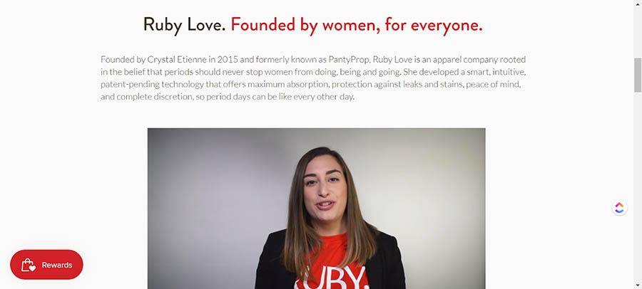
3. RubyLove

The RubyLove About Us page

What makes this a good About Us page?

  • The copy is upfront, accessible, and fun — despite the brand selling products that (sadly) still have some stigma attached to them.
  • It sets out their mission from the first sentence.
  • It’s not always a wise idea to sell on your About Us page; however, this site succeeds by soft-selling using videos, great imagery, and natural internal linking.
  • It features a section that boldly states the benefits of their products and how they can help you. In other words, the copy is user-centric.

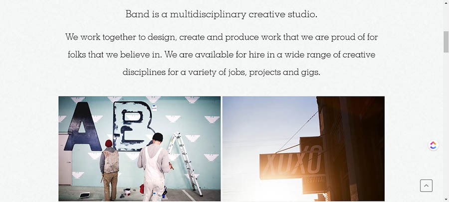
4. Band

Band’s About Us page.

What makes this a good About Us page?

  • As a creative studio, this About Us page demonstrates that knowing your user is crucial. The page kicks off with some fantastic imagery that reinforces their business mission.
  • The copy is minimal but covers what’s needed: who they are, why they exist, and why you should work with them.

5. Anton & Irene 

Anton & Irene About Us page.

What makes this a good About Us page?

  • This is one of the best one-page websites we found. Anton and Irene have effectively turned their entire site into an About Us page. It’s edgy and daring and, well, pretty unforgettable.
  • The photography for the team (just the two of them) is incredibly creative. When you hover over their figures, snippets of what’s beneath the veneers are revealed. This one definitely isn’t following the crowd. Exactly what a design brand needs.
  • It tells you who they are and what they do using one sentence and a few bullet points. In other words, it’s minimalist and to the point, while letting the user know exactly how Anton and Irene can help them.
  • It features where they’ve appeared and what they’ve achieved, and it breaks it down into fun sections using hard facts (with a side of cheeky humor).
  • Their contact information is some of the most detailed on this list, but it doesn’t feel tedious or over-the-top. It has that human touch. Largely because they’ve injected their personality into the entire page.
  • They top it off by featuring testimonials and highlighting the awards they’ve won — and they manage this without sounding like they’re giving you a sales pitch.

6. LessFilms

The LessFilms About Us page.

What makes this a good About Us page?

  • They understand their target audience. As a video production company, they (understandably) use video to tell their brand story, and they do it in less than a minute.
  • Everything else is kept to a minimum — they inject a little humor using bullet points that articulate who they are in less than 20 words. To top it off, they have a team member section that makes you feel like you know them personally. The page makes it almost impossible not to want to work with them.

7. Mailchimp

 The Mailchimp About Us page.

What makes this a good About Us page?

  • Despite being a big company, Mailchimp successfully manages to circumvent any corporate tropes. Instead, their About Us page makes you feel like you’re going to be working with a small team.
  • Each section is only a couple of paragraphs long. Despite having a ton to talk about, Mailchimp understands that the reader only needs top-level ideas (though you can go off and learn more, thanks to dedicated pages for the company’s culture and history).
  • At no point does the page feel like a sales pitch. It simply pulls you into what Mailchimp stands for and who they are as a company.

8. 500px

The 500px About Us page.

What makes this a good About Us page?

  • As an online network for photographers, you would expect great visuals on their About page, and it doesn’t disappoint — especially if you happen to be a dog person!
  • The page goes on to explain who they are and their commitment to their network. Plus, it’s completely free of fluff.
  • It sets out the benefits of joining the network, and it does it clearly and concisely.

9. GIPHY

The GIPHY About Us page.

What makes this a good About Us page?

  • If you’ve ever used a Graphics Interchange Format file (aka a GIF), then you’re probably aware of GIPHY. GIFs are fun. So GIPHY should be too. And they certainly haven’t let us down. They’ve seemingly taken their ethos, worked from the ground up, and created an About Us page that’s quirky, engaging, and completely on point when it comes to reflecting the brand and its identity.
  • And it’s pretty much done entirely using — you guessed it — GIFs.

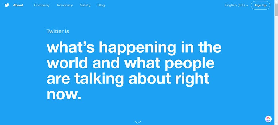
10. Twitter

Twitter’s About Us page.

What makes this a good About Us page?

  • Twitter’s About page hits the nail on the head when it comes to copy with brevity. It lays out who they are and what they stand for without going into too much detail. You know precisely what you’re going to get from the social network just by looking at their About Us page.
  • It does an excellent job of moving visitors down the funnel and getting them to sign up and start using the site. They do this in part by pulling trending content into the page. This gives readers a CTA to try the platform.

11. Moz

The Moz About Us page.

What makes this a good About Us page?

  • Moz is known for its transparency, and this shines through in their About Us page. It’s honest, to the point, and tells you their entire story — but without dragging on or going into unnecessary detail.
  • The page also acknowledges their faults and when and why that had to pivot their products to survive in their niche. This is pretty unique and impressive. Not all companies are so honest.

12. Cupcakes and Cashmere

The Cupcakes and Cashmere About Us page.

What makes this a good About Us page?

  • While Emily’s adopted a more traditional approach, this About Us page clearly conveys who Cupcakes and Cashmere are and what they do.
  • They do this using a set of strong visuals that show there are real people behind the brand with a legitimate mission.
  • The site also includes a comprehensive FAQ section where pretty much every question a reader could have is answered — right down to how their affiliate links work.

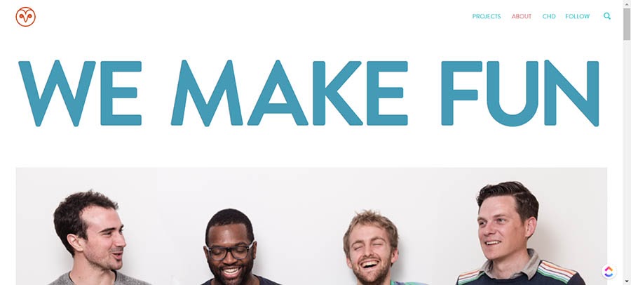
13. Eight Hour Day

The Eight Hour Day About Us page.

What makes this a good About Us page?

  • This is another creative studio that successfully reflects the quality of their work with a simple About Us page that doesn’t beat around the bush.
  • They tell you who they are, what they do and why they do it, and who they’ve worked with.
  • And they do it all on one page, using clear, concise, and engaging copy.

14. National Geographic 

The National Geographic About Us page.

What makes this a good About Us page?

  • Creating a more corporate About Us page that doesn’t feel stuffy and stagnant isn’t easy, but National Geographic manages to pull it off. The page begins with an inspiring video that’s right on-brand.
  • The page then discusses their mission, alongside information about their leadership team. It also features a job board.
  • Finally, they point you towards some of their most recent content — essentially a fairly subtle CTA.

15. Cultivated Wit

The Cultivated Wit About Us page.

What makes this a good About Us page?

  • As a comedy company, you’d expect their About Us page to be on the playful side. Cultivated Wit hasn’t let their visitors down. They’ve delivered engaging copy that articulates their mission statement in just a few hundred words.
  • Cultivated Wit also uses well-chosen team imagery that makes it crystal clear who they are and how they work.

16. Lonely Planet

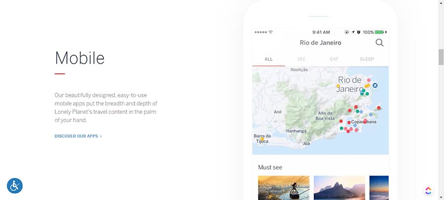
The Lonely Planet About Us page.

What makes this a good About Us page?

  • If you’re reading the About Us page on Lonely Planet, you probably already know what they do — and Lonely Planet gets this. So, instead of preaching to the choir, the focus is on how their site can help the user.
  • This page demonstrates the importance of design when it comes to an About Us page using stunning visuals and incredible design. Every part oozes class.

17. GummiSig

The GummiSig About Us page.

What makes this a good About Us page?

  • Gummisig is a freelance web designer, so we’d hope they’d know how to put a good About page together. Thankfully, this one doesn’t disappoint. From the start, you know you’re on a quality page when you see the text, “Who is this man? Dude, myth or mega designer.”
  • Gummisig also shows how important it is to inject your personality into your About page. The copy reflects this perfectly, so readers can get a real feel for who they’ll be working with.

Ready to Create a Stellar About Us Page?

Whether you need help writing a mission statement, creating a marketing strategy, or boosting your conversion rate, we can help! Subscribe to our monthly digest so you never miss an article.

So, What’s Your Value Proposition?

As you might have noticed, there’s no one set way to design an effective About Us page. Pages can be casual or corporate. Silly or serious. Image-led or copy-led. Or both.

Throughout all these pages, the running theme is that they engage, educate, and entice readers to become customers. They’re also an accurate reflection of the brands, and leave users feeling that little bit closer to the company — as well as the people behind it.

Create an About Us page that ticks these boxes, and you may well find you’re converting more customers (and better quality customers) with minimal extra effort.

Good luck, and more importantly, have fun!

The post 17 Great About Us Pages to Inspire You appeared first on Website Guides, Tips & Knowledge.


source https://www.dreamhost.com/blog/how-to-create-about-us-page/

Tuesday, 10 November 2020

How to Create a Kick-Butt Crowdfunding Campaign on Your Own Website

Lightbulb! You’ve got a great idea. We’re sure of it: You’re destined to sell the next must-have tech toy or life-changing product. The virtual masses have a problem, and your business has the solution.

Trouble is, you need a little $$$ to get your venture the ground. No problem.

In this day of 280-character tweets and viral BuzzFeed listicles, anything is possible. Harness the power — and pennies — of the masses to make your idea a reality with the web’s favorite money-making method: crowdfunding.

Crowdfunding has become one of the most highly-favored and fastest-growing ways to raise money for causes, events, and projects. Crowdfunding accounts for $34 billion raised globally! That’s no chump change.

Familiar with Exploding Kittens? How about the Facebook-acquisition Oculus? Between cutting-edge wireless headphones, pioneering smartwatches, high-class fitness equipment, and more, scores of recent small-biz triumphs are the results of successful crowdfunding efforts. Crowdfunding (and a killer web host) can provide the means for ordinary small businesses to accomplish the internet age’s American Dream.

But contrary to popular belief, you don’t need Kickstarter to, well, kick-start your fundraising into high gear. By enlisting the power of your own brand and site traffic to build (financial) support, you can run your campaign on your terms and reap long-lasting business benefits. It’s demanding and requires hustle, but the growing hype and effectiveness of crowdfunding are on your side (plus, we believe in you!). From now on, consider your site as your all-in-one crowdfunding workhorse. Skip the outsourcing — you have what you need to succeed.

Launch Your Crowdfunding Website with DreamHost

Our automatic updates and strong security defenses take server management off your hands so you can focus on creating a great website.

A Closer Look at Crowdfunding

Crowdfunding is a big player in the current state of e-commerce; it’s on the rise and still evolving as people and businesses experiment with new ways of utilizing its power. A marriage of crowdsourcing and microfinance, crowdfunding impacts not only the way businesses raise money, but also how individual consumers spend money.

Crowdfunding also deals with social community on the web. Just as the internet can bring together like-minded individuals for virtual book clubs, organized playdates, pop culture fan clubs and more, this collaborative financing system creates communities out of clicks and unites web users to a common goal: your great idea. It also offers avenues for web users to support companies and projects that interest them outside of traditional brick-and-mortar methods. Through your crowdfunding campaign, your website can play a role in utilizing and adding to those virtual circles and influencing buyer behavior.

Crowdfunding is typically categorized into a few main types (with many other smaller types), including Reward-Based (the pledge-based kind you’re probably most familiar with, like Kickstarter or Indiegogo), Peer-to-Peer Lending (alternative or non-traditional banking and lending solutions, like Lending Club), Donation-Based (GoFundMe fits here), and Equity (real investments made to startups). Crowdfunding has even extended to supporting top-tier athletes, financing education, and even offsetting the cost of the your annoying Facebook friend’s honeymoon fund.

OK, back to your hot new idea. Do you feel overwhelmed with the idea of crowdfunding it into creation? Don’t fret. If you’ve got a website up and running, you’re already well on your way to mobilizing your followers (and getting them to open their wallets).

Why Crowdfund?

Like exercise or flossing your teeth, the benefits of crowdfunding are multifold. It may not be right for every project, but if it serves your needs, it offers a host of benefits. Not only does crowdfunding offer value in financial ways, (can you say CHA-ching?) but it can bolster your brand, establish stronger and more loyal customer communities, increase the visibility of your business, help you conduct better market(ing) research, and build beneficial buzz that lasts beyond your campaign.

So, what’s the benefit of ditching those popular platforms and hosting a crowdfunding campaign solo on your site? Let us count the ways:

  • Avoid Extra Fees. Yep, with popular platforms, you have to fork over an additional percentage of your earnings to the site. Take Kickstarter for example; they charge a fee for their services — 5% of the collected funds, as well as a 3–5% fee for payment processing. Same with Indiegogo. Why share your hard-earned $$$ with a platform? Keep the funds (as much as 10% more!) by bypassing the popular sites and running your own campaign.
  • Retain Full Control. Normal crowdfunding platforms set the ground rules for your fundraising campaigns, often leaving you with rigid parameters that restrict your campaign length, payment processing methods, branding, and more.

Issue your own edicts by running the campaign on your site. Stay in the driver’s seat and determine the experience of the campaign for your participants — tailor structure, aesthetic, and technical aspects to your personal goals. You can design and dissect every step of the customer flow to your unique specifications, rather than working around the popular platforms’ established models. A custom setup gives you the reins to alter campaign length, pledge level, media options, reward offers and more with flexibility. Plus, you’re able to give your backers more options and can implement more tactics, like affiliate marketing, that you can’t do on those other sites. Your creative spin can help set you apart and improve user UX. With a custom setup, you’ll be able to:

  • Skip the Competition. There are a lot of people out there peddling products — you don’t want to get lost in the noise. Ditch your e-commerce competitors by drawing them to the unique campaign hosted on your site and setting yourself apart from the millions of other look-alike campaigns on other popular platforms.
  • Own Your Customers. With self-hosted crowdfunding, the support (and traffic) you bring to your site is yours — you don’t have to share ownership with the big platforms. You set the rules and determine how you interact with backers. Plus, as audiences engage with your campaign, they’re likely to continue engaging with you — hopefully converting to loyal, repeat customers.
  • Build Your Brand, Not Just a Product. Say you’re running a Kickstarter campaign to push a new idea. Once the length of the campaign elapses, it’s over. Consumers don’t necessarily have the means or motivation to engage with you after it ends. But if your campaign is tied to your website, you’re building continued awareness of your business, not just your one-and-done product — an awareness that can benefit your site for long after your campaign wraps up. The traffic and engagement — not only the money — will do your site favors in the long run.
  • Tailor to Your Audience. What works on the popular crowdfunding sites might not be what’s best for your audiences. When running your own crowdfunding efforts, you can tailor processes and design to meet their needs, enhancing the chances of successful campaigns and increased engagement. Plus, you’re building a loyal community.
  • All-or-Something Model. With many popular crowdfunding platforms, you’re faced with an all-or-nothing model: if you don’t meet your ultimate fundraising goal, you don’t collect any dough. When you run things on your own website, you can still collect funds even if you don’t hit your target amount.
  • Utilize Your Momentum. You’ve put a lot of blood, sweat, and tears into creating a slick website, outfitted with smart design and killer content. You’ve designed marketing campaigns to grow your social followings and established a strong business model. Let your labor serve you: with the momentum you’ve already created, you can run a successful campaign without relying on the aid of established crowdfunding services. Utilize the energy you’ve already created and keep things moving full speed ahead.
  • Skip the Learning Curve. If you’ve built a loyal, engaged following, users know that they can trust you. They know what to expect from your site and how to interact without hiccups. Don’t send them to another platform unnecessarily — you might lose them. Even as popular crowdfunding options, not everyone has used the big platforms. Rely on the familiarity of what you’ve built and keep them committed to your brand and what they recognize. Plus, on your end, keeping things in-house is a bonus: you know your site and can manage your campaign better when you pull the strings.

Remember: if you’re new to running a website or don’t quite have the technological know-how or promotional power to pack a punch, an established crowdfunding site might be a good tool to start financing your project.

If you want to run things, do keep in mind: building and running a campaign (not to mention the everyday, routine tasks for your site) are no small to-dos, especially when playing manager. While success is never guaranteed, you can increase your chances of meeting your goals through commitment, grit, and a wide arsenal of tools: strong planning, social media mastery, technical prowess, exhaustive advertising and PR work, tip-top customer service, and patience — especially during the tricky, sometimes complicated, aspects of a campaign. (And it’s okay to outsource and automate where you can). You need to stand out — that takes work. But that’s what we’re here to help you do. Read on.

DIY Crowdfunding: How to Host a Campaign on Your Site

So now you’ve got the why. Let’s talk how. Start small and follow these steps:

Do Your Research

To build a better campaign, do your homework.

Utilize the host of tools available on the web to conduct vital research, like reading up on trends related to your industry, market, and keywords. A few to start:

  • Google Keyword Planner makes monitoring traffic and competition around keyword trends simple.
  • Know your target. Visualize the audiences that might like your product by building buyer personas and customer profiles with this HubSpot tool or YouGov Profiles.
  • Discover what’s popular in internet conversation by perusing Google Trends.
  • Put a finger on the pulse of social conversation by analyzing real-time social media trends with HootSuite.
  • Let Google help you understand how the world is using the internet with its Consumer Barometer.
  • Access raw datasets in a host of fields from the Pew Research Center.
  • Scour Think with Google to find useful stats, tools, trends, and insight. An example? Explore shopping trends and product popularity with Google’s Shopping Insights.

In addition to taking advantage of the web’s wide array of tools, take to the popular platforms to research crowdfunding projects similar to yours — crowds that have backed like-minded campaigns might be interested in participating in yours, too.

And of course, don’t neglect the most important research: direct engagement with your current visitors. By soliciting their feedback, you take important steps in preparing your campaign. Create those essential early adopters by talking with potential customers and those who might be interested in learning more about your product or idea. Discover your audience — and find them early on.

(FYI: The research stage is also a good time to identify possible mentors!)

Gauge Your Idea

Sure, it felt like an epiphany when you dreamt up your new product idea in the middle of the night. But can your lightbulb moment translate into successful business numbers? Not every invention will reach iPhone-level success, so put the feelers out early and often to gauge the level of interest and the potential of your idea.

First of all, take time to assess the demand for the product and the needs in your field. Does your idea fit into a niche too limited to garner enough interest or attention? Does it offer the promise of providing real value to your visitors’ everyday lives?

Create a business pitch and get feedback from family, friends, and strangers, noting observed holes in your plan, places where details can be improved, and questions addressed. Are you solving a problem? Providing value to a perceived need? Is your plan realistic and unique? This insight can help you know if your idea is viable enough to continue, and provide the direction to guide further planning. If you hit roadblocks, keep refining your pitch — or rework your idea.

Plan and Set Goals

Just like Rome, successful crowdfunding campaigns are not the result of a single day’s work. To see your efforts come to fundraising fruition, plan ahead before clicking ‘publish.’

The most successful and well-orchestrated crowdfunding campaigns have a few characteristics in common; one is good planning. Take the time to consider a few goals, like:

  • What is Your Budget? How Much Do You Need to Crowdfund? Let’s talk $$$. How much dough do you need to bring your idea to fruition? Determining your budget and financial goals is one of the important steps in planning and ultimately running a successful campaign. Determine your fee structure, price points, and try to account for the expected — and unexpected — costs, including the rewards you’re offering for backers’ support at each tier (if you choose to go the reward-based route). Remember to add in production, marketing, shipping, payment processing fees, and other costs (it doesn’t hurt to add in an extra percentage for emergencies).

Then consider: if you reach your goal, can you deliver on your product and your promises? Make sure to take the status of your website and your business into account. Plan your goal numbers around the current strength of your following and readership — a smart target amount that pushes you and your backers, but that is still realistic based on your site’s situation. Use your research about each aspect of the campaign to establish your figures. Work with a budgeting template to crunch the numbers (and try this nifty program to estimate fundraising possibilities).

  • What Type of Campaign Will You Run? What form of crowdfunding works best for your ultimate goals?  Are you hoping to build your pool of investors? Then start planning a campaign using equity crowdfunding. Are you looking to offer incentives to backers? Build a reward-based fundraising campaign. Your crowdfunding type will guide future decisions regarding execution, design, length, and marketing approach.
  • How Long Will Your Campaign Be? What is the optimal length of time for your campaign to be successful? It’s important to find a balance. Too long and you exhaust your followers (and yourself) and decrease your chances of success; too short and you might be cutting off opportunities for engagement with potential backers. According to insights, the optimal campaign length is 45 days. Whatever length works best for your audience and your business, make sure to plan strong campaign bookends — 42% of funds are raised in the first and last three days of a campaign. Give yourself a timeline that allows for a realistic execution of your idea. Demarcate important phases, communication frequency (crowdfunding campaigns raise 126% more when owners update supporters), and desired campaign milestones.
  • What Rewards Will You Offer? You want to incentivize visitors to support your innovation. What rewards will you offer them for participating in your campaign? Will you put their name in a special acknowledgment section? Offer them an advanced copy of your product? Give them a reduced pre-sale price? Take time to think through which offers will motivate your audiences best. Decide the rewards you’re going to offer (if you need ideas, check here) and how you’ll separate them into different donation tiers — you’ll want to cater to both the casual and gung-ho backers. Even these small offerings can help encourage backers to pitch in and build positive momentum.

With goals established and plans made, you can now direct each step of your campaign with your ultimate aim in mind.

Prepare the Technical Components

Now that you’ve got the details of your campaign mapped out, it’s time to make sure your site is capable of handling the technical tasks of running a successful crowdfunding campaign. Between setting up seamless checkout processes and creating a positive UX, polishing your site and oiling its gears assures that your campaign — and your business — runs smoothly. As the home-base for your campaign, your site needs to be functional, consistent with your brand, and appealing (no Comic Sans or animated graphics here). Prep your site before you begin your campaign by completing the following checklist:

  • Use a Quality Hosting Provider. If your site can’t handle campaign crowds or the heavy tasks of running an e-fundraiser, you can’t expect to draw crowds and reach your financial goals. Having a reliable provider ensures that all aspects of your site perform at highest capacity and that visitors have a positive experience on your site.

Additionally, a good host provides a hardworking CMS to keep up with your campaign responsibilities (like sharing updates and creating spaces for interaction). Partnering with a quality host is one of the most critical parts of running a successful campaign on your site, and luckily, we can help you with that. We’re hosting experts.

  • Create Customer Service Channels. Another hat you’ll need to don as you run a crowdfunding campaign on your site is that of customer service rep. Whether you build a team or are committed to answering every email yourself, you’ve got to make plans and prepare to field a high volume of questions, comments, and concerns about your product or service during the length of your campaign (and after).
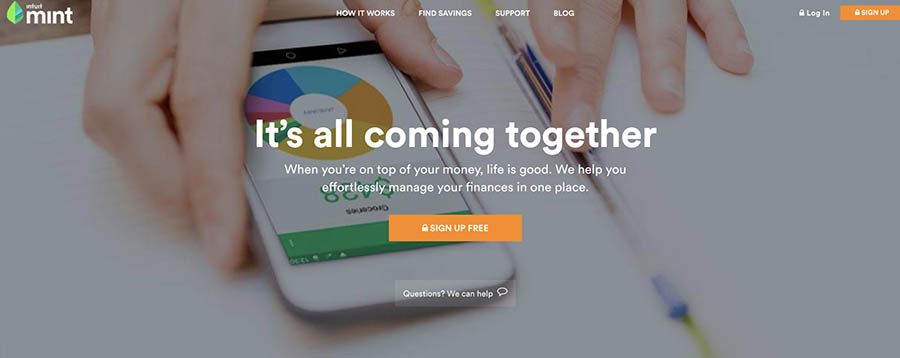
Successful communication promotes trust and satisfaction among your backers, and encourages continued participation and engagement — even shareability!

Be transparent in your communications and make your audiences feel like a critical part of your campaign (ahem, they are) by preparing built-in methods for visitors and backers to contact you easily. Provide simple contact forms and then respond as quickly as you’re able.

  • Be Responsive. DYK? Fifteen percent of crowdfunding donations are made on mobile devices. If your site isn’t mobile-friendly, you’re frustrating visitors and missing out on crucial sales. So don’t neglect responsiveness and make sure your site is functional — and appealing — across devices.
  • Optimize Checkout Processes. Having a simple and seamless (and safe) checkout system on your site will make or break your campaign. If there are too many steps or barriers to making purchases (like hidden fees or unexpected shipping costs), users and potential backers will hit the road, taking their credit cards with them. Thus, no funding and no leads. Make sure your site is equipped with a trustworthy payment gateway (do your research!) and test it regularly for potential friction that might prevent people from checking out.  Display security signage and make navigation clear. And test, test, test!
  • Continue Providing Quality Content. While you run your campaign, you can’t neglect the king of your website: content. Continue to furnish your site with blog posts, articles, and useful information so that audiences have a reason to keep engaging with you after the campaign ends. If your site contains a wealth of valuable content, there’s a better chance of visitors sticking around, interacting, and joining your loyal band of followers (surely, they’re going to be your number one fans — foam fingers, anyone?)
  • Create an Appealing and User-Friendly Design. When potential backers visit your site, what will they find? If the design and navigation of your website are unclear or visually noisy, they won’t stick around long enough for you to see a penny.

Lay out a menu that’s simple and easy to navigate. Don’t create a labyrinth; you want visitors to quickly find what they’re looking for.

Create special pages of your site dedicated to your campaign and your backers, where they can find information, updates, and contact forms.

First impressions are crucial, so make your website inviting: clean up your design by ridding it of old, outdated content and implementing design principles that attract eyes. Keep visual elements consistent and use them to target your CTA. Their experience on your site should be positive enough to inspire confidence in you and your campaign.

  • Stay Social. Keep the momentum going by linking to your social media accounts on your site, so that audiences can engage with you in multiple ways. This also provides them with other avenues to receive campaign updates and share links (meaning: more eyes!)
  • Start Tracking Analytics Early. Of course, the statistics you gather during your campaign help you judge its success (or lack of). But setting up analytic-tracking software early on in the process can provide you a wealth of useful information as you move forward, like insights into better understanding your traffic, visitors, and conversions. Get Google Analytics (or your favorite monitoring software) up and running and start measuring. (More on analytics to come).

Now, a word (or two) for you WordPress users: building a successful crowdfunding campaign can be easy as pie on the popular platform with a fundraising-ready theme or plugin.

Gather Leads with Landing Pages

Now, time to drop a truth bomb: you can’t expect to draw crowds the day you launch your campaign. You can’t, that is, unless you’ve performed the necessary prep work.

The reality is, successful crowdfunding campaigns are actually built long before the campaign hits the web. How? Email.

Let us explain. Committed backers don’t appear out of thin air the moment you announce your campaign, especially if they know nothing about your product, and money is involved. Supporters won’t come running with wallets open unless you’ve taken the time to introduce them to your brand and ideas beforehand. Spend the months before your campaign meticulously generating leads by building an email list. Outfit your site with strong landing pages that feature an opt-in email form, committing your visitors to engage with you before you begin dropping campaign hints. Those invested audiences will be critical to your campaign success.

(We’ve already created the exhaustive guide to building landing pages, so if you need a crash course, start here.)

And it’s not just sending out an occasional “hello” email once in a blue moon. Building and prepping the rapport you need before your project launch requires that you provide value-ridden communications (like free downloads or other offerings, useful content, etc.) to your followers consistently over time. If you’ve given them something they want and made an effort to solicit their feedback, they’re more likely to engage (and pony-up!) when you present your campaign.

You can propel your success in those first days of your campaign, a push that can carry you through to fulfilling your goal if you’ve built and prepared an engaged following before you launch. Spend the necessary time building an email list so you can leverage those crowds once campaign time comes. It’s proven: 53% of email shares convert into donations, so make garnering an essential part of preparing your website. The small investment of time you spend building a landing page and collecting leads will be rewarded with increased crowdfunding success down the road.

And don’t stop building an email list once your campaign is over. Email is still one of the most powerful (and multi-purpose) marketing tools in your arsenal, so use it to continue to build your subscriber list, inviting readers to share content, and to recover abandoned shoppers through email communications.

A few more words on landing pages: you’ll want to set up a few pre-launch pages (that you’ve thoroughly tested), enticing visitors about what’s to come. They should have a singular focus dedicated to collecting email sign-ups. During your campaign, your landing pages will likely feature CTAs inviting crowds to contribute to your campaign. Keep your landing pages updated as goals change before and during your campaign.

Get the Word Out

While hosting your campaign on your own site has a myriad of benefits, the popular platforms often have an advantage: they’ve got traffic built in as established sites, and as a double whammy, reporters often scour popular crowdfunding sites looking for projects to publicize. So while you’ve got that working against you, implementing a solid marketing campaign can help you bring attention to your project. You’re not out of the game yet — not even close.

Like most aspects of your campaign, marketing should be planned and developed long before you launch, and with significant chunks of your budget devoted to it.

You need your campaign to gain early traction to promote a positive trajectory, so give it a big push as you begin, and continue to engage in daily marketing activities. Repeat after us: ABS. Or, Always Be Searching. Trust us; there really are audiences out there willing to invest in your idea.

We’ve identified email as a key marketing tactic; here are other crucial ways of promoting your campaign:

  • Build connections. Engage with other blogs, influencers, and media connections within your industry that can share your campaign with their own communities. Provide featured interviews, guest posts, or other collaborative content to widen your reach. Craft content that includes other campaigns and ideas similar to yours —  then share it with those businesses. It’s likely they’ll want to share! Chances are, you’ve already built relationships that can help further your goal. Get those big players clued into the brilliance of your idea, and they’ll do marketing work for you (a fancy term we like to call ‘social proof.’ It’s powerful stuff!)
  • Encourage Referrals. Put your current customers and early adopters to work building hype. Incite your followers (especially those superfans) to engage in word-of-mouth (err . . . word of keyboard) promotion and to recommend your idea to their friends by providing shareable links and content. Bandwagon backers can supercharge your conversions, boost your fundraising numbers, and become their own powerful influencers.
  • Tweet, Post, Share, and Snap. Social content is shareable, meaning that social media marketing is an important way to get more eyes on your campaign. Utilizing the communities you’ve built on these platforms and planning targeted ads, you can pack a wallop in spreading the word; in fact, 12% of Facebook shares convert into donations. Plus, easily digestible bites of content shared on social platforms are often easier for you to craft — and easier for audiences to scan.
  • Write a Too-Hard-to-Ignore Title. It’s the first thing your site visitors will see, and if it’s not captivating enough, it might be the only thing. Your campaign’s headline is your blink-of-an-eye opportunity to draw crowds in, so it’s got to be strong, benefit-driven, and eye-catching. A few words and visitors have decided whether they’re pledging loyalty or taking a hike. Your title also largely impacts your campaign’s shareability, so don’t just wing it. Take time to plan out each word, build a hook, and make it as effective as possible so your visitors will keep reading.
  • Publish a Video. The numbers don’t lie: campaigns with personal videos raise 105% more than those that don’t. It’s hard to argue with that. An emotionally-resonant video will prove an asset to your campaign and provides essential information to potential backers: what your idea is, and why they should support it (or, the what and why). If your wallet allows, hire a professional to produce a top-notch video for your campaign (or invest in some quality equipment to make your own).

Measure Your Success

Without a yardstick to measure results, you can’t judge the success of your campaign. Of course, the numerical figures of your fundraising clue you in, but there are more analytics to consider when quantifying the success of your project.

A few basic metrics to keep your eye on:

  • Traffic Source. Where are your site visitors coming from? Are they direct, from Google searches, or referrals? Note the highest performing channels and give them additional marketing attention.
  • Cost Per Conversion. What’s the price of getting a visitor to act on your CTA? To sign up for your email list? To make a purchase? With this number, you’ll want to aim for a proper ratio of the cost of generating traffic divided by the number of conversions. This stat helps you know how to best spend your advertising dollars.
  • Interactions Per Visit. The goal is that visitors who come to your site are engaging with you. But if your interactions per visit are low, customer behavior is showing that something on your page is hindering potential customers from acting. Armed with this knowledge, you can identify troublesome pages, improve ill-performing elements, and modify the information provided to better your chances of finding success when your campaign goes public. Figure out what’s causing visitors to slam on the brakes and improve momentum.
  • Unique Visitor/Return Visitor Conversion. How do first-time visitors behave on your site? How about returning visitors? Do newbies sign up right away, or does it take subsequent visits from the already-acquainted to generate leads? If a majority of your visitors aren’t following through on your call-to-action until second or (yikes) third visits, then work to identify what is preventing them from immediately responding.

You’re Cordially Invited

Join DreamHost’s Facebook group to connect with like-minded website owners and get advice from peers and experts alike!

Raise Those Funds

Well, there’s your start. Are you ready? The success of your crowdfunding campaign lies in your hands. Scary, isn’t? Sure, but it’s also exhilarating. With your hands on all the controls, you control your e-commerce destiny. Contrary to the internet’s common dialogue, you don’t need a Kickstarter or other platform to build a successful campaign. With a decked-out site, careful planning, and megaphone-like marketing, you can draw crowds and raise the funds you need to bring your stellar idea to fruition. You’ve got this.

The post How to Create a Kick-Butt Crowdfunding Campaign on Your Own Website appeared first on Website Guides, Tips & Knowledge.


source https://www.dreamhost.com/blog/crowdfunding-on-your-website/

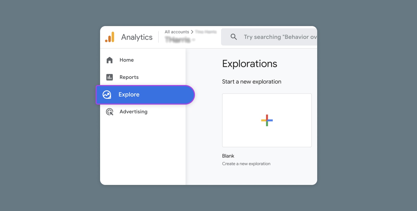
Creating and Mastering GA4 Explorations

In the switch from Universal Analytics (UA) to Google Analytics 4 (GA4) — which will go fully into effect July 2023 — a lot of things have...