Thursday 25 March 2021

How to Fix the Sidebar Below Content Error in WordPress (In 3 Steps)

Perfecting your WordPress website’s layout can be a lot of work, but it’s also essential for User Experience (UX), engagement, and conversions. Therefore, it can be frustrating when a seemingly random error causes a disruption to your site’s display — such as your sidebar suddenly appearing below the content rather than to the side.

While there are a few potential causes, it primarily comes down to issues with the Hypertext Markup Language (HTML) or Cascading Style Sheets (CSS). Fortunately, the issues are relatively easy to fix, so you can quickly get your site back in tip-top shape.

In this article, we’ll walk through the common causes of this error, then show you how to resolve it in three simple steps. Let’s get started!

Common Causes of the Sidebar Dropping Below the Content in WordPress

Sidebars in WordPress are content areas meant to be displayed either to the left or right of the page’s main segment (or sometimes both). They often contain widgets, sign-up forms, links to related posts, or similar content that you’d want to include across your site.

Due to various bugs or errors, your sidebars may sometimes appear at the bottom of the page, rather than to the left or right. Needless to say, this can easily ruin a well-designed website.

The primary cause of this behavior is problems with either the HTML or CSS on your site. It is usually a result of direct changes you’ve made to your site’s code, such as a theme or plugin file.

For example, perhaps there is an extra or undisclosed <div> tag on the page. The problem could even be attributed to incorrect width and floating settings in your CSS. Fortunately, fixing this error is easy enough.

Skip the Stress

Avoid troubleshooting when you sign up for DreamPress. Our friendly WordPress experts are available 24/7 to help solve website problems — big or small.

How to Fix the WordPress Sidebar Below Content Error (In 3 Steps)

Now that you know the potential causes of this perplexing error, it’s time to correct it. We recommend running through the following three steps in order, moving on to the next only if the previous one didn’t work. Before getting started, remember to make a backup of your site just in case.

Step 1: Undo Your Most Recent Changes

The first step is also the simplest. If your sidebar moved after making a change to your site — whether that’s installing a new plugin, adding custom code, or anything else — simply undo it. Reversing the action both gets your layout back to its original format and helps isolate the cause of the issue.

So you can start by reversing the change and refreshing your site to see if the sidebar is back in its proper place. If so, you can then look for potential issues with whatever changes you were attempting to make. For example, if you installed a new plugin, check for alternatives. If you altered or added to your site’s code, look for any typos or syntax errors.

Step 2: Fix Unclosed <div> Tags or Remove Extra <div> Tags

Often, an unclosed or extra <div> tag in your site’s code is the cause of the WordPress sidebar error. These HTML tags define the boundaries of sections on your website. If they’re incorrectly placed, browsers won’t render the site properly (hence the wandering sidebar).

Here’s an example of a correctly-formatted page:

Correctly formatted <div> tags on a page.

Below is the same page with an unclosed <div> tag:

Incorrect <div> tags causing elements to appear in the wrong place.

You can see that what should be the closing <div> tag is missing the forward slash. As a result, the browser doesn’t know that it’s meant to be closed, and the content that should be outside the element is now inside.

To fix this, comb through any template files you’ve modified and look for missing or extra tags. Generally, these errors can be found in the “template parts” files of your WordPress theme. To get there, head to your WordPress dashboard and navigate to Appearance > Theme Editor.

The WordPress Theme Editor.

Choose the correct theme from the drop-down menu at the top, and then locate the template parts section in the sidebar.

Template parts in the WordPress Theme Editor.

The templates that generate pages and posts are usually under the content section. Find the one you need from the list, check it, and make any corrections. Then you can click on Update File to save your changes.

If you know which file you edited, you can jump straight there. Otherwise, you’ll need to check them all for inconsistencies.

Step 3: Correct CSS Issues

Another frequent cause of this error is found in your site’s CSS. The WordPress Customizer’s Additional CSS section enables you to add custom CSS to your site.

The WordPress Customizer Additional CSS section.

If you’ve used this feature or edited the CSS through other means, you may have formatted the code incorrectly. In the case of moving sidebars, the most common culprit is the “width” property.

You should double-check that the sum of the widths of the Content and Sidebar elements doesn’t exceed the width of the Wrap element. If it does, the smaller element will be pushed down in order to fit.

Tools to Make Troubleshooting Sidebar Issues Easier

You can also troubleshoot the issue yourself without using code. There are several online tools online that can validate your code and check it for errors.

You can use the W3C Markup Validation Service to check HTML code. The W3C CSS Validation Service is the CSS counterpart. Online Web Check is also an excellent tool that works for both HTML and CSS.

These services are also fantastic if you just want a second set of eyes on your code, regardless of skill level. A quick double-check never hurt anyone!

You could also take fixing WordPress errors off your to-do list with our DreamCare service. Our team of experts handle everything on the backend of your site to make sure it’s safe, secure, and always up.

Additional WordPress Resources

Say goodbye to broken links and error messages! We’ve put together several guides to help you troubleshoot every kind of WordPress problem:

If you’re looking for more WordPress tips and hacks, check out our WordPress Tutorials, a collection of guides that’ll help you navigate the WordPress admin area like a pro.

Take Your WordPress Site to the Next Level

Whether you need help choosing the right WordPress plugin, creating a child theme, or writing your first blog post, we can help! Subscribe to our monthly digest so you never miss an article.

Solving the Sidebar Error

If you’ve spent time building a beautiful WordPress website, you likely don’t want anything to take away from it — least of all sudden errors. Fortunately, if the problem is that your sidebars are appearing below your content, the fix is relatively simple!

To correct the sidebar appearing below content error, you can follow these three steps:

  1. Undo any changes you made to your site just prior to the error appearing.
  2. Check for and fix unclosed or extra <div> tags in your code.
  3. Verify that your site’s CSS is correct.

If you’d rather spend your time working on your business instead of troubleshooting your website, consider switching to DreamPress. With our managed WordPress hosting plans, we take care of the problems for you, so you can stay focused on what really matters.

The post How to Fix the Sidebar Below Content Error in WordPress (In 3 Steps) appeared first on Website Guides, Tips & Knowledge.


source https://www.dreamhost.com/blog/wordpress-sidebar-below-content-error/

Tuesday 23 March 2021

How to Optimize Your Website for Mobile Devices

Fourteen years ago, the iPhone transformed how we browse, shop, and behave. Here’s why a mobile-friendly site is a must for small-business owners.

In January 2007, Steve Jobs strode onto the stage at the Macworld Expo. In his signature style, the Apple co-founder, CEO, and resident showman promised the world three things: an updated iPod, a phone, and a mini computer.

He listed off each item’s attributes: “A widescreen iPod with touch controls. A revolutionary mobile phone. And a breakthrough internet communications device.”

But when it was time for the big reveal, he didn’t unveil three separate products. He held out one gadget in triumph: the iPhone. “Are you getting it?” Jobs asked the crowd. “These are not three separate devices. This is one device! And we’re calling it iPhone.”

With an all-touch interface and sleek aesthetic, the iPhone stood out from the rest of the smartphones on the market. Eleven years later, more than 1 billion have been sold. Experts hail it as one of the most important devices launched this century.

The iPhone led the smartphone revolution and transformed how websites are built and used, ushering mobile and responsive design. Today, nearly everything we do — from ordering takeout to hailing a Lyft to sharing a photo on social media to posting on our blog — can be done through a smartphone. And the iPhone was the key to this shift.

Mobile Design: 14 Years On

Today, many people use their smartphones as their sole computer. There are 3 billion people with smartphones, and 1.3 billion who own computers.

Mobile traffic increases year over year, says Pete Polgar, Chief Marketing Officer at Clikz Digital, a digital design and marketing agency based in Little Falls, New Jersey, and is poised to surpass desktop traffic.

“A phone is more versatile and provides more value to the end-user than a computer,” he says. “You will see a massive increase in phone usage over the next few years as the technology gets cheaper.”

If your website isn’t mobile-optimized, you’re missing out, says Polgar. He points out that Google will not rank your site highly if your website is not mobile-friendly. “If your users have a mobile bad experience, they are most likely not returning your website,” he adds.

What Does Mobile Web Design Mean, Anyway?

Responsive design means that no matter how big a screen is — from a phone to a watch to a tablet to a desktop — the site will fill the screen and present information in a clear way.

“It’s not like you’re getting a flyer made or a newsletter that’s printed and has a constant canvas size,” explains Matt Felten, a Los Angeles-based product designer. “The proliferation of the iPhone means that designers have to adapt to variable screen sizes and come up with new methods for a plethora of different devices.”

Starting a Site From Scratch? Think Mobile-First

Bryan Clayton, CEO of GreenPal, spent nine months building his company’s site from scratch. “Right out of the gate, there were major problems,” he says. “We assumed that the majority of our users would shop for a lawn care service from their desktop or laptop computer. But it became very clear, very quickly that more people were accessing the website from their mobile phones and tablets than from a desktop or laptop computer — 4-to-1.”

The original full-featured desktop experience included all kinds of bells and whistles such as animations. “We had all kinds of other features that make a desktop experience delightful,” he recalls. “The problem with this approach was that the desktop experience would not translate to a mobile web browser.”

As a result, the website was bloated and didn’t work well on mobile. Users found that they had to pinch and zoom to get through the sign-up process.

“Before our website was rebuilt for a mobile-first experience, conversion on a mobile browser was less than 4%,” he says. “That means that people who attempted to sign up abandoned in the process 96% of the time.”

After rebuilding the site to be mobile-first, Clayton found that 82% of people who initiated the sign-up process to get a free price estimate complete the entire process from their mobile device and tablet.

“Our mobile-first product is the only reason why we are even in the game today,” he says.

Hone In On Your Audience

Polgar finds that many clients still ask for desktop-based sites. But “a lot of these businesses did not analyze how their customers are finding them, which was on mobile,” he says.

For any website launch or redesign, he suggests business owners first figure out how the customer uses their site. Once you determine how they will use the site, then you can develop an appropriate strategy.

Additionally, make sure your site is accessible to all readers — from adjusting the contrast so colorblind people can read content to making it possible for visually impaired people to understand through screen readers.

Ask For Customer Feedback

Zondra Wilson, owner of Blu Skincare in Los Angeles, only found out that her site wasn’t mobile-friendly when she started asking for feedback from customers.

“I would ask my customers to write a review and they would say they couldn’t find where to write it,” she recalls. “I would ask them about my blog or articles that I posted and they had a hard time finding them. They had trouble viewing my site on their cell phones. They had to scroll down a lot before my first picture or any information about my company popped up. They didn’t know how to navigate through my site. Many were frustrated and didn’t go past the first page.”

Wilson recently upgraded her site to a more mobile-friendly version and has already noticed that users are viewing more pages on the site than usual.

Think Small Screen

Less is more when it comes to mobile. Since phones aren’t as powerful as a desktop browser, you should make sure your site is optimized to load quickly, and that your web host can handle the traffic, explains Polgar.

Ultimately, the best design strategy is simple: take away all excess clutter.

“You need to design for small,” says Felten. “You have to be a little more focused. You have to cut down on information and content.” After your mobile site is in place, you may find that you don’t need to add more to the desktop version to the site, after all.

“Small businesses will have to overhaul their current marketing strategies, as their screen real estate has shrunk significantly,” says Polgar.

Vitaliy Vinogradov, CEO of Modern Place Lighting, found that switching to a mobile-first design led to 30% more conversions compared to desktop. “One important thing to do is to remove excess plugins, popups, or any other screen inhibitors on the mobile version of the site,” he says.

His team combed through the site and eliminated a few social sharing plugins that took up valuable real estate on the screen.

Refine Your Design Aesthetic

website wireframe sketch and programming code on digital tablet

The rise of mobile has spurred the rise of design-centric companies like Apple and Google. Consumers today expect more sophisticated design, says Felten.

“There’s a big push to see the business cases of a beautiful and well-performing website,” he says. “If I’m a small-business owner and all of the competition has a really nice, responsive website and I don’t, in a less than a second, people make a negative judgment about my product.”

On the flip side, if you have a beautifully designed site, people think that you value and put the same amount of care in your product.

Create a Consistent User Experience

Before mobile-first design, people built a website meant to be viewed on a desktop and then designed a mobile version.

The problem?

Your desktop site might have an entirely different look and feel compared to its mobile site. For example, Gmail’s app on the phone is different from the mobile site and the desktop site. A simple, responsive design eliminates jarring differences in user experience, says Felten.

Think Social

The vast majority of blogs are being read and shared through social, says Felten.

Think about it: From cat photos to product reviews to memes, if anyone is sharing content they’ve read from a blog, it’s most likely going to be through a social platform. This is a case where you’d want to make sure you have a responsive design, Felten suggests.

Your business should have a social media presence across the appropriate platforms, so you can reach the maximum amount of people. “For some businesses, it makes sense to have a Facebook, and others require an Instagram,” he says. “This creates multiple entry points to your site and a way to showcase your full range of services.”

Do You Need An App For That?

The iPhone also introduced the concept of apps that companies can build for their customers. But does your company need one? Felten says you should make sure that your website is strictly informative.

If your company provides daily functions — like booking a service, checking a balance, or ordering a product, it may be best to create a companion app.

What’s Next?

“Moving forward for any small business, you need to have a website and your need to have all your browsers be mobile-friendly,” says Felten. Beyond that, Polgar foresees that the cloud will become even more important, which means that companies will have to design around making your files are easily accessible using an internet connection.

7 Ways to Optimize Your Website for Mobile Devices

Now that we’ve made it clear why it’s necessary to prime your site for mobile usage, let’s get a little more practical. In the next few sections, we’ll walk you through some of the most critical aspects of creating a mobile-optimized website, ranging from the simple to the more technically complex.

We recommend that you take the time to implement as many of these methods as possible, to improve the odds that your website performs well on all devices (and is favored by Google’s mobile-first index). Let’s get to work!

1. Test Your Site Using Google’s Mobile-Friendly Tool

Before you take any further action, it’s a smart move to see how your site is already faring when it comes to mobile-friendliness. Doing this will help you hone in on the specific areas of your site that need work, and give you useful information on how you can make improvements.

One way to do this is by simply using your website on several different devices. Access the site using your own smartphone or tablet, and see how it looks and feels to use. Doing this lets you get a feel for the loading times, how well the design works on a smaller screen, whether the content is still readable, and if the navigation is easy to use.

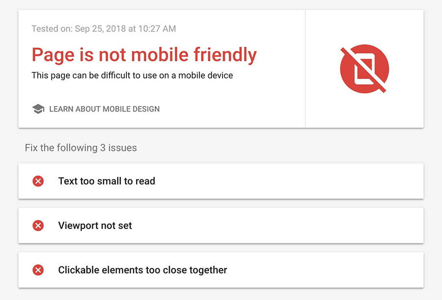
Once you’ve done that, you can go even deeper by using a dedicated testing tool. Fortunately, Google has created one you can use for free, which will show you if your site is up to its standards for mobile pages. Appropriately, this is called the Mobile-Friendly Test tool.

The Mobile-Friendly Test home page.

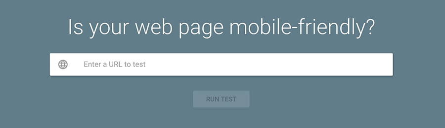
To test your site, you only need enter its URL and select Run Test. The process will usually complete in a few seconds, at which point you’ll see the results.

Mobile-Friendly Test results page.

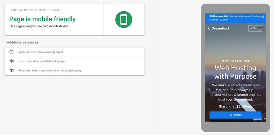
If your site is mobile-friendly, you’ll see a message letting you know, alongside a screenshot of how your website appears on a smartphone. On the other hand, if your site isn’t mobile-friendly, the results will show you what elements need to be adjusted.

Mobile-Friendly Test results, showing that the page is not mobile friendly.

Even if your site gets an overall positive result, it might still have difficulty loading certain assets. In that case, you’ll see a Page loading issues notification.

Page Loading Issues notification.

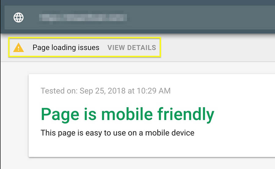
This will open a page where you can see exactly which resources Google wasn’t able to load.

 Information about loading errors.

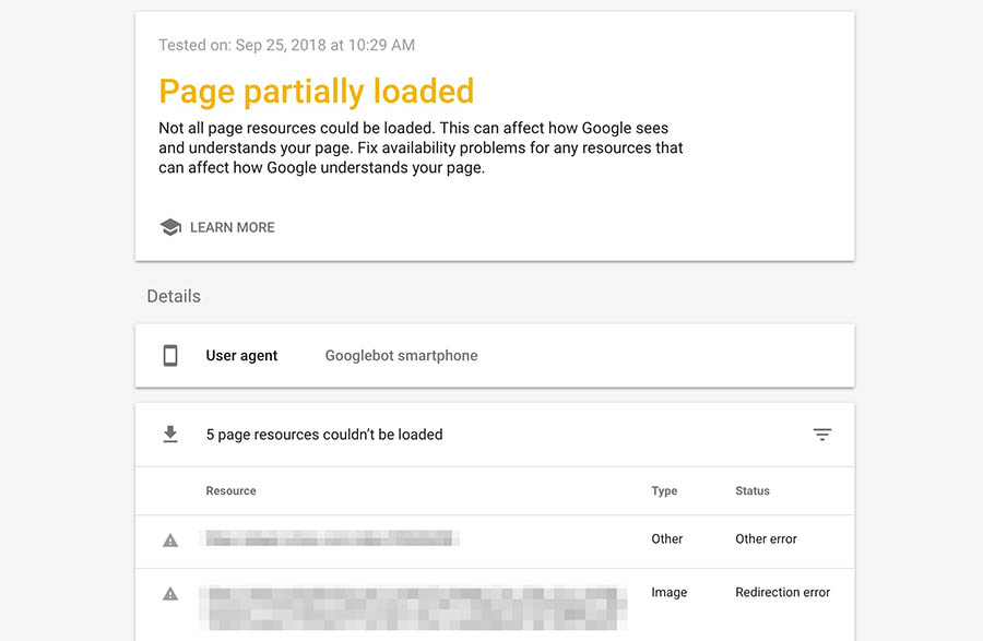
At this point, you can deal with each listed issue in turn. For example, you could edit your robots.txt file to allow Google to access blocked files, or fix any redirection errors.

2. Use a Responsive WordPress Theme

When it comes to choosing a WordPress theme, there are some things you need to keep in mind. For one, you’ll want to make sure it’s well-optimized and doesn’t negatively affect your website’s performance. It also needs to be secure, and provide you with the settings you’ll need to customize it. Of course, it also needs to have an appealing look and style.

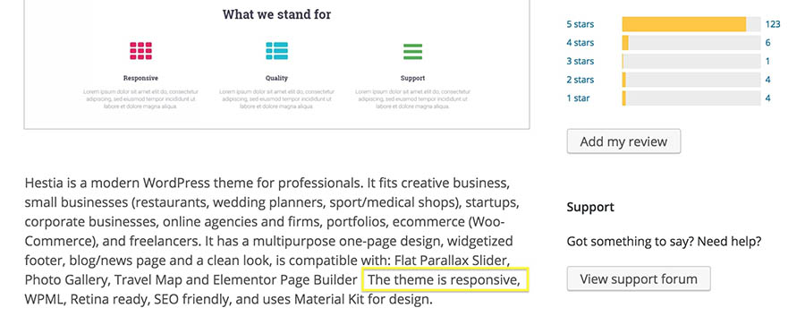
One piece of criteria that’s easy to overlook during this process is whether or not a theme is responsive. This means that your site’s design will be rendered properly, regardless of what device, browser, and screen size it’s viewed on. Fortunately, most themes these days are fully responsive. This is particularly true for many of the options in the WordPress Theme Directory.

However, you’ll want to make sure a given theme is responsive before installing it. Most of the time, the developer will mention this explicitly in the theme’s description, so make sure you check its list of features carefully.

An example of a theme description.

Other sites will let you filter themes to only show the responsive options. ThemeForest is one such place.

Browsing responsive themes on ThemeForest.

Once you’ve found a theme you like that offers a responsive design, you may want to see how your site will actually look on each device. If the theme is installed, you can do this by navigating to Appearance > Customize in your dashboard. If you look at the bottom-left corner of the screen, you’ll see a set of icons representing different devices.

Options for viewing a site in tablet or mobile mode.

Clicking on one of these will change the view, and display your website as it will appear on the selected type of device.

Customizing a site’s appearance in tablet mode.

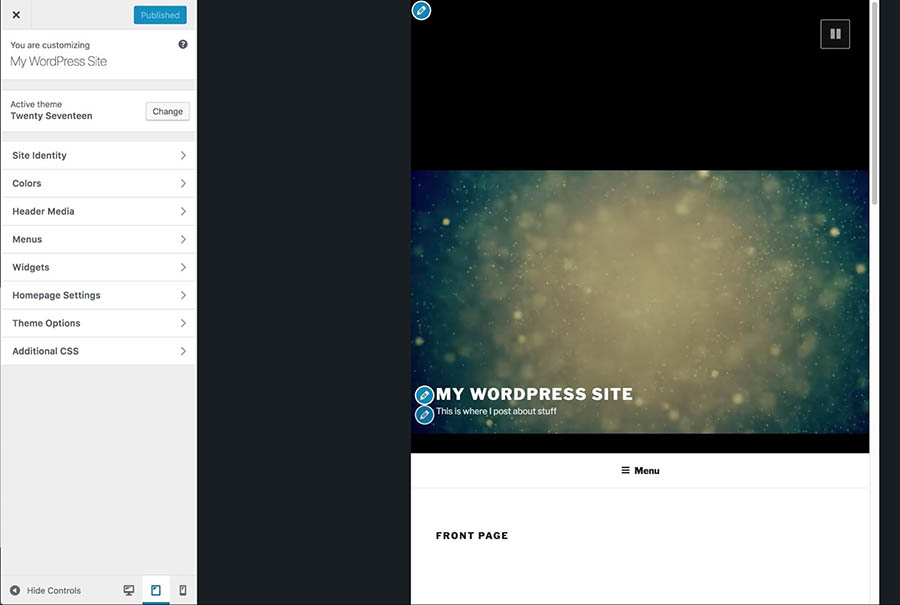
You can now see precisely how responsive your theme is, and whether it lets you make further configurations to improve the mobile experience. It may take some time to find the right responsive theme and set it up to work across various devices, but the final result will be worth it.

3. Choose a Reliable Web Host

We’ve said it before and we’ll happily say it again — picking the right web host for your site is one of the most crucial decisions you’ll make. The simple fact is that if you choose a host or plan that doesn’t offer the speed and resources you need, no amount of work on your part can stop your website from performing poorly.

Your web host will do a lot to determine how well your site performs, and when it comes to mobile-first optimization, speed is even more important than usual. We’ll discuss why this is in more detail later on. For now, what’s relevant to know is that selecting a host that keeps your site running fast will help a lot with your site’s mobile-friendliness.

With that in mind, you need to choose a plan that can guarantee consistently high performance and absolutely minimal downtime. The best option in most cases is going with a VPS hosting plan, as they tend to be affordable while still offering terrific performance at all times.

However, if you need even more out of your web hosting, you might want to go with a managed dedicated server — which means you’ll be able to use a server that’s reserved specifically for your site. Not only does this let you customize the server to your exact requirements, but it also means increased security and speed – both of which are key elements on a mobile-friendly site.

We Know You've Got Lots of VPS Options

Here’s how DreamHost’s VPS offering stands apart: 24/7 customer support, an intuitive panel, scalable RAM, unlimited bandwidth, unlimited hosting domains, and SSD storage.

4. Improve Your Site’s Loading Times

As we hinted at in the previous section, website speeds are particularly significant in a mobile-first world. Of course, keeping your site’s loading times to a minimum is always an important consideration. In fact, optimizing your site for speed will not only help you keep your bounce rate down, but it can also improve your users’ experience, which is good news for your bottom line.

However, performance becomes even more of a priority when you’re optimizing a site for mobile users. Not too long ago, Google introduced its “Speed Update,” which made site speed a ranking factor for mobile pages. As such, it’s critical you consider how well your site performs on mobile devices if you want it to be easily found in search engines.

Testing Your Site’s Mobile Speed

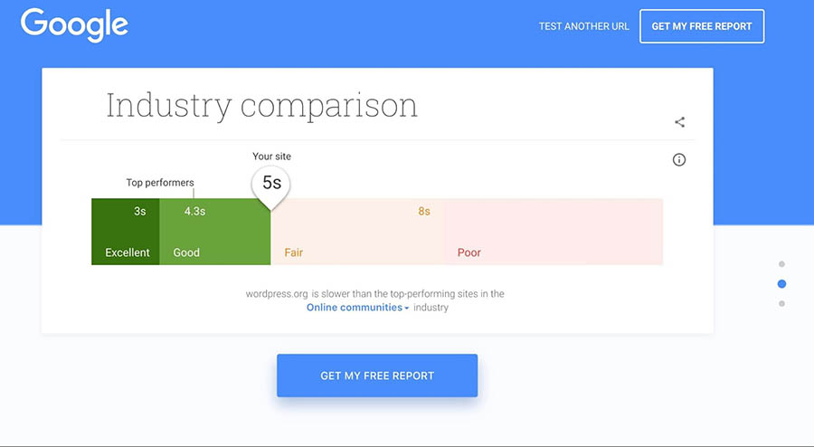
The first thing you’ll need to do is find out how well your site is currently performing. Once again, Google is here to help you out with its Mobile Speed Test tool.

The Mobile Speed Test home page.

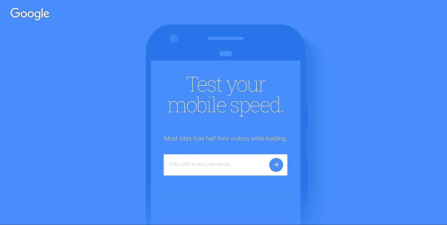
All you need to do here is enter your site’s URL and click on the arrow button. The tool will access and scan your website to see how quickly it loads on a mobile device.

Mobile Speed Test results.

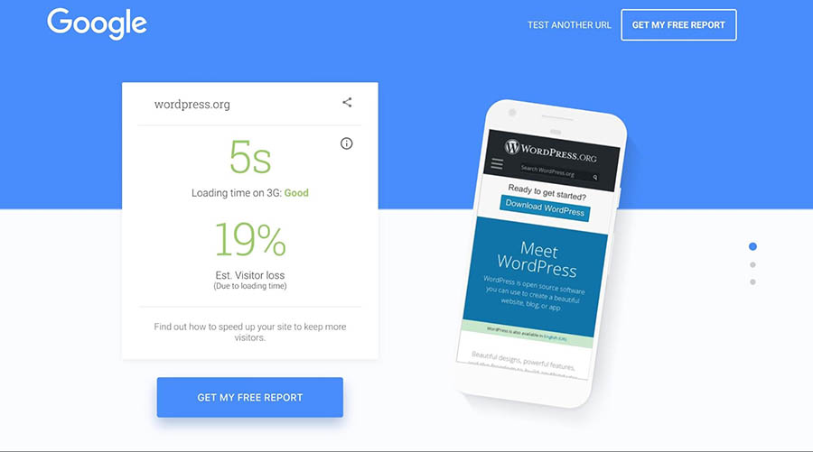
You can also scroll down to find more detailed information. Here you’ll see how your site compares to the competition, and even how many seconds you could shave off your loading times.

Graph showing a site’s loading times compared to competitors.

If you want to make those times shorter, there are plenty of ways you can optimize your site for performance on both desktop and mobile devices.

Optimizing Your Site’s Loading Times

Let’s look at some of the basic methods you can use for improving your site’s speed.

  • Implement caching. When you use caching, some of your website’s files will be saved in a more convenient location (such as on each visitor’s local device), so they don’t need to be downloaded every time a new page is accessed. There are many free caching plugins available, although some hosting plans such as DreamPress include this feature by default.
  • Use a Content Delivery Network (CDN). Instead of delivering your files from one central server, a CDN lets you store copies of them in a series of servers that are spread out geographically. This makes loading times more balanced regardless of a given user’s location, while also reducing your bandwidth usage.
  • Compress your images. Large image files are often the culprits behind slow loading times. By compressing them, you can reduce their size without affecting their quality. There are a number of free and premium solutions to help you do this, including the ShortPixel plugin and the TinyPNG tool.
  • Minify your code. By optimizing your site’s CSS, HTML, and JavaScript code, you can make it more efficient and shave precious seconds off your load times.
  • Keep all aspects of your site up to date. Using outdated software to run your website not only leaves you vulnerable to security issues, but it also prevents it from performing at peak efficiency. By keeping your plugins, themes, and CMS updated at all times, you can avoid those problems.

While this can seem like a lot of work, most of these techniques can actually be implemented using simple free solutions that require little-to-no configuration on your part. As a result, your site should perform considerably better on mobile devices and have an advantage in search engine rankings.

Get Your Site Up to Date

Technology is constantly moving forward and keeping up can be a chore. We'll upgrade your outdated, insecure software to get you back on track.

5. Redesign Your Pop-Ups for Mobile Devices

While pop-ups get a lot of criticism, they remain one of the most effective methods of grabbing a visitor’s attention. As such, we wouldn’t be surprised if your site contains at least one or two strategically positioned pop-ups, designed to increase conversions or pass vital information on to users.

An example of a website pop-up.

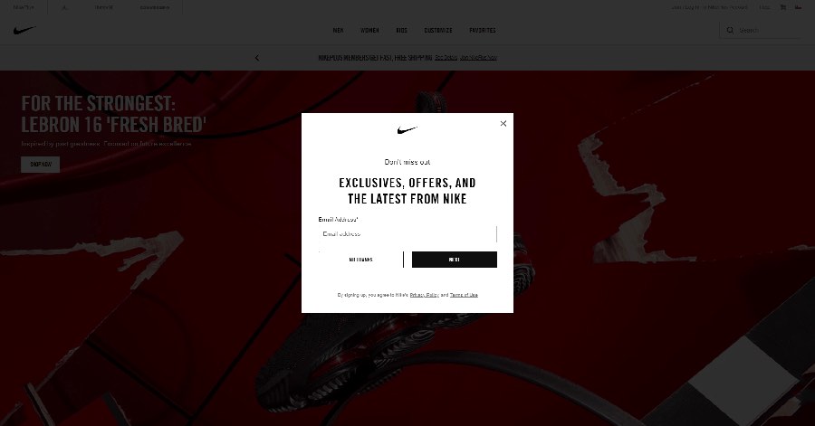
However, this can become a problem when your site is viewed on mobile devices. On a smaller device, screen space becomes more important, and even medium-sized pop-ups can become far more disruptive than they appear on the desktop version of your website.

To crack down on pop-ups that harm the user experience this way, Google recently implemented some pop-up penalties. These are effectively a set of rules that pop-ups must follow, to avoid frustrating mobile users or covering up too much of the site.

In order to avoid being penalized, you’ll need to make sure your mobile pop-ups adhere to those guidelines. In simple terms, you’ll want to configure your pop-ups as follows.

  • Pop-ups must be as non-obstructive as possible. On mobile devices, pop-ups should only cover a small fraction of the screen.
  • Pop-ups must be easy to close. It should be clear how a mobile users can dismiss the pop-up, usually via a clearly visible, decently-sized button.
  • Pop-ups containing necessary information are exempt. The above guidelines do not apply to login dialogs, age verification forms, or other pop-ups that display essential information (such as cookie notices).

As long as you bear these considerations in mind when designing your pop-ups, you shouldn’t be at risk of getting penalized.

6. Enable Accelerated Mobile Pages (AMP)

As part of Google’s mission to make mobile surfing a smoother experience, the company has also recently launched its Accelerated Mobile Pages (AMP) project. The project has grown immensely since it was unveiled in 2015, and many sites are now using AMP to ensure that their mobile versions operate at peak performance.

So, what exactly is an Accelerated Mobile Page? In simple terms, it’s a method for creating mobile-friendly versions of your site’s pages. This involves stripping down the content, as well as removing unnecessary media files and advanced layouts. The AMP version will then be served to users who access your site using a mobile device.

Naturally, there’s a lot more to AMP, including specially-created versions of your site’s HTML and JavaScript files, but fortunately, you don’t need to understand all the technical details to take advantage of this technology yourself. If you want to create your own AMP pages, an excellent place to start is with the AMP for WordPress plugin.

The AMP for WordPress plugin.

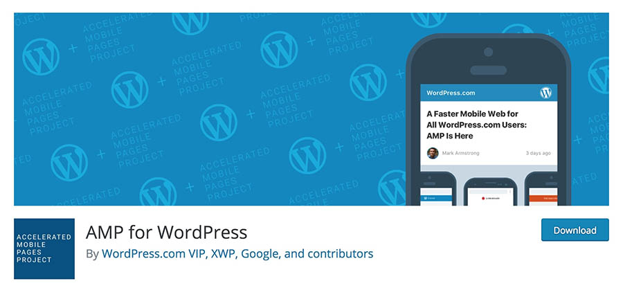
While this plugin is light on features, it will introduce you to the basics of using AMP and is very easy to use. You just need to download and install the plugin, and it will automatically generate AMP versions of your pages. You can even make some changes to the pages’ appearance, giving you more control over how they look on mobile devices.

7. Create a Mobile App

Finally, we come to a solution that might seem drastic at first glance. After all, it wasn’t long ago that mobile apps were exclusive to large websites and services. However, the market has changed significantly, and it’s now commonplace for almost any type of business or organization to offer a mobile app in addition to its standard, responsive site.

Creating a dedicated app comes with many unique benefits that a simple website can’t offer. For example, it enables you to offer subscriptions and deal with them directly through your own interface. You can also use push notifications to grab users’ attention when you post content or want to share some news.

While it’s possible to code a mobile app from scratch (or hire a developer to do so), a far easier solution is to use a tool that helps you turn your site into an app. One such solution that’s optimized for WordPress users is AppPresser.

The AppPresser home page.

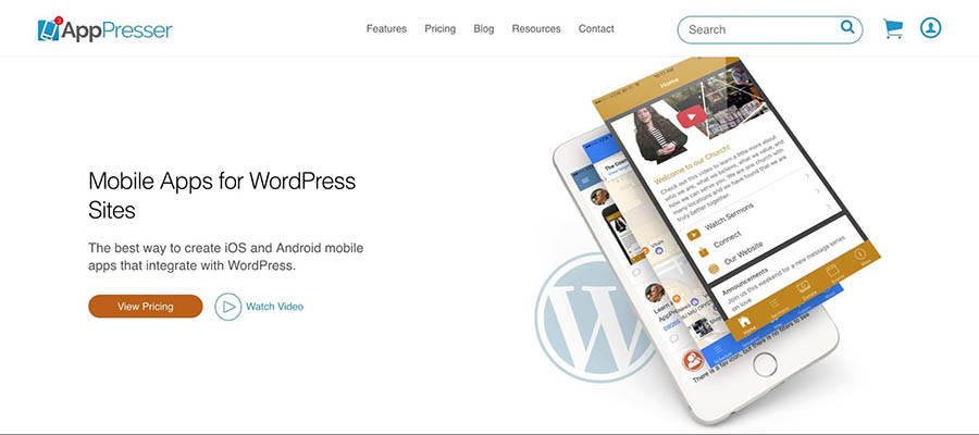
This is a premium tool with plans that start at $19 per month. For that, you get an intuitive app builder interface that should be easy to use if you’re already familiar with WordPress.

With that interface, you can quickly put together an app based on a specific site for both Android and iOS, which you can then share with your users. For example, you could submit it to an app store, or provide it directly to your site’s visitors or subscribers.

You’re Cordially Invited

Join DreamHost’s Facebook group to connect with like-minded website owners and get advice from peers and experts alike!

Mobile Optimization Can’t Wait

We now live in a mobile-first world. The majority of internet users rely more on mobile devices than their desktop counterparts, which means that you need to carefully consider how your website works and looks on smaller screens. Optimizing your site so that it performs well and is still easily usable on mobile devices is key, especially if you don’t want to get penalized by search engines.

Do you have any questions about creating a mobile website? Join our Facebook Group and let’s start the conversation!

The post How to Optimize Your Website for Mobile Devices appeared first on Website Guides, Tips & Knowledge.


source https://www.dreamhost.com/blog/how-to-optimize-your-site-for-mobile/

Friday 19 March 2021

DreamHost User Makes It Easier to Get COVID-19 Vaccines with FindaShot.org

Getting a COVID-19 vaccine can be a roller coaster of emotions. First, there’s the thrill of knowing you’re finally eligible. But once you start to search for an appointment, the frustration begins.

David Newell experienced this firsthand. Based in Dallas, Texas, his parents became eligible to receive the vaccine as part of phase 1B at the end of December. “The challenge began of finding a way to get my parents vaccinated,” he says.

Thanks to the Texas Department of State Health Services, Newell knew which local pharmacies would receive doses of the vaccine. However, the local pharmacy chain didn’t have one website where they could search for appointments at multiple locations at once. Instead, he had to check each location individually.

“That would mean we had to do 30 searches every time we were looking for appointments,” Newell explains. “I started building a toolset to search all of these locations automatically so that as soon as it became available then we could make an appointment. As I was figuring out how to make that work, I realized a lot of people are going to need this for several weeks or several months.”

That’s why Newell created FindAShot.org to help people easily find an appointment to get vaccinated.

Leave No Appointment Behind

Launched on January 6, Find A Shot regularly checks pharmacy COVID-19 vaccine appointment websites and shows the appointment availability status. The results can be found by searching by state, zip code, or using a user’s location.

Newell, who is currently a part-time student enrolled in the Wharton School’s MBA for Executives program and employed full-time at McAfee, is certainly earning his community service hours, as the project is completely led by volunteers. Find A Shot is funded through donations via their Buy Me A Coffee page, which has raised more than $3k to keep the site running, with the typical donation at just $6.

The goal for Find A Shot is simple. “The big thing was to reduce frustration throughout the process, ensuring that people who want to find an appointment can find an appointment,” Newell says.

He has been spreading the word of Find A Shot with #LeaveNoAppointmentBehind on social media. Of any vaccine finder, Find A Shot has the widest appointment availability coverage of pharmacies, currently covering 19,000 locations owned by CVS, H-E-B, Hy-Vee, Rite Aid, and Walgreens. They have listed appointments available in 47 states, along with Washington, D.C., and Puerto Rico (New Hampshire, North Dakota, and Oklahoma are the exceptions.) In most cases, they get updates on availability every few minutes to an hour.

One of the biggest challenges for Find A Shot is that most pharmacies have designed their appointment finders based on their flu shot scheduler and adapted them to COVID-19 vaccines.

“They are designed in such a way to be very local store centric, which is great for flu vaccines and tetanus shots or measles shots that have high supply relative to demand, but the challenge with the COVID-19 vaccine is supply is very constrained,” Newell says. “The closest store won’t have availability, which makes it challenging to search others. With Albertsons, for example, if I search my zip code, it will never return more than the six closest stores, even if there isn’t availability. Either you need to figure out the closest zip codes in your area or you give up, essentially.”

Another benefit of Find A Shot is that it will cut down on vaccines that go to waste since it helps try to fill all appointment slots.

“A bigger concern from a logistics standpoint is taking appointments so you can line up people to thaw and open one vial of the vaccine — there are typically 10 doses for Moderna,” Newell says. “Hopefully there will be zero no-shows so there won’t be any wasted doses. When 10 appointments open up, as soon as you book an appointment, the dose is allocated to you. If an appointment goes unfilled, then that could mean the dose goes unused unless they can find a standby list. People want to get it, so we need to find a matchmaker to help them get to where there are appointments. In extreme cases, an unused dose could lead to costing lives.”

Using DreamHost to Power the Backend

Newell has been a loyal DreamHost customer since 2007, so using DreamHost for Find A Shot was a no-brainer. “I have a fantastic hosting plan and experience with DreamHost and I already have all of my personal projects on DreamHost, so naturally it’s the first place I would go for adding another personal project.”

He’s a fan of DreamHost for the simplicity of setting up a new website, particularly registering it, as his plan includes five free domain names, one of which is Find A Shot. Another point of appreciation is the flexibility, specifically with the types of websites or web applications you can host.

Findashot.org’s homepage

“I’m using Python Flask and having that flexibility of not just a static website is really nice,” he says. “Additionally, in a few clicks I’ve got a database set up and can tie the Flask app directly into it, which accelerates the time it took to deploy — I was able to get it out really quickly.” It only took a few business days for Newell to completely build Find A Shot.

Another benefit of DreamHost that Newell appreciates is that there isn’t a separate bill for bandwidth. “Not having to worry about other charges and the fact that it’s all-inclusive with the plan rate means that the costs are predictable, so I’m not going to have any surprises on the bill,” he says. The scalability is another plus, as Find A Shot recently hit 65,000 unique visitors without breaking the memory limit. Finally, DreamHost’s support team is another element that makes Newell a loyal customer. “The support team has been phenomenal with getting back to me with details,” he says. “They are on top of it, incredibly professional and easy to work with.”

We Support Your Dream

Whatever your online goals, we’ll be right there with you, making sure your site is fast, secure, and always up. Plans start at $2.59/mo.

Newell has volunteered countless hours to keep Find A Shot running, and the feedback from users makes it all worth it.

“All the heartwarming messages of support that we’ve gotten is so rewarding,” he says. “People are appreciative — the frustration [of trying to book an appointment] can border on desperation.”

Newell has received loads of positive feedback. For example, one user said, “Thanks for this site!! I scheduled a lot of my parents’ elderly friends that had no access or knowledge how. Thank you!”

For some people, Find A Shot has been lifesaving. One user said, “I live in NY and tried for weeks to get my 69 year old mom w/chronic illness a shot in MA to no avail. I used your site once and had an appointment for her within 20 minutes. Thank you!!!!!!!!!”

Newell has always had one thing in mind for Find A Shot. “Ultimately the goal is to make the site obsolete because everyone has been able to get vaccinated,” he says. Thanks to Find A Shot, that target gets a little closer every day.

The post DreamHost User Makes It Easier to Get COVID-19 Vaccines with FindaShot.org appeared first on Website Guides, Tips & Knowledge.


source https://www.dreamhost.com/blog/customer-spotlight-findashot/

The Best Gets Better: 7 Ways We’ve Improved the DreamHost Experience

The last year has been full of unexpected changes. While certainly not unique to DreamHost, one of the challenges we faced as a company was keeping everyone productive and engaged while working remotely.

Fortunately, our team rose to the challenge and was able to adapt and move more quickly than ever before. That resulted in a slew of improvements for our customers.

We wanted to take this opportunity to share some highlights of what the team has accomplished so far as we gear up for even more in 2021!

1. Better Website Management

The Websites section of our customer control panel — the central hub for everything to do with your sites — got a complete overhaul. Out with the old, dated codebase that was difficult to develop for, and in with the new modular layout that has room for days.

The panel’s new, modern tech stack allowed us to create a more intuitive experience tailored to each user’s needs. It also allowed us to launch new features like Free WordPress Migrations, the ability to easily Change Your Domain used for any WordPress site, and a DNS Propagation Checker that shows your domain’s up-to-the-minute DNS status from different parts of the world.

Planning out user improvements

But the improvements to our control panel didn’t stop at website management! We’ve also revamped our user management interface, introduced and updated the onboarding flow for new customers getting started with their first site, and reorganized our control panel’s primary navigation to put things where you’d expect to find them.

The direct customer feedback we’ve received from DreamHost users has been an invaluable resource throughout all these months of development. With each release of the panel, we immediately heard from you what worked and what needed some work. This phased approach to releases has allowed us to iterate and continually improve our control panel, avoiding any unnecessary surprises that might come from launching everything all at once with our fingers crossed.

Thank you for helping us build the DreamHost that you want to see!

2. ¡DreamHost en EspaƱol!

In 2018, we began expanding our support team to better serve our Spanish-speaking clientele. In 2020, we took another big leap forward in that area by translating our entire website, customer control panel, and knowledge base — along with all our other content — into Spanish.

You Could Be Reading This in Spanish

All the great tutorials you’ve come to expect from the DreamHost blog are now available in Spanish.

3. Improved Email Performance

Email inbox on computer illustration

Email: Love it or hate it — odds are that you use it. Whether you’re corresponding with customers or staying in touch with the rest of your team, email is a vital tool for just about every business.

We’ve made email performance a priority at DreamHost, upgrading and updating our systems to make sure that your inbox is fast, reliable, and ready for whatever’s thrown at it.

DreamHost recently partnered with MailChannels to improve inbound and outbound spam filtering for all DreamHost customers, with features like customizable allow/block lists, compromised-account detection to guard against unauthorized senders, and intelligent quarantining that allows both senders and receivers to release blocked messages rather than lose them to the murky depths of the junk folder.

4. Upgraded Web Servers

There’s a lot going on under-the-hood of most websites today. Most folks don’t even think about the operating system on their hosting server, yet it plays a crucial role in a website’s overall health. But just like your smartphone, home computer, and so many Wi-Fi light bulbs, web servers need updates too.

There’s a constant cat-and-mouse game between attackers and DreamHost’s fearless admins, with software vulnerabilities and security patches leapfrogging each other until the end of time. Our infrastructure team has worked hard to plan and execute regular upgrades to keep your data safe with minimal disruption across our network. We’re just about done rolling out the latest and greatest version of PHP, with support for new features like OPCache Preloading to help boost site performance.

5. New Tutorials to Help You Succeed

There’s a lot to learn when setting out to build a website, and not everyone has time to navigate the sea of information out there. Even figuring out where to start can feel like a lot!

We wanted to do something about that. We took our collective smarts, compressed them down to a series of wafer-thin layers, and launched DreamHost Academy, a set of tutorials that cover everything you need to know to get your website off the ground!

Step-by-step, detailed articles take you from building your site to driving traffic to it to optimizing all the little things that help your visitors have the best possible experience.

6. Pro Services to Shrink Your To-Do List

DreamHost’s Pro Service homepage

It’s fun to DIY, but sometimes you just need to get things done. Once you’ve covered the basics of creating a website for your business — domain registered, email set up, WordPress installed — there’s still more involved in taking a site from concept to success.

With our newly launched Pro Services, DreamHost can now help with a range of next-level tasks, from setting up your storefront to repairing a hacked site to helping you market your website on social media, and so much more.

You Dream It, We Code It

Tap into 20+ years of coding expertise when you opt for our Web Development service. Just let us know what you want for your site — we take it from there.

7. Additional Support Staff

Our customer support team is legendary, and it’s growing! Now, more than ever, you need an online partner who’s available when you are. To ensure we’re delivering the kind of service you expect from us, we’ve hired an army of online success experts to respond to your questions as close to instantly as is humanly possible.

And We’re Just Getting Started

That’s just a handful of the projects that have crossed the finish line so far, and we have much more in store this year!

Within the next month, we will be rolling out some performance enhancements for our flagship Managed WordPress service, DreamPress, and a new search engine optimization (SEO) service to help customers drive more traffic to their sites.

Keep your eye on our newsletter and follow us on social media so you don’t miss out!

The post The Best Gets Better: 7 Ways We’ve Improved the DreamHost Experience appeared first on Website Guides, Tips & Knowledge.


source https://www.dreamhost.com/blog/the-best-gets-better/

Thursday 18 March 2021

How to Fix White Text and Missing Buttons in the WordPress Visual Editor (5 Steps)

Picture this: You log in to your WordPress dashboard to write a new blog post. You fire up the Classic Editor, only to find a problem. All of the formatting buttons are missing, and the text is white and impossible to see.

Encountering this error can be frustrating. It may even prevent you from getting work done, potentially putting you behind schedule. Fortunately, there are several solutions to this issue.

In this article, we’ll look at exactly what this error involves and then walk you through how to fix it in five steps. Let’s get started!

An Introduction to the White Text and Missing Buttons Error in the WordPress Visual Editor

Before we dig into this error, let’s clarify exactly what we mean by the “visual editor.” This refers to the nicely-formatted editor you use to create your posts or pages in WordPress, whether that’s the Classic Editor or the newer Block Editor.

The error we’re dealing with in this article occurs with the visual editor when using the Classic Editor plugin.

The WordPress visual editor.

The formatting buttons along the top suddenly vanish. Additionally, the text you write in the editor field may appear the same color as the background, making it unreadable.

This makes using the Classic Editor pretty much impossible. If you rely on it to create your blog content, you’ll want to fix this problem as quickly as possible. Fortunately, this issue isn’t difficult to correct.

What to Do Before You Start Troubleshooting

Before you start troubleshooting, we recommend making a backup of your site. If you’re using DreamHost, we make the backup process incredibly easy.

If you’re using a different hosting provider, it likely also offers a backup solution. You can consult the appropriate documentation for instructions. You can also opt for a WordPress backup plugin such as UpdraftPlus.

Skip the WordPress Error Stress

Avoid troubleshooting when you sign up for DreamPress. Our friendly WordPress experts are available 24/7 to help solve website problems — big or small.

How to Fix White Text and Missing Buttons in the WordPress Visual Editor (In 5 Steps)

This error is most likely either a problem with your browser cache or with the Classic Editor itself  — both of which can be easily fixed. We recommend following these five steps in order, and only proceeding to the next if you’re still experiencing the issue.

Step 1: Clear Your Browser Cache

The first and simplest method you can try is clearing your browser cache. Your browser saves versions of websites you visit (including your WordPress editor) to make loading them quicker.

If your cache is corrupted or has stored a version of a page with errors, it may continue to load the broken page. Clearing the cache forces the browser to load a fresh copy of the editor, hopefully resolving the problem.

To clear your cache in Google Chrome, click on the three-dot menu icon in the upper-right corner, and then click on Settings. Under the Privacy and security section, select Clear browsing data.

Options for clearing user data and cache in Google Chrome.

In the pop-up, make sure only Cached images and files is selected, and then click on Clear data. If you don’t use Chrome or want further guidance, you can refer to our guide on clearing your browser cache.

Step 2: Deactivate All of Your WordPress Plugins

Next, you can check if a plugin might be causing the issue. The best way to do this is to deactivate all your plugins (except for the Classic Editor), check to see if the problem is resolved, and then re-enable them one by one until the error returns.

At that point, you’ll have isolated the problematic plugin. Then you can check for updates, look for alternatives, or simply leave it deactivated if it’s one you don’t depend on.

To deactivate your WordPress plugins, head to the dashboard and navigate to Plugins > Installed Plugins.

Check the box next to all of the plugins except for the Classic Editor. In the Bulk actions box, you can choose Deactivate and click on Apply. Then reload the WordPress editor and verify that everything is working properly.

If deactivating your plugins resolved the error, your next step is to isolate the plugin that was causing it. You can go down the list one by one and click on the Activate button under the plugin’s name. After each one is reactivated, check to see if the error has reappeared. If not, you can move on until you find the problematic plugin.

Step 3: Replace the TinyMCE Folder

TinyMCE is the technical name for the WordPress Classic Editor. It’s an open-source editor that’s used by quite a few platforms, in addition to WordPress.

An issue with the TinyMCE files can cause the editor’s buttons to disappear. To fix this, you can replace the folder with a fresh copy.

First, download the version of WordPress your site is using. You can find the current version number by checking the bottom-right corner of any page in your WordPress dashboard.

The WordPress version in use on a website.

Open up the WordPress zip file and move the TinyMCE folder somewhere else, such as your desktop. It’s located at wp-includes/js/tinymce.

Finally, you’ll need to access your WordPress site’s file system and replace the old folder with the new one. Head to your DreamPress account (see Step 1 for instructions). Under the Details section, click on Manage Files to open the DreamHost file browser.

The DreamHost file manager.

If you’re not a DreamHost customer, you can also access your site via Secure File Transfer Protocol (SFTP). Navigate to wp-includes/js and upload the new copy of the TinyMCE folder using the “up arrow” button in the bottom left. Then you can refresh your WordPress dashboard and check the editor again.

Step 4: Modify the wp-config.php File

If the above fixes haven’t worked, you can try modifying your wp-config.php file to force WordPress to load scripts individually. To do so, start by opening up your WordPress site in the DreamHost file manager or via SFTP, as outlined above.

The wp-config.php file is located in the root directory of your site. Simply add the following line of code to the top of the file, right after the opening <php> tag:

define(‘CONCATENATE_SCRIPTS’,false);

Here’s what your code should look like:

The wp-config.php file, showing the location of the opening <php> tag.

When you’re done, save the file, refresh your site, and then try to load the visual editor again. If you’re still seeing the error message, proceed to the last step.

Step 5: Install the Advanced Editor Tools Plugin

Previously known as TinyMCE Advanced, the Advanced Editor Tools plugin is a version of the TinyMCE script that offers additional features.

The Advanced Editor Tools plugin.

Essentially, it provides you with a hybrid of the TinyMCE editor and the Block Editor. Also, it’s free to download and use.

After you install and activate it, you can locate the settings by navigating to Settings > Advanced Editor Tools.

The Advanced Editor Tools plugin settings.

Once it’s activated and you’ve configured the settings to your liking, refresh your WordPress site. Now, when you go to a new WordPress post or page, you should see that the previously-missing buttons appear in your visual editor.

Additional WordPress Issue Resources

Want to learn more about fixing common WordPress errors? We’ve put together several guides to help you.

Website Management Made Easy

Let us handle the backend — we’ll manage and monitor your website so it’s safe, secure, and always up.

WordPress Visual Editor Problem, Solved

If your WordPress editor is experiencing problems, such as unreadable white text or disappearing buttons, don’t worry. Like many WordPress errors, this one is relatively simple to fix, and there are multiple methods you can try.

As we’ve discussed, you can follow these five steps to resolve the white text and missing buttons error in the WordPress editor:

  1. Clear your browser cache.
  2. Deactivate your WordPress plugins.
  3. Replace the TinyMCE folder with a fresh copy.
  4. Modify your wp-config.php file.
  5. Install the Advanced Editor Tools plugin.

If you want to make troubleshooting easier, consider using DreamPress, our managed WordPress hosting solution. With DreamPress, we take care of problems for you, so you can focus on what matters.

The post How to Fix White Text and Missing Buttons in the WordPress Visual Editor (5 Steps) appeared first on Website Guides, Tips & Knowledge.


source https://www.dreamhost.com/blog/how-to-fix-white-text-missing-buttons-wordpress/

Creating and Mastering GA4 Explorations

In the switch from Universal Analytics (UA) to Google Analytics 4 (GA4) — which will go fully into effect July 2023 — a lot of things have...