Every website owner wants to attract as many visitors as possible. However, few take the steps necessary to ensure their site can be used by everyone. There are millions of users out there who rely on sites being accessible, and if you don’t take the time to understand their needs, everyone will be missing out.
Fortunately, accessibility isn’t difficult to implement. You just need to understand the underlying issues that can make a site hard or impossible to use by certain people. Once you do, you can take steps to avoid those mistakes and make your site welcoming to all visitors.
In this article, we’ll look at what website accessibility actually involves and why it’s so important. We’ll also outline the most important accessibility guidelines and show you how to implement them on your site. Let’s get going!
A Brief Introduction to Web Accessibility
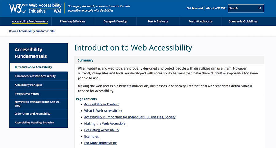
Ideally, everyone should be able to use any website on the internet. It shouldn’t matter if they have a condition that affects their capabilities or what hardware and software they need to use. This is the main tenet behind the concept of web accessibility.
The fact is that millions of internet users have special needs, disabilities, and impairments that can make it difficult or even impossible for them to use certain types of websites. By designing your site with these challenges in mind, you can ensure that it’s welcoming to as many users as possible.
While there are a lot of disabilities and conditions that can affect the way people use websites, let’s take a look at some of the most common categories of impairments:
- Visual Impairment: This includes a partial or total inability to see or to perceive color contrasts.
- Hearing Impairment: Some users have a reduced ability to hear.
- Motor Skills/Physical Disabilities: Users may have difficulty moving parts of their bodies, including making precise movements (such as when using a mouse).
- Photosensitive Seizures: Conditions such as epilepsy can cause seizures that are often triggered by flashing lights.
- Cognitive Disabilities: There are also many conditions that affect cognitive ability, such as dementia and dyslexia.
To work around these issues, many people use assistive technologies to browse the internet. This includes screen readers that vocalize the text on each page, speech recognition software that converts speech into text, Braille terminals, and even alternative keyboards that accommodate special needs.
As such, it’s possible for almost anybody to browse the web. What’s more, you can make their experiences significantly better by designing your site with accessibility in mind.
Create a Website for All
With automatic updates and strong security defenses, DreamPress takes server management off your hands so you can focus on what really matters: building a site that can be enjoyed by every user.

Why Making Your Website Accessible Should Be a Priority
As you can imagine, the benefits to the user of making your site accessible are huge. This is an important thing to do simply from a humanistic perspective, as it ensures that you don’t shut out people with disabilities.
Of course, improving accessibility on your site provides you with a lot of benefits as well. Crucially, it immediately expands your potential audience. The math should be evident here. If more users are able to use your site, you’ve just grown your potential user base exponentially. This could put you one step ahead of competitors who may not have taken the same steps towards accessibility.
By thinking in terms of accessibility, you can also benefit all your visitors, not just those who fit the categories we listed earlier. Many of the considerations involved in making your site more accessible will also improve its overall design and usability. Plus, you’ll be making your site more flexible and “future-proof” along the way.
Finally, it’s important to note that many countries have laws regarding web and software accessibility. As such, you may be legally required to match specific accessibility standards.
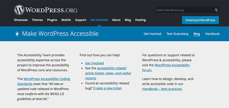
Thankfully, you’re not alone. The Web Accessibility Initiative project has been working since 1997 to help improve accessibility online. Be sure to check out the Web Content Accessibility Guidelines, also known as WCAG, on their site. These guidelines specifically outline steps you can take to make your site more user-friendly.
Similarly, WordPress has its own Make WordPress Accessible team that focuses specifically on the platform. There are also countless other community-driven projects, such as A11Y, that provide guidance and resources to help you create highly accessible websites.
10 Ways to Make Your Website Accessible
Now we’re going to look at a few ways you can make your website more accessible right away.
First, we should mention that one of the most important things you need to do is choose the right Content Management System (CMS) to run your site on.
When it comes to accessibility, few CMSes can top WordPress. As such, we’ll be referencing a number of solutions specific to the WordPress platform throughout this guide (although you can find accessibility tools for nearly any CMS).
1. Make Sure Your Site Is Keyboard-Friendly
This step is also the most important. Put simply: for a website to be accessible, it must work without the use of a mouse. This is because many assistive technologies rely on keyboard-only navigation. As such, it must be possible to use all of your site’s major features via a keyboard and nothing else. This includes accessing all pages, links, content, and so on.
The most common way of navigating using a keyboard is with the Tab key. This will jump between areas on a page that can have “keyboard focus,” which includes links, buttons, and forms. Therefore, your goal should be to ensure that all web content and navigation can be accessed using Tab.
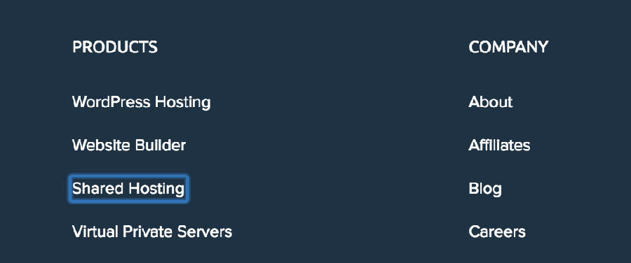
This is easy to test — simply use your own site without a mouse. If you find that you can’t access certain elements or that navigating is difficult, you can pinpoint those issues and address them. To help you out with this, WebAIM provides a handy guide for keyboard accessibility design.
Be Awesome on the Internet
Join our monthly newsletter for tips, tricks, and how-to content to build your dream website!

2. Make Sure All Content Is Easily Accessible
In addition to making your site keyboard-friendly, you also need to ensure that all content on the page is actually accessible. While this is usually not a problem, it can be an issue when a page contains dynamic content.
In short, content is dynamic if it can change without the page it’s on reloading. This can become a problem if the site doesn’t inform assistive tools of the change. For example, many screen readers will only “read” the site as it appears when it first loads. As such, you need to make it aware when something shifts, or the user will miss the new content.
One way you can do this is by using ARIA landmarks. These are tags you add to content in order to clearly define it on the page. You can tag dynamic content as a “live region,” which enables screen readers and similar devices to understand the content as it changes.
ARIA is also useful for making navigation more straightforward as it lets users skip directly to specific content. This way, they won’t have to tab through every menu item just to get to your main content and can easily pass over other link-heavy sections. The same effect can be achieved using skip-to-main links, which are invisible links that let users skip menus. However, ARIA tends to be more flexible and efficient.
The Make WordPress Accessible handbook contains a section on ARIA landmarks that you may want to check out. It’s also worth noting that all WordPress themes with the accessibility-ready tag will have ARIA landmarks added by default.
3. Add Alt Text to All Images
When adding images to WordPress, you’ve probably noticed this field.
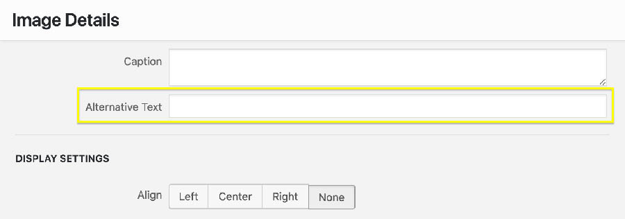
Here, you can enter the alternative text for an image. This text acts as a replacement for the image if it fails to load.

However, alt text (sometimes called alt attributes, alt descriptions, or alt tags) is also accessed by screen readers to “read” the picture. You can, therefore, use this field to describe an image, giving context to users who would otherwise miss it.
As if that weren’t enough, alt text can also help you improve your site’s SEO, giving search engines more information to crawl. Just make sure to write descriptive summaries of each image, and try to include your keywords whenever it makes sense.
4. Choose Your Colors Carefully
We often talk about color blindness as if it’s a, no pun intended, black-and-white issue. However, it’s more of a spectrum since different people perceive colors in unique ways (remember The Dress)? As such, you need to make sure the colors you select on your site contrast well to ensure that everyone can distinguish between various elements on the page.
The most pressing issue is making sure text stands out against the background. Ideally, you should set a dark color against a light one, making sure that they don’t bleed into each other.
Let’s say you want to use a blue color scheme. You’d want to avoid creating a palette where the shades are too similar in hue and saturation, like this:

This is very difficult to read. Instead, a clearer color contrast works much better.

There are plenty of online tools you can use to find and test color combinations. WebAIM has one, and we also like Contrast Checker because it gives you a score in real-time. The latter tool also enables you to switch to monochrome to get a rough idea of how effective any given combination is.
5. Use Headers to Structure Your Content Correctly
Another key task to make your site accessible is structuring your content by using headers carefully. Doing this will make your content much easier to understand and digest and improves flow.
Additionally, clear headers also help screen readers interpret your pages. This makes it much easier to provide in-page navigation. It’s also simple to do as you only need to ensure you use the correct heading levels in your content.
For instance, you should only use one H1 per page – usually as the page title. This can be followed by subheadings starting with H2, which can then be nested further with H3, followed by H4. These should always be used in order so you should avoid using an H4 directly after an H2 (and so on).
6. Design Your Forms for Accessibility
Forms are a useful addition to most sites but must be designed carefully. What’s most important is to ensure that each field is clearly labeled. You should also aim to place the labels adjacent to the respective fields. While a sighted user can easily match a label to the corresponding field or option, this may not be obvious for someone using a screen reader.
You should also aim to provide instructions and information in a clear way that the user can easily understand. To create accessible forms in WordPress, you can use a tool like the Caldera Forms builder. This is a plugin specifically focused on accessibility, which will make your job much easier.
7. Don’t Use Tables for Anything Except Tabular Data
When it comes to displaying data, tables are handy. They make it much easier for all users, including those using assistive technology, to parse a large amount of data. To get the maximum benefit, however, you’ll want to keep your tables as simple as you can.
In addition, it’s best to avoid using tables for anything but tabular data. For example, you should never use a table for layouts, lists, or anything else. This can be confusing to screen readers and similar devices.
If you do need to create more complex tables, you can follow this guide from W3. It shows you how to code a table while maintaining accessibility standards.
8. Enable Resizable Text That Doesn’t Break Your Site
Most devices and browsers will enable users to resize text, which can be helpful for those with visual impairments. However, if you don’t build your site to support this feature, resizing text could break your design or make it difficult to interact with your site.
A good practice is to avoid absolute units, such as specifying text size using pixels. Instead, use relative sizes, which enable the text to scale depending on other content and screen size.

You should also never turn off user scalability as this will make it difficult for users to resize the text at all.
To make sure your site meets these criteria, test your font sizes thoroughly by increasing the zoom level in your own browser. If you notice that content becomes difficult to read or navigate, you can check out this guide by WebAIM that discusses font size.
9. Avoid Automatic Media and Navigation
Automatically-playing media files have been a bane of internet users since the days of MySpace. As annoying as it can be to have music or videos start when a page loads, this is an even bigger issue in terms of accessibility.
For example, figuring out how to turn off the media can be difficult when using a screen reader, while other users could simply be confused or even frightened by the sudden noise. You should, therefore, avoid including elements that start without the user first prompting them.
It’s also best to avoid automatic navigation, such as carousels and sliders. This can be incredibly frustrating if the viewer needs more time to absorb all the information before moving on to the next slide or section.
Related: Leveling the Web: 12 Questions with Accessibility Expert Gian Wild
10. Create Content With Accessibility in Mind
Finally, we come to the core of your site: its content. While designing your site for accessibility is hugely important, you should bear the same considerations in mind when creating content.
This means paying attention to relatively minor things, such as always fully writing out acronyms, to more important points, like making sure you give all your links unique, descriptive names and anchor text.
If you’ve read through this entire tutorial, you’ll already have a clear idea of the potential issues that can cause certain users trouble. Keep in mind that — just as your site should usable by anybody — your content should be approachable and readable no matter who discovers it.
Web Content Accessibility Matters
Making sure your site is welcoming to as many people as possible should be a top priority. There’s no reason to exclude anybody, especially since it’s relatively easy to avoid doing so. Not only will your users thank you, but you’ll also likely see benefits in the form of increased traffic and conversions.
By taking the time to understand the possible flaws in your design and content, you can make sure your site is optimized for accessibility today.
At DreamHost, our mission is to empower people to get online. That means we take accessibility seriously. If you’re ready to set up a site, consider DreamPress, our managed WordPress hosting solution. With automatic updates and strong security defenses, DreamPress takes server management off your hands so you can focus on what really matters: creating a site that can be used (and enjoyed) by everyone. Learn more about plan options today.
The post 10 Ways to Make Your Website Accessible appeared first on Website Guides, Tips and Knowledge.
source https://www.dreamhost.com/blog/make-your-website-accessible/
No comments:
Post a Comment